Fashion
Mixed Media Brand Interaction Campaign Poster
Create bold mixed-media campaign visuals combining real studio photography with hand-drawn illustration elements, featuring dynamic human-object interaction and oversized graphic props. Perfect for fashion branding, streetwear campaigns, and viral editorial poster design.
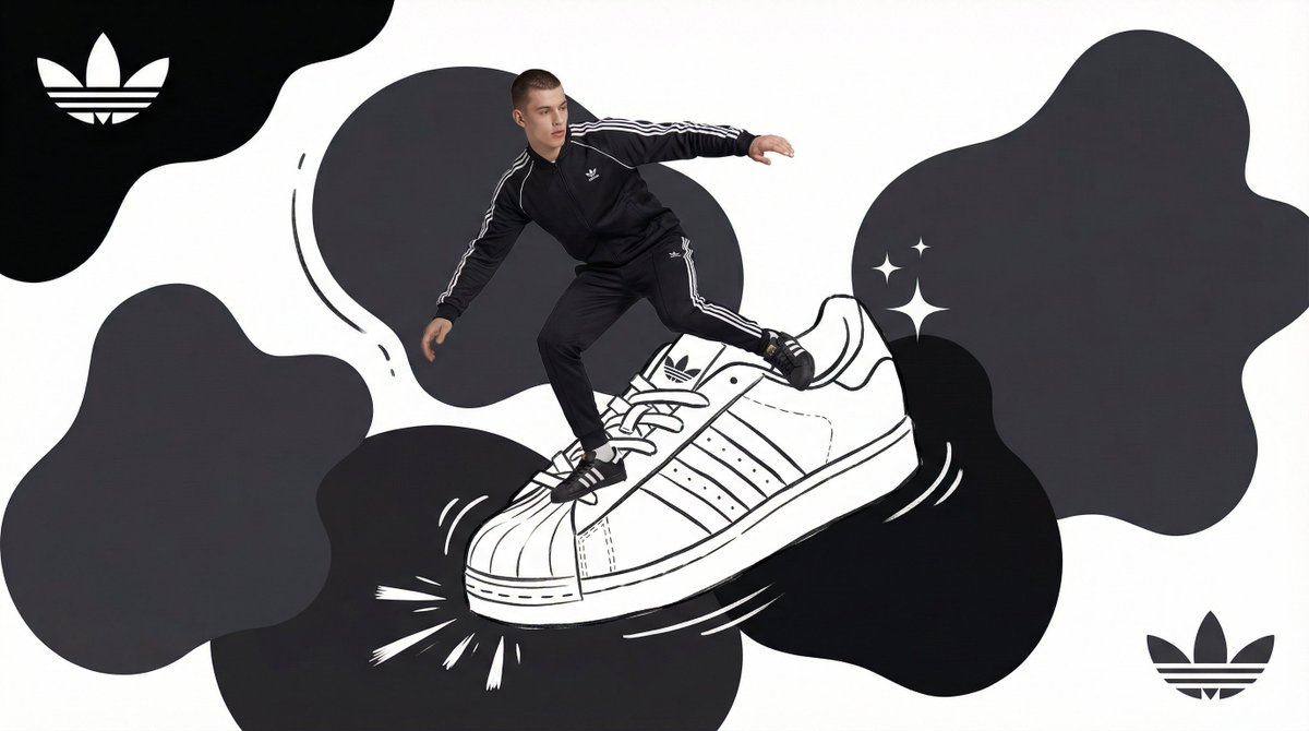
P
+ Act as a Mixed-Media Campaign Art Director. Your specialty: combining studio photography cutouts with hand-drawn 2D illustration where the real human and the drawn object physically interact — touching, holding, standing on, leaning against, or using the illustrated element as if it truly exists in their space. PHASE 1: CANVAS & COLOR SYSTEM Format: 1:1 square canvas. Base: single flat saturated color . No gradients. No texture. Pure chromatic field. Overlay: 3–4 organic amoeba blob shapes in the same but 20% darker in value. Smooth edges, irregular silhouettes, scattered asymmetrically. Some bleeding off-frame. Hand-painted feel, clean execution. PHASE 2: AUTONOMOUS OBJECT SELECTION BEFORE staging the scene, the AI must first make two autonomous decisions: DECISION 1 — SELECT THE OBJECT: Analyze and identify ONE iconic physical object from this framework: — What is the single most recognizable product or artifact this brand has ever made? — What object do fans of this brand collect, use daily, or photograph? — What prop has defined this brand's visual identity across decades? Do NOT choose animals. Do NOT choose logos. Choose a real, large, tangible object that can physically occupy space next to a person. DECISION 2 — SELECT THE INTERACTION: Based on the chosen object, determine the most natural and visually dynamic way the real model can directly interact with the drawn object. Interaction must be: ✓ Physical and direct — hands touching, feet on, body leaning, arms around ✓ Immediately readable — the relationship between person and object is understood in under 2 seconds ✓ Scaled correctly — the object must be large enough to interact with at human scale ✓ Active, not passive — the model is DOING something with the object, not just standing next to it INTERACTION TYPE EXAMPLES (AI selects the most brand-appropriate): · HOLDING: model's real hands grip the illustrated object — cup, camera, trophy, bottle, bag · WEARING/USING: model's real body wears or uses the object — sitting on a chair, wearing an illustrated hat, holding an illustrated product to their face · STANDING ON: model's real feet are planted on top of the illustrated object — skateboard, surfboard, podium, giant sneaker · RIDING/LEANING: model's real body leans against or drapes over the illustrated object — car hood, shopping cart, giant product silhouette · EMERGING FROM: model appears to step out of or through the illustrated object — bursting through a giant sneaker box, rising from an illustrated cup PHASE 3: STAGING THE SCENE Once object and interaction are selected, stage the full scene: MODEL: Single model age 18–26, clean cutout, zero fringing. Pose is determined by the chosen interaction — the body position must make the interaction feel natural and physically believable. Wardrobe: 's most iconic apparel in monochromatic palette. ILLUSTRATED OBJECT: Pure white (#FFFFFF) flat 2D illustration. Brush-pen marker line quality, 3–5px weight. Slightly imperfect organic edges — hand-drawn feel, not vector-perfect. NO shading. NO gradients. Flat white fill only. SCALE RULE — CRITICAL: The illustrated object must be LARGE. Minimum size: 40% of canvas height. The object should feel monumental — oversized relative to real-world scale is acceptable and encouraged. A coffee cup can be waist-height. A sneaker can be as tall as the model. Large scale = better readability = stronger visual impact. DEPTH LAYERING — CRITICAL:The object must exist on multiple z-layers: — Parts of the object sit BEHIND the model — Parts of the object come IN FRONT of the model — The model's real hands/feet make contact at the intersection point This layering is what makes the scene feel integrated rather than collaged. BRAND STAMP: One small logo mark appears on the object's surface — naturally embedded as if printed, engraved, or stitched. Rendered in darker variant. Subtle, not dominant. PHASE 4: SUPPORTING ILLUSTRATION SYSTEM All supporting elements: white, flat, brush-pen line style. Same visual language as the hero object. LOGO MARKS: primary icon in white: — Large (upper-left corner, ~15% canvas width) — Medium (opposite corner, ~10% canvas width) IMPACT MARKERS: 2–3 manga-style exclamation dash clusters near the point of interaction between model and object — where hands grip, where feet land, where bodies touch. This emphasizes the physical connection. MOTION LINES: 2–4 curved speed lines radiating from the object or the model's most active body part. Taper at ends. Cross behind and in front of the model for depth. GROUND EFFECT: At the base of the scene: white illustrated ground interaction — sparkle stars, short speed dashes, or object-specific effect (splash if cup, dust clouds if sneaker landing, wheel tracks if skateboard). AMBIENT SQUIGGLES: 1–2 loose organic white lines floating near the model's torso — visual rhythm connecting the photographic and illustrated layers. PHASE 5: LIGHTING Studio strobe, high-key, even and clean. 5500K neutral. No dramatic shadows on model. Soft contact shadow at model's feet (opacity 15%). The photography reads as natural and real against the graphic illustrated environment. TECH SPECS Aesthetic: mixed media — real photograph integrated with hand-drawn 2D illustration. Color count: 3 maximum — light, dark blobs, white illustration. Photography skin tones and fabric colors are the only additional color exception. Illustration style: Y2K comic energy, Japanese streetwear magazine, brush marker. Composition: asymmetric and dynamic. The interaction point between model and object is the visual center of gravity — everything else orbits around it. No text. No wordmarks. Logo icon only. Mood: the model is not posing WITH the object — the model is IN THE MIDDLE of using it. Caught mid-action. Alive.
Prompt
Loading reviews...
Reviews
Sign in to leave a review
Share your rating, feedback, and optional image.
Want to use this prompt programmatically?
Access this prompt via the PLH API.
CategoryFashion, Modern +6
StyleCreate Bold Mixed Media Campaign Visuals Combining Real Studio Photography With Hand Drawn Illustration Elements, Featuring Dynamic Human Object Interaction And Oversized Graphic Props. Perfect For Fashion Branding, Streetwear Campaigns, And Viral Editorial Poster Design.
Length~933 words
DifficultyAdvanced
Models102, 101 +2
AddedMay 10, 2026
Similar Prompts You Might Like
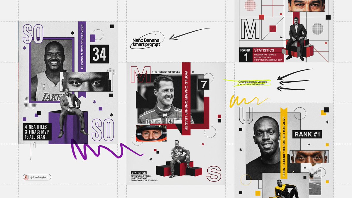

. Act as a Senior Editorial Designer and Graphic Artist. Goal: Generate a complex, multi-layered Swiss-style collage poster for . PHASE 1: SEMANTIC INTELLIGENCE (AUTONOMOUS) : Analyze "". Determine their primary field (e.g., Elite Sports, Cyber-Engineering, Cinema, History). Select an "Iconic Accent Color" based on their identity (e.g., Racing Orange for a driver, Neon Cyan for a hacker, Crimson for a hero). Generate 3 key statistics or milestones (e.g., "7 TITLES", "98% ACCURACY") and a short professional title. PHASE 2: COMPOSITIONAL STRUCTURE (THE GRID) The image is a single vertical composition with overlapping geometric frames and segments: - MAIN SUBJECT (Top Left): A large, high-grain grayscale or color portrait of , smiling or looking confident. - DETAIL SHOT (Center Right): A zoomed-in, cropped rectangle showing only the eyes or a specific detail of . - FULL BODY SHOT (Bottom Center): sitting on a geometric box or podium in a relaxed but powerful pose. - BACKGROUND: Light gray with a heavy, tactile film grain/noise texture. PHASE 3: GRAPHIC ELEMENTS & TYPOGRAPHY - Initials: Large, outlined capital letters of the first and last name placed in opposite corners. - Vertical Ribbon: A solid color strip with the text "WORLD CHAMPIONSHIP LEADER" or a relevant title running vertically through the center. - Data Blocks: - A specific number (ID or rank) in a bold sans-serif block. - A "Statistics" block in the bottom-left corner with 3 lines of text (e.g., "TWO POLES / FOUR WINS / FIVE PODIUMS"). - Accents: Scatter orange and black squares, dotted circles, and small asterisks throughout the grid for visual complexity. PHASE 4: LIGHTING & TEXTURE - Texture: High-contrast, gritty, and grainy. The overall image should look like a printed high-end magazine or a vintage poster. - Lighting: Professional studio lighting on the subjects, but processed with a "risograph" or "halftone" feel. PHASE 5: TECH SPECS 8K Resolution. Swiss Modernism aesthetic. Flat vector shapes combined with hyper-realistic photography.
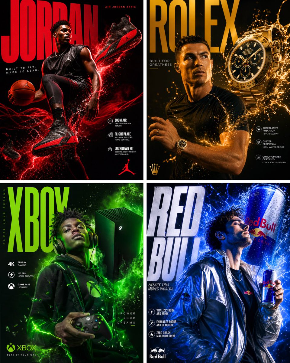
A world-class luxury advertising campaign poster, 4:5 ratio, for . A single model — confident, expressive, mid-motion or mid-use — positioned as the emotional hero of the frame, wearing or interacting with naturally, shot in a high-end photography studio. Dramatic neon and gel lighting casting vivid colored shadows across the model’s face and body. The product is both worn/held AND appears large and floating in the background or surrounding atmosphere. Explosive energy elements — liquid splashes, electric sparks, colored smoke, or light trails — erupting from the model and product interaction. Oversized bold editorial brand name typography dominating a corner or edge of the frame, the letters partially behind the model. Supporting text: a short punchy tagline in clean thin font, plus 2–3 product feature callouts in bold white text placed naturally in negative space. Deep dark gradient background. Photorealistic, shot on Hasselblad, feels like a real Nike or Apple global campaign, magazine cover quality
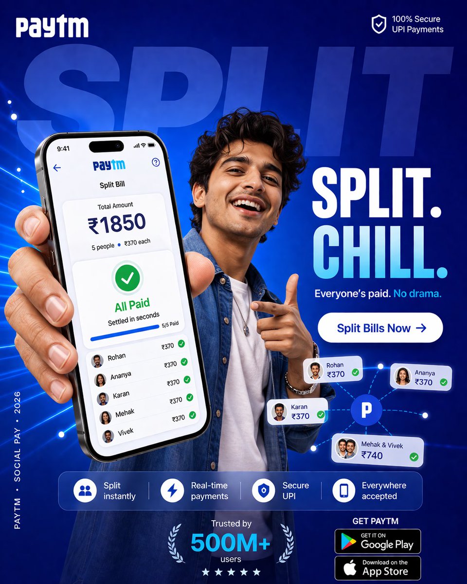
4:5 vertical SMM performance ad, ultra-high resolution (8K), Instagram + paid ads + app installs Style: Bold Gen-Z layout (Paytm-style) × expressive human emotion × product-first UI × high-conversion fintech creative 🧠 CORE INTENT: Money between friends should feel easy, fun, and natural. No tension. No reminders. Just shared moments. 🎯 CAMPAIGN OBJECTIVE: Increase app installs + boost “Split Bill” usage among young users Primary KPI: → Open app → Split → Everyone pays instantly 🎬 SCENE COMPOSITION: BACKGROUND: Large rounded rectangle block in rich PhonePe purple gradient (#5F259F → #7B3FE4 with soft radial glow) Overlay typography (huge, cropped behind subject): “SPLIT” bold uppercase, ultra-heavy opacity ~12% white 👤 SUBJECT: Young Indian female (18–28), stylish, relatable - casual chic outfit (oversized shirt / crop top + denim) - subtle accessories (rings, nails, maybe headphones around neck) POSE: - leaning slightly forward - holding phone toward camera (hero perspective) - other hand mid-gesture (laughing / pointing / reacting) EXPRESSION: genuine laugh / smile — energetic, social, alive MOOD: warm, lively, slightly playful 📱 PRODUCT (HERO ELEMENT): Phone large in foreground (slight perspective distortion) SCREEN UI (PhonePe): TOP: “Split Expense” CENTER: ₹1850 total BREAKDOWN: 5 people → ₹370 each STATUS: ✔ All Paid SUBTEXT: “Settled in seconds” MICRO DETAILS: - green ticks beside each name - subtle glow pulse - soft completion animation feel IMPORTANT: UI must feel native, clean, believable ✨ GRAPHIC SYSTEM: - playful floating dots (lavender + white) - soft connector lines between people (friendship cue) - rounded UI cards floating lightly - glow halo behind subject + phone 🎨 COLOR SYSTEM: PRIMARY: PhonePe purple (dominant) SECONDARY: Lavender / soft white ACCENT: Green (payment success only) SKIN TONES: Natural, warm (important for realism) 💡 LIGHTING: - soft studio + ambient café mix - gentle highlight on face - UI glow reflecting slightly on fingers - soft shadow separation ✍️ TYPOGRAPHY SYSTEM: TOP LEFT: PhonePe logo (white) TOP RIGHT (TRUST BADGE): “UPI Secure” (minimal) CENTER HEADLINE (BOLD): “SPLIT. CHILL.” SUBLINE: “Everyone’s paid. No drama.” MID CTA BUTTON (IMPORTANT): Rounded pill: “Split Bills Now →” Color: White button with purple text Soft drop shadow BOTTOM FEATURE STRIP: Split instantly Real-time payments Secure UPI Everywhere accepted Clean, evenly spaced ⬇️ DOWNLOAD CTA: BOTTOM RIGHT: “GET PHONEPE” - Google Play badge - App Store badge BOTTOM CENTER (SOCIAL PROOF): “Trusted by 500M+ users” LEFT EDGE (VERTICAL MICRO TEXT): “PHONEPE · SOCIAL PAY · 2026” 📐 COMPOSITION: - Phone = primary focal point - Subject = emotional hook - Typography layered behind Eye flow: Face → Phone → “All Paid” → Headline → CTA → Download 🎥 CAMERA STYLE: - 35mm slight wide angle - slight perspective exaggeration (Gen-Z feel) - sharp subject, soft background 🔥 PERFORMANCE LAYER: - Emotion-driven (laughter = relatability) - Outcome shown (All Paid) - Clear CTA (Split Bills Now) - Strong visual hook (girl + gesture + color) ✨ FINAL FEEL: Not just a payment ad — A moment between friends. Fast. Fun. Effortless. Feels like: “Yeah, let’s just split it.”
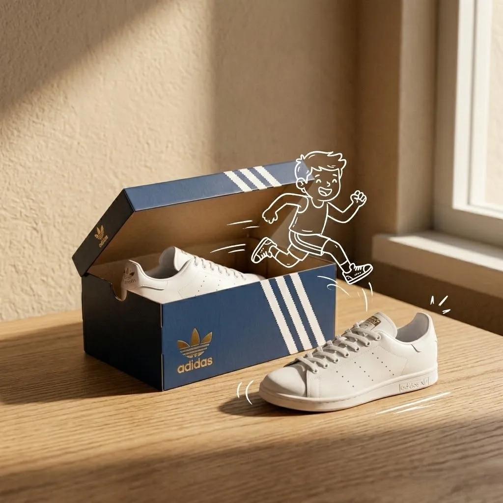
Adidas sneakers in the box, minimalist product photography, clean warm studio scene, textured beige wall in the background, soft directional sunlight creating long shadows, simple table surface, the product placed in a playful conceptual composition,overlaid with a hand-drawn white outline doodle interacting with the product, mixed media style combining real photography and sketch illustration, premium branding feel, shallow depth of field, ultra-realistic, no extra text, no watermarks, 8K, 1:1.
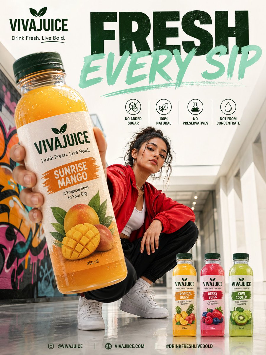
Create a premium modern beverage advertisement poster in a vertical 3:4 format featuring a stylish young female model crouching confidently in a bright urban indoor hallway with colorful graffiti wall art on one side and clean minimal architecture on the other, giving a trendy streetwear lifestyle vibe. The model wears casual fashionable clothes such as a red oversized jacket, white inner top, black joggers, and white sneakers, looking directly at the camera with a cool confident expression. In the foreground, a giant realistic fruit juice bottle is held toward the camera in forced perspective, dominating the composition with sharp focus and glossy reflections. The bottle should have a completely different fictional brand name such as “VIVAJUICE” in bold modern typography, with attractive fruit illustrations on the label and flavor text like “Sunrise Mango” or “Tropical Burst.” At the top left, place the brand logo and a catchy tagline like “Drink Fresh. Live Bold.” Across the top center, add huge bold overlapping typography reading “PURE AS NATURE” or “FRESH EVERY SIP” in contrasting colors like dark green and mint. Below the headline, include 4 clean icon-based feature badges in a row with text such as “NO ADDED SUGAR,” “100% NATURAL,” “NO PRESERVATIVES,” and “NOT FROM CONCENTRATE.” At the bottom right, display three smaller bottle variants in different flavors neatly arranged. Use soft natural lighting mixed with commercial studio polish, realistic shadows, shallow depth of field, glossy floor reflections, and a premium energetic eCommerce campaign aesthetic inspired by modern Instagram and billboard ads.
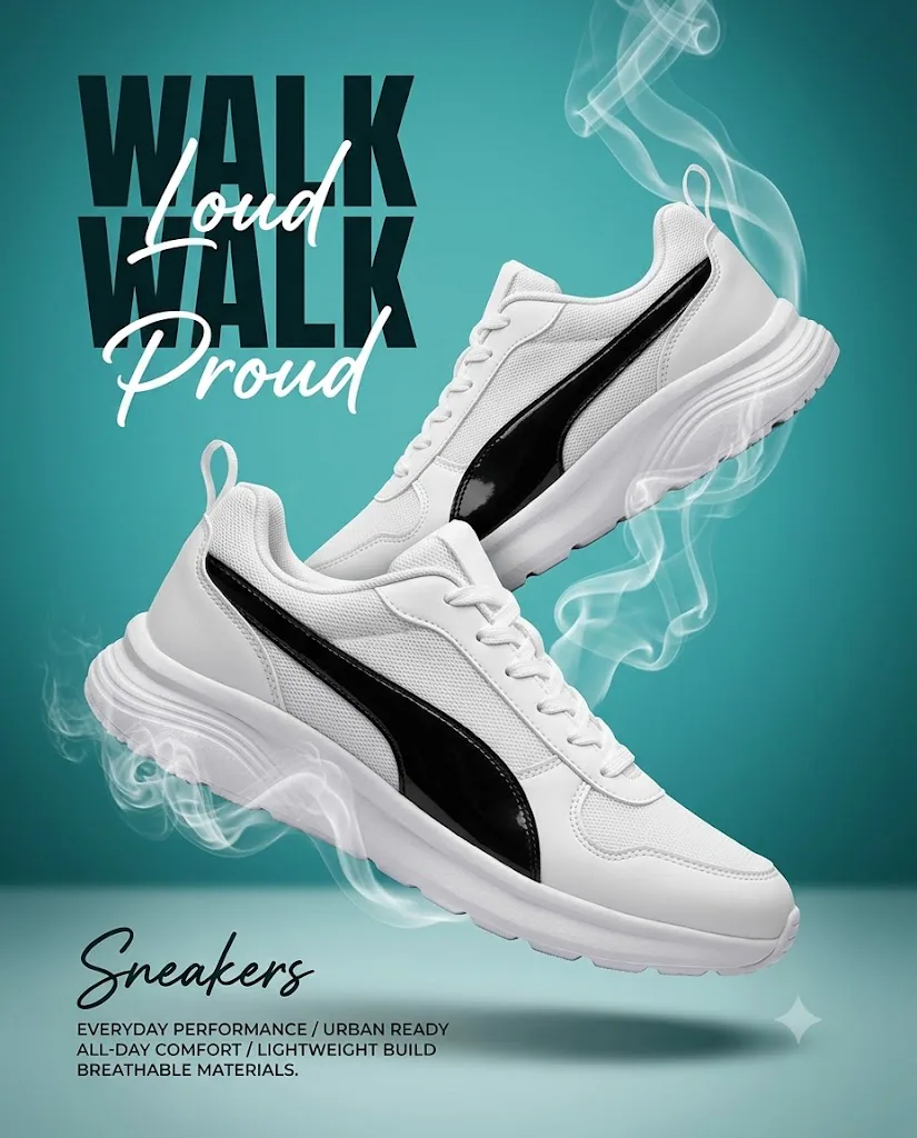
Use the uploaded image as the main visual reference, but refine it into a cleaner, more professional, brand-safe sneaker advertising poster. Do not recreate any real brand identity. Keep the overall concept of two floating athletic sneakers, teal studio background, soft smoke trails, and bold ad-poster styling, while improving realism, typography, layout clarity, and product presentation. Generate a high-end commercial poster of two modern white athletic sneakers with bold black curved side panels, shown floating in a studio scene in a vertical 4:5 composition. The lower sneaker is the primary hero object, larger and closer to the viewer, positioned in the lower half of the frame and angled diagonally from the lower-left/west side toward the lower-right/south-east side. Its heel sits more toward the west/left, while its toe extends slightly downward and toward the south-right corner, creating a forward dynamic motion. The upper sneaker is placed above and slightly behind it, crossing diagonally in the opposite direction, with its heel higher on the north-east/right side and its front section pointing more toward the center-left. The upper shoe partially overlaps the lower shoe, with the upper shoe visually sitting behind but still clearly visible. Product geometry and materials: both sneakers are low-top performance lifestyle shoes with a sleek sporty silhouette, rounded toe shape, slightly raised heel collar, pull tab at the back, lace-up closure, breathable mesh side panels, smooth synthetic overlays, and thick cushioned midsoles. The side panel on each shoe is a glossy black curved strip that contrasts with the matte and textured white upper. The upper material combines fine white mesh, smooth white synthetic leather-like panels, white laces, and a sculpted white sole with subtle tread texture. Keep the sneakers clean, premium, and realistic, with natural stitching, believable lace structure, proper sole geometry, and no distorted anatomy. Color and finish: the shoes are bright white with low saturation and high brightness, while the side strip is deep black with a soft glossy reflection. The background is a clean turquoise-to-teal gradient wall, brighter in the center behind the shoes and darker toward the side edges, with a darker teal vignette on the far west and east sides. The lower part of the scene includes a floor plane in a slightly paler teal-grey tone, separated from the wall by a subtle horizon/meeting line. This makes the set look like a studio wall and floor, not a flat background. The meeting edge between the wall and floor should be softly visible, with mild shadow build-up where the vertical wall and horizontal floor visually meet. Background and environment: use a clean studio advertising setup with a smooth gradient wall backdrop and a separate matte floor surface below. The wall should feel softly lit, with darker shadowed edges on both the left and right sides. The floor beneath the shoes should show soft atmospheric shading and a faint reflection-free matte appearance. Add soft diffused shadows on the ground beneath the floating shoes, including a broad elongated shadow directly below the lower sneaker and a lighter secondary shadow beneath the upper sneaker. The shadows should help anchor the shoes in space without making them look like they are touching the floor. Smoke effects: surround both shoes with elegant semi-transparent white smoke wisps. The smoke should appear to rise and curl upward from beneath the soles, around the heel areas, and along the side edges of the shoes. Around the lower sneaker, smoke should gather near the heel and sole on the west/left underside, then curl upward around the front and side, with some strands wrapping near the midsole and drifting toward the center. Around the upper sneaker, smoke should rise from below the sole and behind the heel, then trail upward toward the north/top area in thin flowing ribbons. Keep the smoke airy and graceful, with layered semi-transparent curls, not heavy fog. The smoke should enhance motion and energy without covering key product details. Lighting: use clean commercial studio lighting. Main key light from the front-right/east side at roughly 2 o’clock, creating bright highlights on the right-facing upper edges, toe surfaces, collar edges, and black side panels. Add soft fill from the front-left to keep the white shoes readable and maintain detail in the mesh and laces. Use subtle rim lighting to separate the shoes from the teal background. The shadows on the floor should be soft, diffused, and slightly blurred, consistent with floating objects in a studio setup. Keep the overall lighting crisp, premium, and ad-ready. Typography and layout: ignore the messy original text styling and replace it with a cleaner, more professional, editable-looking layout. In the upper-left quadrant, place the headline text in a way that can easily be changed later. Use sample text: “WALK WALK” in a bold condensed display font, all caps, dark near-black color, stacked with strong presence. Overlay “Loud” and “Proud” in a contrasting flowing script font in white, with “Loud” crossing the upper headline and “Proud” placed beneath it. Keep the typography stylish but readable, with proper spacing and alignment, and leave enough clean room so a designer could replace the text later. At the bottom-left area, place the word “Sneakers” in a handwritten or signature-style script as a product title, and below it add a short block of small uppercase sans-serif promotional copy. Use the same wording seen in the image as placeholder copy, but render it cleanly and neatly so it feels like editable sample text rather than distorted AI text. Make all text placement balanced and supportive, not overpowering the shoes. Overall style: premium sneaker campaign poster, studio product advertising, energetic but clean, modern sportswear branding aesthetic, highly polished, photorealistic, globally usable, and marketplace-ready. Emphasize realism, typography clarity, balanced composition, and ad-quality finish. Render at maximum photorealistic quality. Preserve the floating two-shoe composition, the teal wall-and-floor studio setup, the smoke motion, and the soft ground shadows. No real brand logos, no trademarked identity, no extra objects, no clutter, no warped shoes, no deformed laces, no messy text, no watermark. Keep the final image clean, premium, and suitable as a reusable commercial prompt example.
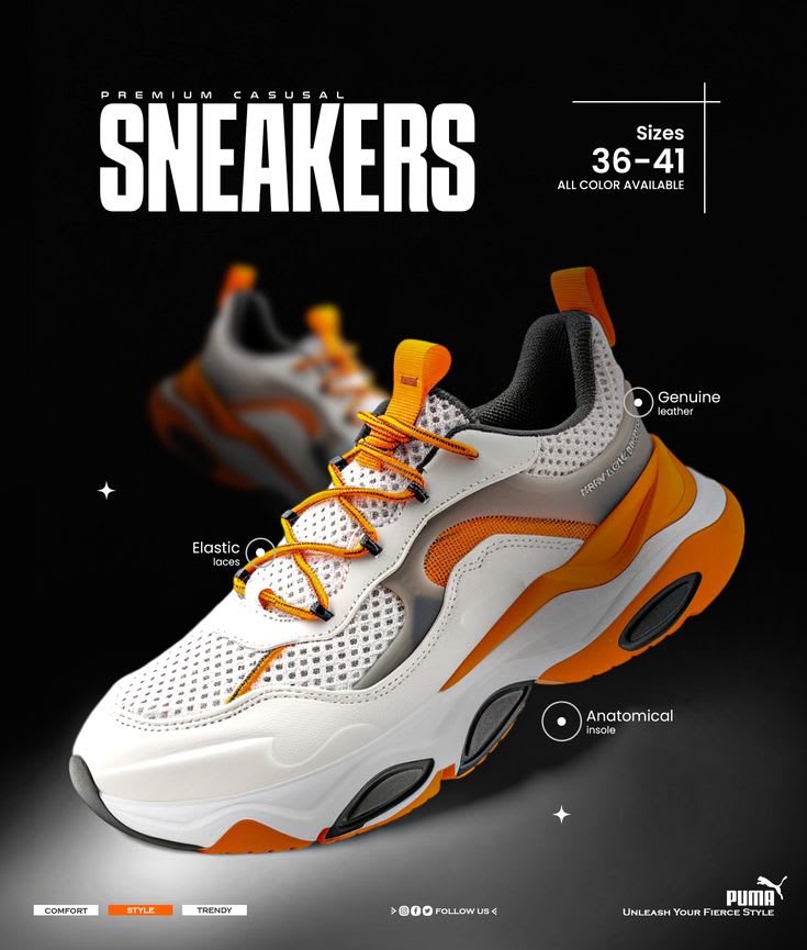
Square (1:1) commercial sneaker advertisement poster, dark black-to-charcoal gradient background, studio product-shot style with strong contrast. Framing lock: Full hero sneaker, all headline text, and both callout/feature labels must stay fully inside the frame with a small safe margin on all sides. Nothing — text, shoe, or callout lines — should be cut off at any edge. Bold oversized white condensed uppercase headline "SNEAKERS" in the upper-left, with a smaller thin letter-spaced line "PREMIUM CASUAL" directly above it. In the upper-right, inside a thin white bracket-style frame, size text "Sizes 36–41" in bold with "ALL COLORS AVAILABLE" beneath it in smaller letter-spaced type. A chunky casual athletic sneaker as the hero product, angled low three-quarter view, centered slightly right and filling the lower half of the frame: white mesh toe box with open-weave texture, smooth white and grey synthetic overlay panels, orange elastic laces threaded through black lace loops, an orange padded heel tab, a black mesh-textured inner collar, and a thick sculpted white midsole with bold orange side panels and black oval tread inserts on the outsole. A soft grounding shadow beneath the shoe on a smoky grey studio floor. A second identical sneaker sits blurred in the upper-left background, angled more steeply as if mid-stride, motion-blurred to suggest dynamic forward movement, out of focus behind the sharp hero shoe. Three thin white line-and-circle callouts point from small hollow circle markers on the shoe to feature labels: one near the laces reading "Elastic laces," one on the side panel reading "Genuine leather," and one near the sole reading "Anatomical insole" — each in small clean white sans-serif type. Small white four-point sparkle icons scattered asymmetrically in the negative space, one lower-left and one near the sole area. At the bottom-left, three pill-shaped tags in a row: "COMFORT" and "TRENDY" as white outlined ghost buttons, "STYLE" as a solid filled orange pill — creating a clear visual hierarchy. At the bottom-center, small social media icons with "FOLLOW US" text beside them. At the bottom-right, leave a small clean empty rectangular space reserved for a brand logo, with a short italicized placeholder tagline beneath it in small white text. Soft key light from the front-left with strong clean highlights on the white toe box, side panels, sole edges, and orange lace/heel details. Subtle rim light separating the shoe from the black background. Dominant palette: white, orange, black, and charcoal grey with high contrast between the white/orange product and dark background. Sharp, crisp focus on the hero shoe; heavy blur on the background shoe. Low grain, high-clarity, high-contrast commercial product retouching, sporty premium retail advertisement mood. Composition note: hero shoe, full headline, size block, and both callouts entirely visible with no edge-cropping; comfortable margin on all sides. If you want the actual Puma name/logo in the final asset, that part you'd need to add yourself afterward (e.g., in an image editor) rather than through the generation prompt.
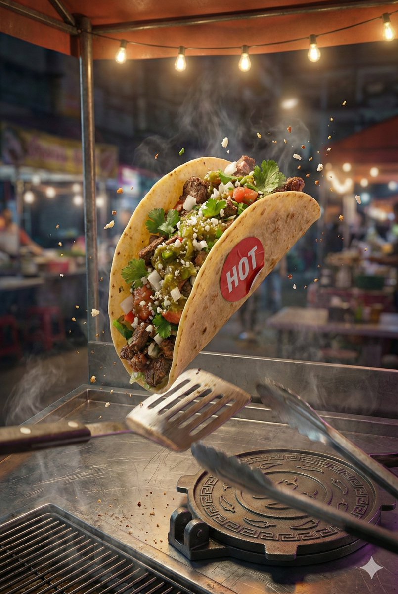
Generate a '2:3' hyper-realistic, high-resolution poster featuring the attached taco image. Adjust its perspective if needed to match the scene’s perspective and blend naturally into the composition. COMPOSITION: Capture a dynamic freeze-frame moment of a taco mid-flip during a street-side catch, shot from a Dutch tilted low three-quarter angle that exaggerates motion and urgency. The camera is positioned slightly below the taco, angled upward, with the taco large and dominant dead-center in the frame, sharply in focus, suspended just above a scarred stainless-steel street cart counter. A single harsh overhead streetlamp mounted top left casts a focused cone of warm light, carving crisp highlights and deep shadows that emphasize motion blur in the background while keeping the taco tack-sharp. The atmosphere is alive with subtle steam rising from the cart grill at bottom left, faint oil smoke drifting upward, and tiny airborne crumbs frozen mid-air. The tone is clean, appetizing, cinematic, and urban. The food-signature prop is a custom round taco press stamped with geometric chili patterns, resting closed on the counter in the lower right foreground beneath the airborne taco, its metal edges catching the lamp’s glare. The story-signature prop is a battered transit-station flip-clock timer mounted on the back wall at top right, showing '19 03' on split flip panels, implying split-second timing and street rhythm. Wet pavement reflections shimmer in the blurred background, grounding the scene in a late-night street setting. Keep visible wiring and cables subtly running along the wall toward the neon and props, with a faint magenta/purple spill mixing into the neon glow on the wall and paper. HEADER: 'STREET FLIGHT' The header is physically formed from bent single neon tubing (no double tubes). Neon tubes are made of reflective glass with neon gas inside, mounted on a chipped concrete wall in the upper center background behind the taco. The neon tubes glow 'warm amber', with uneven brightness, faint buzzing, and soot-darkened mounting brackets. The header is stacked on two lines: 'STREET' above 'FLIGHT'. The letters cast soft neon spill and distorted shadows across the wall’s cracked surface, with minimal grime dulling parts of the glow, and thin black power cables feeding into the neon from the right. TAGLINE: 'Caught in Motion' The tagline is printed in bold condensed sans-serif on a narrow strip of grease-stained receipt paper taped directly beneath the neon header using four translucent yellow tape pieces. The paper sags slightly at the center, edges curled and darkened by oil, catching a softer secondary glow from the neon above with a faint magenta/purple tint in the spill. CALL TO ACTION: 'ORDER NOW' The cta is integrated into the taco press hardware in the foreground as on an angled metal bar/handle element, reading as bold, worn black lettering with slight chipping and grease settled into the letter edges, plus a hard specular highlight running along the metal. STICKER: 'HOT' A small circular red vinyl sticker is physically adhered directly to the taco shell, perfectly centered, with slight white highlights. The sticker conforms to the taco curvature, shows tiny wrinkles under the adhesive, and tiny air pockets are trapped beneath the adhesive to reflect realism.
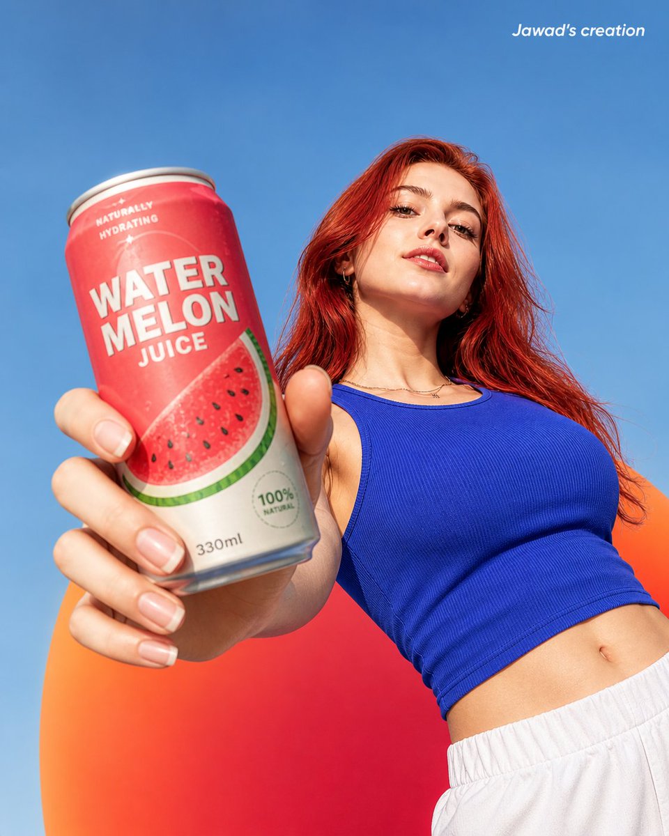
A highly realistic low-angle shot of a confident young woman with long, vibrant red hair, holding a watermelon juice can close to the camera in a dramatic perspective. The can appears large in the foreground due to forced perspective, with sharp focus on the product. The woman has fair skin, natural makeup, and a subtle confident expression, looking slightly down toward the camera. She is wearing a fitted blue sleeveless crop top and light gray sweatpants. Her posture is relaxed yet bold, with one arm extended forward holding the can. The background is a smooth, colorful gradient blending blue, orange, and red tones, creating a vibrant summer aesthetic. Bright natural sunlight illuminates the scene with soft shadows and high contrast, giving a clean commercial photography look. The juice can design features a watermelon theme with red and green colors, minimal modern typography, and realistic texture details like condensation droplets. Ultra-detailed, photorealistic, 8K resolution, sharp focus, shallow depth of field, professional product photography, vibrant colors, cinematic lighting. Add text: in small clean white font at the upper right corner.
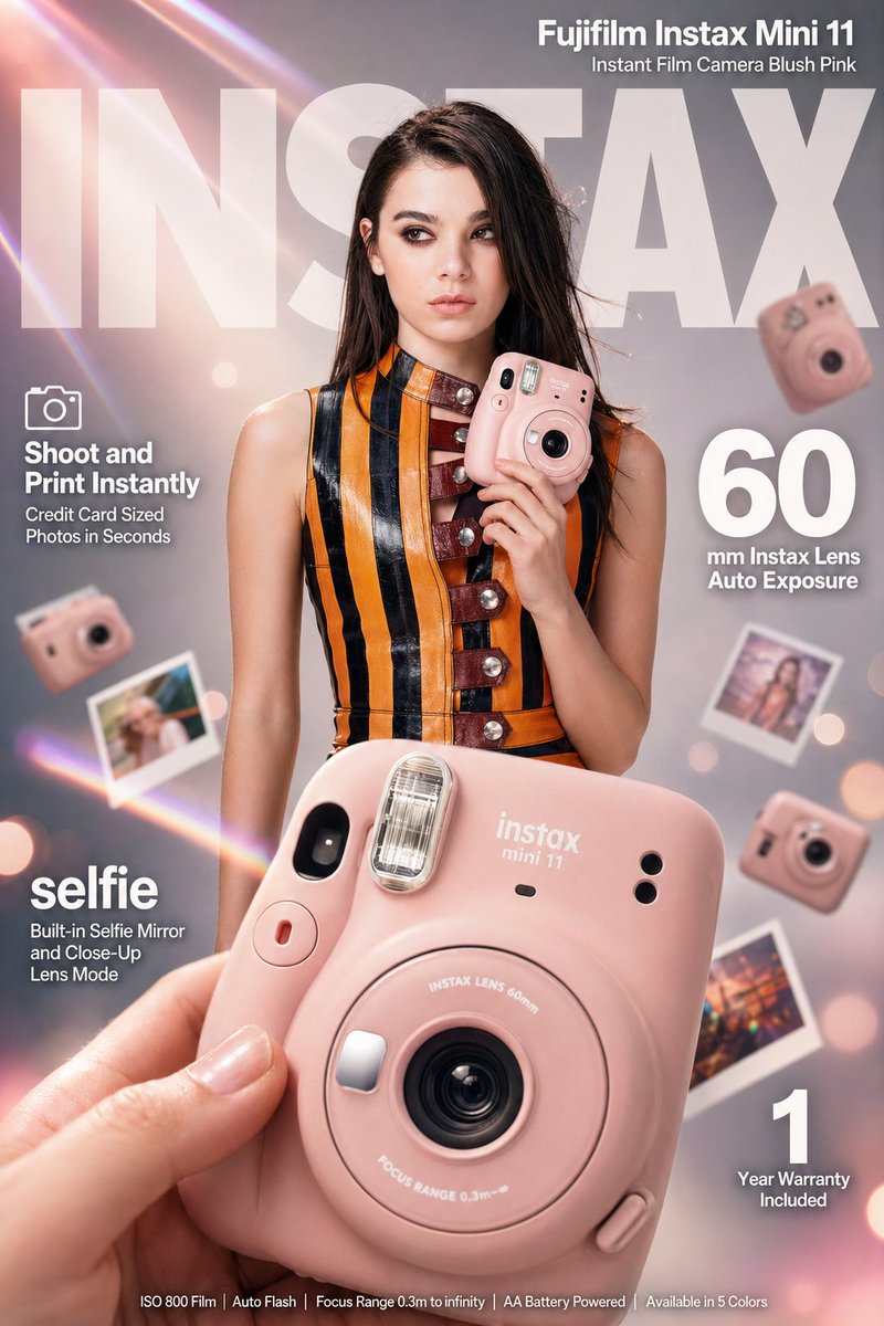
High-impact e-commerce infographic advertisement for "Fujifilm Instax Mini 11" blush pink instant camera. FOREGROUND: Extreme close-up of a hand holding a compact rounded blush-pink Fujifilm Instax Mini 11 camera angled toward camera, razor-sharp center focus, macro-lens shallow depth of field, visible 60mm silver lens ring, crystal pop-up flash, white instax mini 11 branding on body, red shutter button accent, fingertips softly blurred at edges. CENTRAL MODEL: confident young woman with straight dark brown hair, light natural makeup, cool editorial expression, wearing a bold orange and black vertical-striped sleeveless leather mini dress with deep red buckle details and silver stud buttons, holding the blush-pink Instax Mini 11 casually at chest height with camera face pointing outward, slight off-camera gaze, stylish composed energy. BACKGROUND: soft-focus cool light gray gradient studio backdrop fading to warm white center, diagonal pastel prism lens flares in pink peach and lavender cutting upper-left to lower-right, soft blush-pink and cream light leaks at corners, 4 to 5 blurred Fujifilm Instax Mini 11 cameras floating at various depths and rotation angles, scattered polaroid-style instant photo prints in background bokeh, subtle bokeh circles from studio lights. LIGHTING: professional three-point studio lighting, key light upper-left, fill light right side, rim light behind model for separation, glossy highlights on camera lens ring and flash unit. TYPOGRAPHY overlaid clean bold white sans-serif: massive semi-transparent "INSTAX" text spanning full width behind model at top center, top right bold text "Fujifilm Instax Mini 11" with subtitle "Instant Film Camera Blush Pink", mid-left small camera icon with bold "Shoot and Print Instantly" and subtext "Credit Card Sized Photos in Seconds", mid-right extra-large bold numeral "60" with smaller text "mm Instax Lens Auto Exposure", lower-left bold "selfie" with subtext "Built-in Selfie Mirror and Close-Up Lens Mode", bottom-right bold numeral "1" with subtext "Year Warranty Included", bottom center fine print "ISO 800 Film | Auto Flash | Focus Range 0.3m to infinity | AA Battery Powered | Available in 5 Colors". TECHNICAL: 8K ultra-sharp, hyperrealistic commercial ad aesthetic, editorial fashion meets lifestyle product photography style, color palette blush pink orange black cream pastel prism accents, tack-sharp on Instax camera with shallow DOF on everything else, 85mm macro slight low angle, warm vibrant professional color grading.
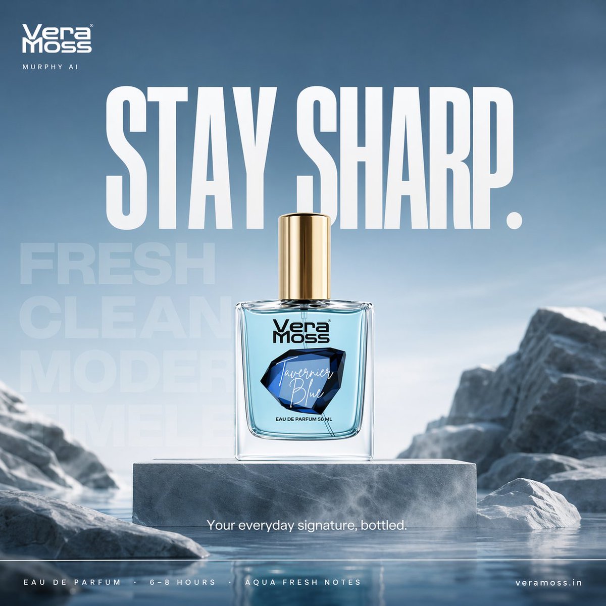
Hyper-realistic cinematic perfume billboard poster for Vera Moss Tavernier Blue Eau De Parfum, built around freshness, clarity, and modern sharp identity Scene: minimal architectural environment with smooth stone surfaces and cool-toned textures, soft air-like mist flowing horizontally across frame, creating a sense of movement and freshness Product placement: perfume bottle placed center on a clean elevated platform, perfectly upright, label facing camera subtle reflective surface beneath with soft diffused reflection Environment styling: abstract stone formations + soft gradient sky tones (light blue to grey), inspired by open air and water freshness no clutter, strong negative space Composition: centered hero product strong breathing space around background depth layers for cinematic feel Typography system (Nike-style, strict hierarchy): top-left — Vera Moss logo beneath — small thin uppercase “MURPHY AI” center massive — “STAY SHARP.” bold condensed sans-serif, high impact background typography (very faint, oversized): “FRESH / CLEAN / MODERN / TIMELESS” layered subtly into environment mid-lower — “Your everyday signature, bottled.” bottom strip (clean spec line): “EAU DE PARFUM · 6–8 HOURS · AQUA FRESH NOTES” bottom right — website Lighting: soft cool daylight with slight blue tint gentle highlights on glass edges subtle rim light for separation Color palette: icy blue, soft grey, white, silver accents Atmosphere: light mist / air particles to represent freshness Camera: 50mm lens, slight low angle for presence shallow depth of field, ultra sharp product focus Mood: calm, confident, modern, effortless Output: 4:5 billboard format ultra high resolution luxury commercial finish Hyper-realistic cinematic perfume billboard poster for Vera Moss Tsunami Eau De Parfum, built around energy, motion, and explosive freshness Scene: dynamic water environment where a powerful wave is frozen mid-impact, curling around the perfume bottle, capturing the exact moment of motion and force Product placement: perfume bottle placed center, emerging from the water surface partially surrounded by a rising wave arc glass and liquid reflecting blue tones Environment styling: deep aqua-blue gradient background transitioning from dark ocean tones to bright fresh highlights water particles suspended in air fine droplets and mist frozen in motion Composition: central hero bottle diagonal motion created by wave direction strong depth and perspective Typography system (Nike-style, high energy): top-left — Vera Moss logo beneath — small thin uppercase “MURPHY AI” center massive — “FEEL THE RUSH.” bold condensed sans-serif, slightly stretched vertically background typography (layered, kinetic): “WAVE / POWER / MOTION / ENERGY” subtly warped as if affected by water movement mid-lower — “Powerful freshness in motion.” bottom strip — “EAU DE PARFUM · STRONG INTENSITY · AQUATIC CITRUS NOTES” bottom right — website Lighting: high contrast lighting strong highlights on water edges reflective glow on bottle subtle backlight through water for depth Color palette: aqua blue, deep navy, white highlights Atmosphere: water spray, mist, droplets, motion particles Camera: low angle + slight tilt for dynamism 35mm cinematic lens feel Mood: energetic, powerful, refreshing, bold Output: 4:5 billboard format ultra high resolution premium commercial finish
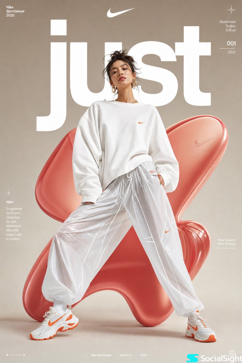

High-fashion futuristic sportswear editorial poster, full-body female model in dynamic wide-leg stance, oversized white minimalist sweatshirt with voluminous sleeves, glossy translucent parachute pants, chunky white-orange athletic sneakers, sleek messy updo hairstyle, gold statement earrings, soft natural makeup, confident editorial expression, studio fashion photography, centered composition, smooth neutral beige gradient background with large abstract glossy red-pink organic 3D inflatable blob shapes behind model, bold oversized white typography “just” partially behind subject, premium athletic brand campaign aesthetic, ultra-clean lighting, soft diffused studio shadows, luxury streetwear advertisement, contemporary magazine cover design, minimalist layout, subtle futuristic graphic microtext, highly polished commercial fashion retouching, sharp focus, cinematic soft contrast, photorealistic, high detail, 8k