
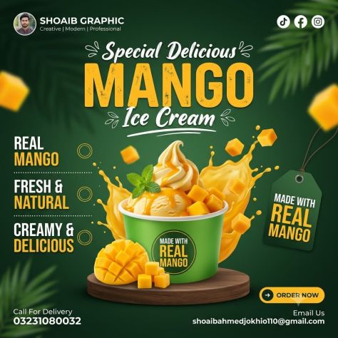
Generate a photorealistic product poster of a scoop of creamy mango ice cream in a green cup topped with a swirled ice-cream scoop, diced mango cubes, a mint leaf sprig, and mango drizzle, standing on a round dark-wood pedestal with a fresh mango half and loose mango cubes beside it, plus a dramatic mango-juice splash erupting from behind, in a square composition, with brand identity top-left, social icons top-right, the stacked headline centered at the top, the ice-cream cup centered as the hero in the lower-middle area, a feature-claims column on the left, a hanging product tag on the right, and the CTA/contact block along the bottom. Typography: render the following text exactly as written, with no spelling changes, no added words, and no dropped blocks — Headline: "Special Delicious" / "MANGO" / "Ice Cream". Subhead: "none present". CTA/button: "ORDER NOW". Price/badge: "REAL MANGO" / "FRESH & NATURAL" / "CREAMY & DELICIOUS" (left feature column) and "MADE WITH REAL MANGO" (cup badge and hanging tag). Fine print: "Call For Delivery" / "03231080032" / "Email Us" / "shoaibahmedjokhio110@gmail.com". Additional locked branding text: "SHOAIB GRAPHIC" / "Creative | Modern | Professional". Typeface style: "Special Delicious" in a white handwritten script with small decorative flourishes on either side, centered above the headline; "MANGO" in a huge bold condensed uppercase sans-serif, yellow-orange with a lightly speckled/textured surface, centered; "Ice Cream" in white handwritten script with an underline stroke and small leaf doodles, centered directly below "MANGO"; left feature labels in bold uppercase sans-serif with the first word in white and the emphasis word in yellow-orange, each paired with a thin circular outline icon, left-aligned in a stacked column with dotted divider lines; "SHOAIB GRAPHIC" in bold sans-serif at top-left beside a circular profile photo, with "Creative | Modern | Professional" in a smaller thin sans-serif directly beneath it; "MADE WITH REAL MANGO" rendered twice — small on the cup's front circular badge and larger on the right-side hanging tag, both in a mix of white and yellow bold uppercase sans-serif; "ORDER NOW" in bold uppercase dark text centered inside a yellow rounded pill button with a small arrow icon, bottom-right; contact text in small clean white sans-serif, bottom-left and bottom-right. Product placement: cup centered and front-facing with the ice-cream scoop, mango cubes, and mint visible on top, occupying roughly 40–45% of the poster height together with the pedestal and surrounding mango pieces, positioned in the lower-middle of the frame on a round dark-wood pedestal with a soft contact shadow; a cut mango half and loose mango cubes resting beside the cup at lower-left, and a bright mango-juice splash with floating mango cubes rising behind and beside the cup. Branding: "SHOAIB GRAPHIC" with circular profile image fixed top-left, tagline beneath it, TikTok/Facebook/Instagram icons fixed top-right, "MADE WITH REAL MANGO" badge on the cup front and matching hanging tag on the right side — do not invent, distort, relocate, resize, or omit any of this branding. Color palette: dominant deep forest-green background (about 60%, dark and saturated), bright mango yellow-orange for headline, ice cream, mango pieces, and splash as secondary (about 25%), white typography and icon accents (about 8%), dark wood-brown pedestal (about 5%), fresh green leaf accents (about 2%); yellow-orange carries the primary promotional/brand accent against the dark green field. Background: dark green gradient background with softly blurred leaves and subtle tropical shadow texture, layered depth with the dark green leafy background furthest back, the headline, feature icons, hanging tag, and mango splash in the middle layer, and the ice-cream cup, mango chunks, pedestal, and CTA sharp in the front layer; no watermark beyond the top-left designer profile mark. Lighting: soft frontal to top-front commercial lighting, soft contact shadow beneath the pedestal and product, glossy highlights on the mango cubes, ice cream surface, and cup rim, overall photorealistic commercial dessert-composite finish with premium tropical styling, main cup and foreground mango sharp while background leaves and flying mango pieces are slightly blurred, straight-on food-advertising camera perspective. Render at maximum quality, matching the uploaded reference's exact layout, typography content and hierarchy, product geometry and color, branding placement, and lighting. No garbled, misspelled, duplicated, or invented text. No warping, no logo distortion, no added props, no watermark unless specified above. Sharp, legible type throughout; natural material texture on the product.
Share your rating, feedback, and optional image.
Access this prompt via the PLH API.

Generate a photorealistic product poster of an iced mixed-berry coffee drink in a clear plastic cup with dome lid, layered with a berry-swirled pink-and-white base, brown iced coffee on top, and stacked ice cubes, standing on a round burgundy pedestal platform, surrounded by a dramatic berry-juice splash and scattered fresh strawberries, raspberries, blueberries, and blackberries, in a portrait composition, with a stacked headline block at the top, the drink cup centered as the dominant hero in the middle-lower area, a circular price badge to its right, and a white feature-icon strip with a tagline beneath it at the bottom. Typography: render the following text exactly as written, with no spelling changes, no added words, and no dropped blocks — Headline: "NEW MENU" / "MIX BERRY" / "Coffee". Subhead: "BERRY SWEET, COFFEE COMPLETE!". CTA/button: "none present". Price/badge: "15K". Fine print: "none present". Additional locked text blocks: cup branding "KOPI" / "NUSA" and hashtag "#seduhanlokalrasaisitimewa" printed on the cup; feature strip "REAL BERRIES" / "PREMIUM COFFEE" / "FRESH MILK" / "ICE COLD"; bottom tagline "Segarnya berries, nikmatnya coffee!". Typeface style: "NEW MENU" in bold uppercase burgundy sans-serif sitting on a rough white brush-stroke banner, top-center; "MIX BERRY" in an enormous uppercase bold condensed sans-serif with a distressed/grunge texture, white, centered directly below; "Coffee" in a large pink handwritten script with an underline stroke beneath the headline; the subhead in small uppercase white sans-serif with dash ornaments on either side, centered; "15K" in a white handwritten brush style centered inside a dark-berry circular badge with a glowing outline and a small white arrow/doodle pointing toward it; "KOPI" in small clean sans-serif above "NUSA" in a larger clean serif/sans-serif hybrid, both white, centered on the cup; the hashtag in small white sans-serif across the lower cup; feature-strip labels in small uppercase sans-serif paired with thin line icons on a white brush-stroke strip; the bottom tagline in white handwritten script, centered. Product placement: cup centered and front-facing, occupying roughly 40–45% of the poster height, positioned slightly below the poster's midpoint, standing on a round burgundy pedestal platform with a soft contact shadow, transparent plastic cup showing the pink berry-swirl base transitioning to brown iced coffee with visible ice cubes on top and a clear dome lid. Branding: "KOPI NUSA" printed centered on the cup with the hashtag beneath it, no separate corner logo; 15K price badge fixed to the right side of the cup — do not resize, distort, recolor, or relocate this branding. Color palette: dominant deep burgundy/dark berry-purple background (about 55%, saturated and dark), vibrant berry pink splash and drink layer as secondary (about 20%), bright white headline, feature strip, and cup branding as accent (about 10%), warm brown iced-coffee layer (about 10%), raspberry-red, strawberry-red, blueberry-navy, and blackberry-purple fruit accents with small green leaf details (about 5%); white carries the primary contrast accent against the burgundy field, with the 15K badge in dark berry-red. Background: dark burgundy gradient background with subtle shadowed leaf textures and berry-themed depth, a dramatic pink-red berry-juice splash erupting behind and around the cup, floating berries, juice droplets, and small white decorative doodles scattered throughout, layered depth with the burgundy gradient and leaf shadows furthest back, the headline and berry splash in the middle layer, and the cup, platform, foreground berries, and bottom feature strip sharp in the front layer; no watermark, no additional logos. Lighting: soft frontal to top-front commercial lighting, soft contact shadow beneath the cup on its platform, glossy reflections on the plastic cup, ice cubes, lid, and liquid surface, overall photorealistic beverage-composite finish with a glossy berry splash, cup and foreground fruit sharp while some background fruits and droplets are slightly softened, straight-on beverage-advertising camera perspective. Render at maximum quality, matching the uploaded reference's exact layout, typography content and hierarchy, product geometry and color, branding placement, and lighting. No garbled, misspelled, duplicated, or invented text. No warping, no logo distortion, no added props, no watermark unless specified above. Sharp, legible type throughout; natural material texture on the product.

Generate a photorealistic product poster of a large red-velvet cupcake with a pleated bronze-toned wrapper, a pink cake base, tall swirled cream-beige frosting piped in smooth folds, and a glossy strawberry-cherry topping, positioned as a right-side hero product layered over a graphic deep-red background, in a portrait composition, with the typography stack left-aligned occupying the left half of the frame, the cupcake dominant on the right and lower-right cropped slightly at the bottom and right edges, faint oversized diagonal "CUPCAKE" letterforms visible as a background texture, and small blurred cupcake props tucked into the top-right and bottom-left corners. Typography: render the following text exactly as written, with no spelling changes, no added words, and no dropped blocks — Headline: "Delicious" / "CUP" / "CAKE". Subhead: "A Little Frosting Makes" / "Everything Better.". CTA/button: "ORDER NOW". Price/badge: "none present". Fine print: "none present". Typeface style: "Delicious" in an elegant white handwritten script, top-left; "CUP" and "CAKE" in a huge uppercase condensed block sans-serif, left-aligned, stacked directly beneath, rendered in a soft cream-beige to dusty-pink tonal gradient with "CUP" slightly lighter/cream and "CAKE" a muted pink-mauve; the body copy in clean white sans-serif sentence case, left-aligned, smaller than the headline, positioned below it; "ORDER NOW" in bold condensed uppercase dark maroon sans-serif, centered inside a beige rounded-rectangle button beneath the body copy; faint oversized diagonal background letterforms in a barely-visible darker red tone, no other text effects, no drop shadows on the main headline. Product placement: cupcake positioned right side, lower-middle to bottom-right, occupying roughly 50–55% of the poster height, front-facing with slight side perspective, layered as a photorealistic/CGI-polished composite directly over the red graphic background with no visible tabletop, soft shading on the frosting folds and wrapper pleats, no strong ground shadow. Branding: no formal logo or brand mark present; keep "Delicious CUP CAKE" as the sole promo identity on the left and the "ORDER NOW" button beneath the body copy as the only CTA — do not invent or add any logo, handle, or icon. Color palette: dominant deep burgundy-red gradient background (about 60%, dark and saturated), cream-beige headline, frosting, and CTA button as secondary (about 25%), pink-red cupcake base and berry topping as accent (about 10%), white script/body text as a smaller accent (about 5%); cream-beige carries the primary brand-identity accent against the burgundy field, with dark maroon reserved for the CTA text. Background: deep red-to-burgundy gradient with subtle darker shadow falloff and faint oversized diagonal "CUPCAKE" letterforms as a barely-visible textural pattern, one blurred cupcake prop softly cropped in the top-right corner and another in the bottom-left corner, layered depth with the red gradient and faint typography pattern furthest back, the main text stack and CTA in the middle layer, and the large cupcake hero sharp in the front layer; no watermark, no additional props. Lighting: soft front-left to top-left commercial lighting, smooth creamy highlights along the piped frosting swirls, glossy specular highlight on the berry topping, soft shading with no strong cast shadow, overall polished photorealistic dessert-composite finish, main cupcake in sharp focus while corner cupcake props are heavily blurred, close-up dessert-advertising camera perspective. Render at maximum quality, matching the uploaded reference's exact layout, typography content and hierarchy, product geometry and color, branding placement, and lighting. No garbled, misspelled, duplicated, or invented text. No warping, no logo distortion, no added props, no watermark unless specified above. Sharp, legible type throughout; natural material texture on the product.

Generate a photorealistic product poster of a fried-chicken cheese burger (toasted sesame bun, melted cheese dripping down the sides, crispy fried chicken patty, lettuce, tomato) layered as a cutout composite over a flat graphic background, in a portrait composition, with a large curved deep-maroon abstract shape occupying the left and lower portion of the frame behind giant cropped "BURGER" typography, the burger positioned center-right overlapping that oversized text, the top area holding smaller headline text and a social handle, and the offer/CTA block stacked in the lower-right. Typography: render the following text exactly as written, with no spelling changes, no added words, and no dropped blocks — Headline: "Super" / "Delicious" / "Cheesy Crunch" / "Burger" (mixed placement across the top area, not a single stacked block). Subhead: "none present". CTA/button: "Order Now". Price/badge: "50%" / "OFF". Fine print: "none present". Typeface style: "Super" in a thin dark-brown handwritten script, tilted, top-left; "Delicious" in a bold black/dark-brown sans-serif directly beside it; "Cheesy Crunch" and "Burger" in a dark-brown serif display typeface, spread across the top-center; the social handle "@crunchycrave_food" in small bold black sans-serif at the top-right; a giant "BURGER" rendered in an extremely large, bold, cropped block sans-serif in deep maroon-brown, stacked vertically down the left/bottom edge of the poster and partially cut off by the frame edges; "50%" and "OFF" in a large decorative serif/display typeface with an outlined, shadowed look, dark maroon, stacked on the right side; "Free Home" and "delivery" in bold black sans-serif beside a scooter-delivery icon; "Order Now" in bold rounded sans-serif, beige/gold color, centered inside a filled maroon pill-shaped button; the phone number "+91 98765 43210" in bold dark text below the button beside a phone icon. Product placement: burger positioned center-right, overlapping the giant background typography, occupying roughly 40–45% of the poster height, straight-on hero side view, treated as a photorealistic cutout composited flatly onto the graphic background with no realistic table surface or cast shadow — just soft product-level shading; falling sesame seeds scattered above the burger and glossy melted cheese dripping downward from between the bun layers. Branding: no formal logo present; keep "@crunchycrave_food" fixed at the top-right corner, the "Order Now" pill CTA and phone number stacked at the bottom-right, and the delivery scooter icon beside "Free Home delivery" — do not invent, add, distort, or relocate any branding elements. Color palette: dominant warm beige/tan background (about 55%, medium-light, low saturation), deep maroon-brown oversized typography and curved graphic shape as secondary (about 25%), golden-orange bun and dripping cheese as accent (about 15%), green lettuce and red tomato as a smaller freshness accent, black text and icons (about 5%); maroon carries the CTA and giant-type brand accent against the beige field. Background: flat beige base with one large dark maroon curved abstract shape sweeping behind and around the burger, layered depth with the beige background furthest back, the maroon curve and oversized cropped "BURGER" typography in the middle layer, and the burger, discount text, CTA, and delivery details sharp in the front layer; no additional props beyond the burger itself, no watermark beyond the social handle. Lighting: soft frontal commercial lighting on the burger with glossy highlights on the melted cheese and bun, minimal to no realistic cast shadow consistent with a cutout-composite style, overall photorealistic burger cutout over a flat, sharply rendered graphic poster layout, straight-on food-hero camera perspective. Render at maximum quality, matching the uploaded reference's exact layout, typography content and hierarchy, product geometry and color, branding placement, and lighting. No garbled, misspelled, duplicated, or invented text. No warping, no logo distortion, no added props, no watermark unless specified above. Sharp, legible type throughout; natural material texture on the product.

Generate a photorealistic product poster of a fast-food combo meal — a stacked burger with sesame bun, melted cheese, lettuce, tomato, red onion, and beef patty, a tall glass of cola with ice and a splash, a piece of golden fried chicken, and a red-and-white fries badge — arranged bottom-center on a glossy white/gray reflective surface, in a portrait composition, with the promo headline and price stacked in the upper half against a deep red background and the food hero arrangement filling the lower half, flanked by motion-blurred cropped burgers at the left and right edges. Typography: render the following text exactly as written, with no spelling changes, no added words, and no dropped blocks — Headline: "Paket" / "COMBO" (two-line headline, centered). Subhead: "special menu for you". CTA/button: "ORDER" / "NOW". Price/badge: "200.000" (struck through) above "150.000". Fine print: "none present". Typeface style: "Paket" in a white hand-painted brush-script, positioned above "COMBO"; "COMBO" in a very large, condensed, uppercase, distressed/grunge-textured block sans-serif in yellow-orange, centered and dominating the upper composition; "special menu for you" in a small centered white sans-serif directly below; "200.000" in bold yellow sans-serif, centered, with a strikethrough; "150.000" in a larger bold yellow sans-serif directly beneath it, centered; "ORDER NOW" in bold black uppercase sans-serif, left-aligned at the bottom-left of the frame; no drop shadows or 3D extrusion on any text. Product placement: food combo arranged bottom-center, occupying roughly 45–50% of the poster height, shot straight-on with a slight tabletop perspective, sitting on a glossy white/gray surface with realistic contact shadows and surface reflection beneath each item; the cola glass with a visible splash positioned to the left of the burger, the fried chicken piece to the right of the burger, and a red fries badge/sticker (no text inside) tucked at the upper-right of the burger; additional burgers cropped and motion-blurred at the far left and far right edges of the frame for depth. Branding: no restaurant logo or wordmark present; keep "Paket COMBO" as the top-center promo title and small WhatsApp, Instagram, and Facebook icons grouped at the bottom-right — do not invent, add, or relocate any branding. Color palette: dominant deep saturated red background (about 60%, warm gradient), yellow-orange headline and price text as secondary (about 15%), warm golden-brown food tones — burger bun, fried chicken, cola brown, lettuce green, tomato red (about 15%), white and black text/icon accents (about 10%); yellow-orange carries the discount/promo accent against the red field. Background: red gradient background with a subtle darker illustrated food-pattern texture, loose white brush-stroke marks and cropped decorative shapes scattered near the edges, and a wavy white torn-paper-style divider separating the upper text zone from the lower food zone; layered depth with the patterned red background furthest back, the headline/price/decorative shapes in the middle layer, and the burger/cola/chicken/fries/CTA sharp in the front layer; no additional props beyond those listed, no watermark beyond the social icons. Lighting: soft frontal studio lighting, soft contact shadows and glossy reflections beneath the food and drink, strong specular highlights on the burger bun's sesame seeds, the cola glass surface, and the fried chicken's crisp texture, overall photorealistic commercial food-poster composite finish, main combo rendered sharp while the side cropped burgers carry motion blur, straight-on food-advertising camera perspective. Render at maximum quality, matching the uploaded reference's exact layout, typography content and hierarchy, product geometry and color, branding placement, and lighting. No garbled, misspelled, duplicated, or invented text. No warping, no logo distortion, no added props, no watermark unless specified above. Sharp, legible type throughout; natural material texture on the product.

Generate a photorealistic product poster of a Lay's West Indies' Hot 'n' Sweet Chilli potato chips packet (orange packaging with red concentric swirl graphics) standing upright on a glossy red reflective surface, surrounded by rising flames, smoke wisps, floating potato chips, red chilies, garlic bulbs and cloves, sugar cubes, spice flakes, and oil droplets, in a portrait composition, with the headline occupying the top negative space, the packet centered as the dominant focal point taking up the middle and lower-middle of the frame, and fire/ingredient props layered around it in the foreground. Typography: render the following text exactly as written, with no spelling changes, no added words, and no dropped blocks — Headline: "SPACE FOR" / "HEADLINE" (two stacked lines, center-aligned, top of frame). Subhead: "none present". CTA/button: "none present". Price/badge: "₹30". Fine print: small nutrition information text on the lower-right of the packet, present but not fully legible. Typeface style: headline in a large, bold, heavy uppercase sans-serif, pure white, tightly tracked, centered, roughly twice the size of the packet's flavor text, with strong contrast against the background and no outline or shadow; price badge in a bold rounded sans-serif, red text on a bright yellow circular badge; on-pack flavor text in white sans-serif, centered. Product placement: packet centered and upright, front-facing with a straight-on hero-shot angle, occupying roughly 65–70% of the poster height, standing on a glossy reflective red surface with realistic packaging folds and a soft contact shadow plus surface reflection beneath it. On the packet itself, faithfully reproduce: a yellow circular ₹30 price badge in the upper-left area with bold red numerals; the Lay's wordmark in white on a red-and-yellow circular logo centered on the packet; "West Indies'" and "Hot 'n' Sweet Chilli" in white centered text directly below the logo; raw potato and sliced potato chips illustrated in the lower-left of the packaging artwork; small nutrition information panel in the lower-right of the packaging artwork. Branding: Lay's wordmark in white on a red badge with a yellow circular background, centered on the packet at roughly its middle third; ₹30 badge fixed in the upper-left packet area; do not resize, distort, recolor, or relocate this branding. Color palette: dominant fiery orange-red gradient background (about 60%, saturated and warm), orange packet with red swirl graphics as secondary (about 20%), bright yellow logo-circle and price-badge accents (about 10%), white headline and flavor text (about 5%), deep red chili/flame/shadow accents (about 5%); yellow carries the price/brand accent against the red-orange field. Background: fiery red-to-orange gradient background with rising flames and drifting smoke wisps, layered depth with a soft blurred back layer of gradient and smoke, a midground of flames and slightly motion-blurred floating chips/ingredients, and a sharp foreground of the packet plus crisp red chilies, garlic cloves, and sugar cubes resting on the glossy red surface; no watermark, no additional logos. Lighting: strong frontal commercial lighting with a warm glow rising from below, soft contact shadow and glossy surface reflection under the packet, glossy specular highlights across the packet's plastic surface, overall photorealistic commercial food-poster composite finish, packet rendered sharp while some side chips and particles carry slight motion blur, straight-on product-advertising camera perspective. Render at maximum quality, matching the uploaded reference's exact layout, typography content and hierarchy, product geometry and color, branding placement, and lighting. No garbled, misspelled, duplicated, or invented text. No warping, no logo distortion, no added props, no watermark unless specified above. Sharp, legible type throughout; natural material texture on the product.

Generate a photorealistic product poster of a Lay's India's Magic Masala potato chips packet (deep blue packaging, front-facing, slightly crumpled with natural bag texture) surrounded by floating potato chips, red chilies, and masala spice elements against a deep royal-blue glowing background, in a square (1:1) composition, with the headline occupying the top-center negative space, the packet centered as the dominant focal point directly below it, floating chips and red chili motion streaks framing the sides, and a small credit line centered at the very bottom. Typography: render the following text exactly as written, with no spelling changes, no added words, and no dropped blocks — Headline: "Always" / "deliciously" / "distracting" (three stacked lines, center-aligned). Subhead: "none present". CTA/button: "none present". Price/badge: "none present". Fine print: "DESIGN BY LOKESH BGR". Typeface style: "Always" and "distracting" in a bold, rounded sans-serif, light blue-white color, centered; "deliciously" rendered larger than the other two lines in a flowing white handwritten script, centered between them; the fine-print credit line in small, low-contrast light-gray centered text at the bottom edge; normal letter spacing throughout, no drop shadows, no outlines, no gradients on the type — flat, clean coloring with only a soft ambient glow from the background. Product placement: packet centered horizontally and vertically in the lower two-thirds of the frame, occupying roughly 50–60% of the poster height, front-facing with a slight natural perspective tilt and realistic plastic-bag crumple, floating with a soft blue halo and subtle soft shadow/glow beneath it, no ground surface visible. On the packet itself, faithfully reproduce: a yellow circular badge centered on the bag with the red "Lay's" wordmark and white outline; "WAH!" in bold white rounded lettering directly above the badge with "Work At Home pack" in smaller white text beneath it; "India's Magic Masala" in white centered text below the badge; a small green "Potato Chips" dot-and-text mark near the bottom-left of the pack; a small nutrition information panel near the bottom-right of the pack (present but not fully legible); raw potato, sliced potato chips, red chilies, black peppercorns, and a wooden spoon of masala spice illustrated across the lower portion of the packaging artwork. Branding: Lay's red wordmark on a yellow circular badge with white outline, centered on the packet at roughly its upper-middle third; do not resize, distort, recolor, or relocate this logo. Color palette: dominant deep royal blue background and packet base (about 65% of the composition, medium-dark and highly saturated), bright yellow chips and Lay's badge as secondary accent (about 15%), saturated red chili and Lay's-logo red as accent (about 10%), white and light-blue headline text plus small glowing light particles as highlight (about 10%); the red logo/chili carries the brand-accent weight against the all-blue field. Background: deep blue gradient background with a soft glowing halo concentrated behind the packet, tiny scattered glowing light particles/stars across the frame, layered depth with a soft blurred back layer of gradient and glow, a blurred midground of motion-streaked flying chips and red chilies, and a sharp foreground of the packet and a few crisp chips; no other props, no watermark beyond the bottom-center credit text. Lighting: soft frontal light on the packet with a diffused blue glow emanating from directly behind it, subtle soft shadow beneath the pack, glossy specular highlights along the plastic packet's folds and surface, overall photorealistic CGI-composite finish, packet rendered in sharp focus while foreground and background chips/chilies carry motion blur, straight-on product-ad camera perspective. Render at maximum quality, matching the uploaded reference's exact layout, typography content and hierarchy, product geometry and color, branding placement, and lighting. No garbled, misspelled, duplicated, or invented text. No warping, no logo distortion, no added props, no watermark unless specified above. Sharp, legible type throughout; natural material texture on the product.

Ultra-realistic social media poster of a vibrant ice cream cone in waffle cup, scoops of purple berry flavor with melted drips. Floating berries and mint leaves around the cone to create motion. Soft diffused lighting highlighting texture of ice cream and cone, reflective table surface. Background: blurred bright gradient matching brand colors. Include call-to-action and discount badge (e.g., ‘Limited Offer’). Hyper-realistic, editorial-quality, suitable for Instagram story or feed

Create a hyper-realistic vertical commercial food photography poster for a premium , designed in a refined luxury advertisement style, 2:3 aspect ratio. Place as the central hero subject, positioned , with premium realistic details such as , , and . Surround the product with , arranged dynamically but cleanly to create movement, depth, and visual balance. Add interacting with the product in a natural high-speed freeze-frame style, showing realistic viscosity, droplets, suspended particles, soft shadows, and crisp highlights. Use a with a cohesive color palette of , keeping the composition clean, appetizing, and premium. Lighting should be , emphasizing gloss, creaminess, texture, and material contrast. Include if required, placed with elegant spacing and modern commercial balance. Ultra-detailed textures, photorealistic rendering, high-end dessert or beverage advertisement aesthetic, sharp focus on the hero product, slight depth falloff on outer elements, clean studio composition, luxurious, fresh, indulgent, 8K resolution. Cheat Sheet : matcha drink, ice cream bar, pistachio cone, dessert poster : cup, bar, cone, packaged dessert : overhead flat-lay, centered vertical, mid-air diagonal : crumbs, powder, nuts, cream ridges, ice cubes : glossy chocolate, matte powder, creamy swirl, transparent plastic : almonds, tea leaves, pistachios, cherry pieces : splash, drip, swirl, powder burst, frozen particles : soft gradient, textured powder surface, clean studio backdrop : matcha green, chocolate brown, cherry pink, pistachio sage : brand name, product title, tagline, offer badge, CTA button

Ultra-realistic social media poster of a tall glass of iced matcha latte with condensation, topped with whipped foam. Floating matcha powder and mint leaves around the glass. Soft natural lighting, reflective wooden table surface. Background: blurred café or soft green gradient. Include text placeholders for ‘New Flavor’, brand logo, and call-to-action. Professional, high-resolution, commercial-ready

Hyper-realistic social media poster of a tall glass of iced coffee with visible ice cubes, condensation, and coffee beans scattered dynamically around. Floating coffee beans mid-air for motion effect. Soft cinematic lighting with warm highlights and reflective surface. Background: blurred café or gradient light brown backdrop. Text placeholders: ‘The Best Iced Coffee’, discount badge, and brand logo. Commercial-ready, Instagram-friendly, high-resolution.

Hyper-realistic social media poster of a layered chocolate mousse dessert in glass, topped with berries and mint. Floating cocoa powder and berry slices in motion, soft cinematic lighting highlighting textures and reflections. Background: blurred cafe table or gradient abstract for editorial feel. Text: Heading using Playfair Display + Open Sans for luxury & readability ('Decadent Delight'), body text with Lato. Include promotional badge for limited offer. High-resolution, hyper-realistic, commercial-ready Instagram post

Generate a '2:3' hyper-realistic, high-resolution poster featuring the attached taco image. Adjust its perspective if needed to match the scene’s perspective and blend naturally into the composition. COMPOSITION: Capture a dynamic freeze-frame moment of a taco mid-flip during a street-side catch, shot from a Dutch tilted low three-quarter angle that exaggerates motion and urgency. The camera is positioned slightly below the taco, angled upward, with the taco large and dominant dead-center in the frame, sharply in focus, suspended just above a scarred stainless-steel street cart counter. A single harsh overhead streetlamp mounted top left casts a focused cone of warm light, carving crisp highlights and deep shadows that emphasize motion blur in the background while keeping the taco tack-sharp. The atmosphere is alive with subtle steam rising from the cart grill at bottom left, faint oil smoke drifting upward, and tiny airborne crumbs frozen mid-air. The tone is clean, appetizing, cinematic, and urban. The food-signature prop is a custom round taco press stamped with geometric chili patterns, resting closed on the counter in the lower right foreground beneath the airborne taco, its metal edges catching the lamp’s glare. The story-signature prop is a battered transit-station flip-clock timer mounted on the back wall at top right, showing '19 03' on split flip panels, implying split-second timing and street rhythm. Wet pavement reflections shimmer in the blurred background, grounding the scene in a late-night street setting. Keep visible wiring and cables subtly running along the wall toward the neon and props, with a faint magenta/purple spill mixing into the neon glow on the wall and paper. HEADER: 'STREET FLIGHT' The header is physically formed from bent single neon tubing (no double tubes). Neon tubes are made of reflective glass with neon gas inside, mounted on a chipped concrete wall in the upper center background behind the taco. The neon tubes glow 'warm amber', with uneven brightness, faint buzzing, and soot-darkened mounting brackets. The header is stacked on two lines: 'STREET' above 'FLIGHT'. The letters cast soft neon spill and distorted shadows across the wall’s cracked surface, with minimal grime dulling parts of the glow, and thin black power cables feeding into the neon from the right. TAGLINE: 'Caught in Motion' The tagline is printed in bold condensed sans-serif on a narrow strip of grease-stained receipt paper taped directly beneath the neon header using four translucent yellow tape pieces. The paper sags slightly at the center, edges curled and darkened by oil, catching a softer secondary glow from the neon above with a faint magenta/purple tint in the spill. CALL TO ACTION: 'ORDER NOW' The cta is integrated into the taco press hardware in the foreground as on an angled metal bar/handle element, reading as bold, worn black lettering with slight chipping and grease settled into the letter edges, plus a hard specular highlight running along the metal. STICKER: 'HOT' A small circular red vinyl sticker is physically adhered directly to the taco shell, perfectly centered, with slight white highlights. The sticker conforms to the taco curvature, shows tiny wrinkles under the adhesive, and tiny air pockets are trapped beneath the adhesive to reflect realism.