Minimalist Render
Iced Coffee Portrait Social Media Banner
Professional socialmediabanners prompt optimized for Midjourney, DALL-E 3 & ChatGPT
P
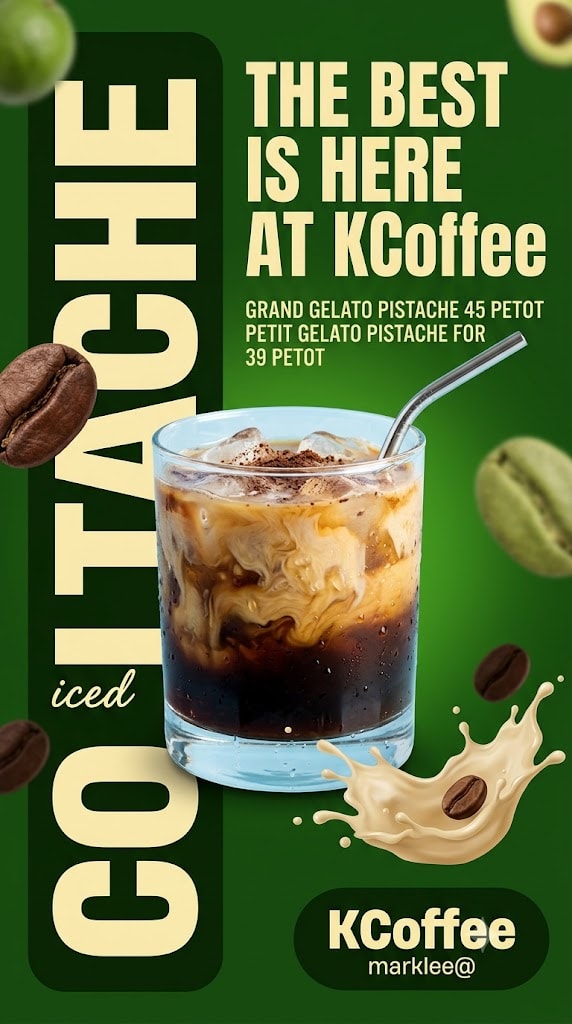
Use the uploaded image as the main design reference. Do not invent a new layout, color palette, typography system, or shape language — follow the upload exactly. Generate a vertical portrait social media promotion banner design in 9:16 aspect ratio, 1080 × 1920 px composition. The final output must be a fully composited flat banner image — all zones, background colors, typography, graphic shapes, decorative elements, and the product subject must appear together in one single flat image. The transparency checkerboard (alpha channel) must not be visible anywhere in the final output. Every pixel of the 1080 × 1920 px canvas must be filled with the banner design. Do not output a standalone transparent cutout or isolated subject. ZONE LOCK — THIS IS A HARD BOUNDARY: The left vertical typography strip occupies exactly 40% of the canvas width (432px at 1080px canvas). The right headline/content zone occupies exactly 60% of the canvas width (648px), spanning from 40% to 100% from the left (432px–1080px). The central product cutout overlaps both zones. The generator must not redistribute these zone proportions under any circumstance. Layout: dark green vertical rounded rectangle left panel occupying 0%–40% width and 0%–100% height with soft right edge rounding. Oversized vertical "COLTACHE" typography running bottom-to-top along the left panel from approximately 3%–38% width and 10%–95% canvas height. Small script "iced" at approximately 3%–16% width and 86%–92% canvas height. Right headline zone: "THE BEST / IS HERE / AT KCoffee" at 43%–97% width and 5%–28% canvas height (96px–538px). Offer text block at 43%–90% width and 29%–38% canvas height (557px–730px). Central iced coffee glass composited overlapping both zones at 8%–82% width (86px–886px) and 38%–88% canvas height (730px–1690px). Cream coffee splash lower-right at 42%–88% width and 82%–96% canvas height (1574px–1843px). Brand badge bottom-right at 52%–97% width (562px–1048px) and 88%–97% canvas height (1690px–1862px). Scattered coffee bean accents and blurred fruit/food accents distributed across the canvas edges. Reading order: "THE BEST IS HERE AT KCoffee" → iced coffee glass → "COLTACHE" vertical text → offer text → brand badge. Background & color blocking: the left 40% of canvas is a dark deep forest green rounded rectangle panel #1A3A10 — slightly darker than the right background, with a soft rounded right edge (approximately 40px radius on the right corners only), filling the full canvas height. The right 60% of canvas is a slightly lighter saturated forest green #2A5A1A with a soft radial gradient brightening at the centre-right area approximately 60%–90% width and 30%–70% height — the bright centre is vivid green #3A7A20 fading to deeper forest green #2A5A1A at the edges. No diagonal panels, no horizontal bands, no flat yellow zones. Graphic shapes: dark forest green left vertical panel with rounded right edge. Cream-coloured coffee liquid splash #E8D8A0 at the lower-right with flowing organic tendrils and droplets, including a roasted coffee bean accent. Soft blurred green fruit accents cropped into the upper-left and upper-right corners. Multiple roasted coffee bean silhouettes at varying sizes and blur levels distributed across the composition. Brand badge bottom-right as described below. Typography: oversized vertical text reads exactly "COLTACHE" — ultra-bold uppercase condensed sans-serif, pale cream-yellow #E8DCA0, rotated 90 degrees counterclockwise so it reads from bottom to top, dramatically cropped by the canvas edges. Small script reads exactly "iced" — handwritten italic script in pale cream #E8DCA0. Main headline reads exactly: "THE BEST" "IS HERE" "AT KCoffee" All in large bold uppercase sans-serif, pale cream-yellow #E8DCA0, with "Coffee" using a slightly softer brand-style treatment. Offer text reads exactly: "GRAND GELATO PISTACHE 45 PETOT" "PETIT GELATO PISTACHE FOR" "39 PETOT" Set in compact uppercase sans-serif, pale cream #E8DCA0, centred within the right content zone. Brand badge text: "KCoffee" in bold rounded display lettering with "marklee@" beneath in smaller pale cream text. CTA button: none — do not add one. Badge/promo tag: rounded dark forest-green badge positioned bottom-right containing the "KCoffee" and "marklee@" branding only. No sale or discount badge. Iconography/contact strip: none — do not add social icons, phone number, email, website, or contact strip. Logo: no separate logo. The bottom-right brand badge serves as the only branding element. Photo/image subject: Condition B applied — iced coffee glass and surrounding props composited directly into the banner. SUBJECT CONTAINMENT LOCK: The primary iced coffee glass occupies approximately 58% of canvas width (626px) and 46% of canvas height (883px). Glass left edge anchored at 10% from canvas left (108px). Glass right edge anchored at 72% from canvas left (778px). Glass top edge anchored at 40% from canvas top (768px). Glass base anchored at 86% from canvas top (1651px). The glass overlaps both the left typography panel and the right content zone. Total subject spread including surrounding props spans from 8%–82% canvas width and 38%–88% canvas height. The product subject is a chilled iced coffee served in a clear rocks glass with visible condensation droplets. The drink features a dramatic layered appearance with a deep espresso base, swirling caramel-beige milk mixing naturally through the centre, visible ice cubes near the top, and a light dusting of cocoa or coffee powder on the surface. A polished silver reusable metal straw extends upward at a slight angle. Strong upper-right lighting creates crisp highlights on the glass, condensation, straw, and creamy swirls. The lower-right features a dynamic cream splash with scattered droplets and coffee beans integrated into the scene. The glass is composited directly into the banner with no cutout border. Render at maximum graphic-design quality pixel-accurate to the reference. The complete 1080 × 1920 px canvas must be fully filled with no transparency, checkerboard, or alpha channel visible. The oversized vertical "COLTACHE" typography must dominate the left panel with dramatic cropping. The tonal separation between the dark left panel and lighter right background must remain subtle but clear. The condensation droplets, layered coffee, swirling cream, and liquid splash should appear highly photorealistic. Coffee bean accents should vary naturally in size, blur, and depth. No warped text, no paraphrased copy, no invented decorative elements beyond those described, no watermark, no zone boundary violations, and no transparency artifacts.
Prompt
Loading reviews...
Reviews
Sign in to leave a review
Share your rating, feedback, and optional image.
Want to use this prompt programmatically?
Access this prompt via the PLH API.
Category
StyleSquare
Length~999 words
DifficultyAdvanced
Models
AddedJul 12, 2026
Similar Prompts You Might Like
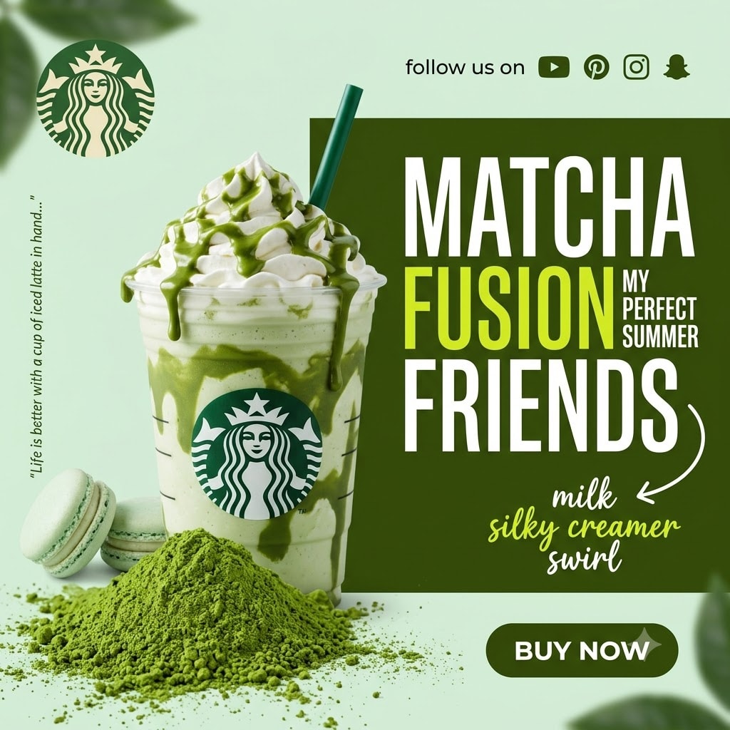

Use the uploaded image as the main design reference. Do not invent a new layout, color palette, typography system, or shape language — follow the upload exactly. Generate a square social media promotional banner design in 1:1 aspect ratio, 1080 × 1080 px composition. The final output must be a fully composited flat banner image — all zones, background colors, typography, graphic shapes, decorative elements, and the product subject must appear together in one single flat image. The transparency checkerboard (alpha channel) must not be visible anywhere in the final output. Every pixel of the 1080 × 1080 px canvas must be filled with the banner design. Do not output a standalone transparent cutout or isolated subject. ZONE LOCK — THIS IS A HARD BOUNDARY: The left product/photo zone occupies exactly 50% of the canvas width (540px at 1080px canvas). The right headline/CTA zone occupies exactly 50% of the canvas width (540px), spanning from 50% to 100% from the left (540px–1080px). The product cutout from the left zone bleeds slightly into the right zone at the centre boundary. The generator must not redistribute these zone proportions under any circumstance. Layout: circular logo mark top-left at 3%–14% width (32px–151px) and 3%–14% height (32px–151px). Vertical quote text along the left edge at 1%–4% width and 8%–92% height. Main product cutout left-centre at 8%–62% width (86px–670px) and 5%–88% height (54px–950px). "follow us on" and social icons top-right at 56%–96% width (605px–1037px) and 3%–10% height (32px–108px). Main headline "MATCHA / FUSION / FRIENDS" right-centre at 52%–97% width (562px–1048px) and 12%–55% height (130px–594px). "MY / PERFECT / SUMMER" small insert at 80%–96% width and 20%–42% height. White curved arrow doodle at approximately 55%–68% width and 52%–60% height. Description text "milk / silky creamer / swirl" at 58%–88% width and 55%–72% height (594px–778px). "BUY NOW" CTA pill bottom-right at 62%–92% width (670px–994px) and 88%–96% height (950px–1037px). Reading order: "MATCHA FUSION FRIENDS" → product cutout → "milk / silky creamer / swirl" → "BUY NOW" → logo → social icons. Background & color blocking: full canvas base is pale soft mint-green #D8EDD8 — a light desaturated green with cool undertone, flat and uniform, filling the left zone and bottom band. On top of the mint base: a large deep olive-green rectangular panel #3A5A1A occupying the right 50% of the canvas from top to approximately 78% canvas height (0px–843px at 540px–1080px width) — flat solid olive-green, no gradient, hard left edge at exactly 50% canvas width (540px), hard bottom edge at approximately 78% canvas height (843px). Below this olive panel on the right side: the pale mint base continues. Soft blurred green leaf-like overlays at top-left corner approximately 0%–18% width and 0%–18% height — blurred dark green organic leaf shapes at approximately 20% opacity creating a soft corner accent. Similar soft blurred green leaf overlay at bottom-right approximately 82%–100% width and 82%–100% height at low opacity. A large mound of vivid matcha green powder #4A8A20 visible at the lower-left and lower-centre of the canvas at approximately 5%–55% width and 75%–100% height — fine granular texture, bright vivid green, scattered powder dust around the mound edges. Two green macarons — round sandwich cookies approximately 8% canvas width diameter, pale mint-green shells #A8C890 with cream filling visible at the join, positioned at approximately 5%–20% width and 80%–96% height, partially behind the powder mound. Graphic shapes: deep olive-green right panel as described. Large matcha powder mound lower area. Two green macarons lower-left. Soft blurred green leaf corner overlays. White hand-drawn curved arrow #FFFFFF approximately 2px stroke at approximately 55%–68% width and 52%–60% height — starts from near the end of "FRIENDS" headline and curves downward-left pointing toward the "milk silky creamer swirl" description text, natural hand-drawn character with arrowhead at the end. No diagonal panels, no dotted patterns, no badge shapes. Typography: vertical quote text reads exactly "Life is better with a cup of iced latte in hand..." — very small serif or sans-serif #2A3A1A dark green at approximately 70% opacity, rotated 90 degrees counterclockwise, running along the left edge from approximately 8% canvas height to 88% canvas height at approximately 1%–4% canvas width. "follow us on" reads exactly as written — small lowercase sans-serif #1A1A1A dark near-black, positioned top-right at approximately 56% from left and 4% from top, approximately 16% canvas width. Main headline line 1 reads exactly "MATCHA" — tall condensed uppercase sans-serif, white #FFFFFF, strong letter-spacing approximately 0.08em, positioned at 52% from left and 13% from top, approximately 44% canvas width, approximately 13% canvas height cap-height. Main headline line 2 reads exactly "FUSION" — same tall condensed uppercase sans-serif, bright yellow-green #C8E820, same letter-spacing, positioned at 52% from left and 27% from top, approximately 35% canvas width, same cap-height as "MATCHA". Small insert text reads exactly "MY" on line 1, "PERFECT" on line 2, "SUMMER" on line 3 — very small compact bold uppercase sans-serif, white #FFFFFF, positioned immediately to the right of "FUSION" at approximately 81% from left and 27% from top, approximately 14% canvas width, approximately 4% canvas height cap-height each line, stacked vertically. Main headline line 3 reads exactly "FRIENDS" — same tall condensed uppercase sans-serif as lines 1–2, white #FFFFFF, positioned at 52% from left and 41% from top, approximately 44% canvas width, same cap-height. Description text reads exactly "milk" on line 1 — small handwritten casual script style, white #FFFFFF. "silky creamer" on line 2 — small handwritten casual script, bright yellow-green #C8E820. "swirl" on line 3 — small handwritten casual script, white #FFFFFF. All three lines at approximately 60% from left and 56% from top, approximately 26% canvas width. CTA reads exactly "BUY NOW" — bold uppercase sans-serif, white #FFFFFF. CTA button: exact text "BUY NOW", rounded pill-shaped capsule, deep olive-green fill #3A5A1A, text white #FFFFFF bold uppercase sans-serif, approximately 20% of canvas width (216px) and 6% of canvas height (65px), right edge at approximately 92% from canvas left (994px), bottom edge at approximately 95% from canvas top (1026px), no border stroke, no drop shadow, no icon. Badge/promo tag: no badge present — do not add one. Iconography/social strip: top-right at 56%–92% width and 3%–10% height — "follow us on" text in small lowercase dark sans-serif followed by four small flat white social media icons each approximately 18px: YouTube icon (simplified play button rectangle), Pinterest icon (simplified P letter in circle), Instagram icon (simplified camera square outline), Snapchat ghost icon (simplified ghost outline). All icons white #FFFFFF in a horizontal row. No phone, no website URL, no email, no contact strip present. Logo: top-left at 3%–14% width and 3%–14% height, a circular green coffee brand emblem approximately 11% canvas width diameter — deep green circle #2A5A1A with a pale cream illustrated emblem inside, positioned directly on the pale mint background. Use a generic circular coffee brand emblem rather than reproducing any trademarked logo. Photo/image subject: Condition B applied — matcha frappuccino-style drink cup and surrounding elements composited directly onto banner, no user replacement supplied. SUBJECT CONTAINMENT LOCK: The primary drink cup occupies approximately 30% of canvas width (324px) and 72% of canvas height (778px). Cup left edge anchored at 18% from canvas left (194px). Cup right edge anchored at 58% from canvas left (626px), slightly bleeding into the right headline zone. Cup top (including whipped cream and straw) anchored at 5% from canvas top (54px). Cup base anchored at 82% from canvas top (875px). Total subject zone including props: left boundary 5% (54px), right boundary 62% (670px), top boundary 2% (22px), bottom boundary 90% (972px). The product subject is a large clear plastic frappuccino-style cup composited directly onto the banner — it is part of the assembled flat banner, not a floating cutout. The cup contains a creamy pale matcha blend with dramatic glossy dark-green matcha drizzle inside the cup and over the whipped cream. A generous swirl of whipped cream tops the drink, finished with thick matcha sauce and a dark green paper straw. The cup features a generic circular coffee-brand emblem instead of any trademarked logo. It sits on a vivid mound of matcha powder with two pale green macarons nearby. Lighting comes from the upper-right, creating crisp highlights on the clear plastic, glossy drizzle, and whipped cream. Render at maximum graphic-design quality pixel-accurate to the reference. The complete 1080 × 1080 px canvas must be fully filled — no transparent regions, no transparency checkerboard, no alpha channel visible anywhere. The hard edge between the pale mint left zone and the deep olive-green right panel must be a clean straight vertical line at exactly 50% canvas width. The "MATCHA" and "FRIENDS" lines must be white while "FUSION" must be bright yellow-green. The thick matcha sauce drizzle inside and on the cup must be dramatically rendered with glossy wet quality. The large matcha powder mound at the lower canvas must have fine granular texture. The white curved arrow doodle between headline and description must have natural hand-drawn character. Use a generic coffee-brand emblem rather than any trademarked logo. No warped text, no paraphrased copy, no invented decorative elements beyond those described, no watermark, no zone boundary violations, no transparency checkerboard in output.
12
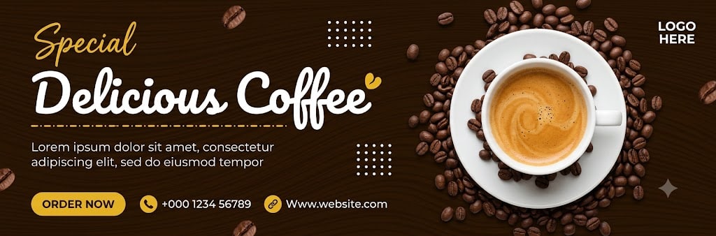
Use the uploaded image as the main design reference. Do not invent a new layout, color palette, typography system, or shape language — follow the upload exactly. Generate a wide horizontal coffee-promotion banner design in 3:1 aspect ratio, 1620 × 540 px composition. The final output must be a fully composited flat banner image — all zones, background colors, typography, graphic shapes, decorative elements, and the product subject must appear together in one single flat image. The transparency checkerboard (alpha channel) must not be visible anywhere in the final output. Every pixel of the 1620 × 540 px canvas must be filled with the banner design. Do not output a standalone transparent cutout or isolated subject. ZONE LOCK — THIS IS A HARD BOUNDARY: The left text/content zone occupies exactly 57% of the canvas width (923px at 1620px canvas). The right image/logo zone occupies exactly 43% of the canvas width (697px), spanning from 57% to 100% from the left (923px to 1620px). The boundary between the two zones is not a hard line — it is a soft fade where the dark brown background continues across the full canvas and the coffee cup and bean cluster on the right side bleed slightly into the centre zone. The generator must maintain the left text zone as the dominant readable content area and must not allow text to overlap the coffee cup subject. The generator must not redistribute these zone proportions under any circumstance. Layout: script accent "Special" upper-left at 4%–20% width (65px–324px) and 8%–18% height (43px–97px). Main headline "Delicious Coffee" left-middle at 4%–55% width (65px–891px) and 18%–42% height (97px–227px). Yellow dotted underline beneath headline at 4%–22% width and 44%–46% height. Body copy directly beneath at 4%–40% width and 46%–60% height (249px–324px). CTA and contact row bottom-left at 4%–55% width and 72%–88% height (389px–476px). Logo "LOGO HERE" upper-right at 74%–92% width (1199px–1490px) and 7%–13% height (38px–70px). Coffee cup and bean cluster composited right-centre at 55%–100% width (891px–1620px) and 5%–95% height (27px–513px). Two white dot grid patterns in centre zone: first at approximately 38%–43% width and 8%–18% height, second at approximately 45%–50% width and 38%–52% height. Reading order: "Special" → "Delicious Coffee" → body copy → "ORDER NOW" CTA → contact row → "LOGO HERE" → coffee image. Background & color blocking: the entire canvas is a deep warm espresso-brown #2A1505 with a subtle wood-grain wave texture — fine curved parallel lines flowing diagonally across the full canvas surface from upper-left to lower-right at approximately 15–20 degree angle, slightly lighter warm brown #3D2010 for the grain lines against the darker base #2A1505, texture opacity approximately 20%. This wood-grain textured dark brown fills 100% of the canvas as the single background layer — no separate color blocks, no gradient panels, no diagonal shapes. The background is uniform dark espresso-brown across the entire canvas with only the wood-grain surface texture differentiating it. Scattered roasted coffee bean shapes — approximately 12–16 individual dark brown coffee bean silhouettes #4A2510 with central crease highlight line #6B3A20, distributed floating across the upper portion of the canvas from approximately 5%–65% width and 2%–25% height at various rotation angles and sizes (8px–18px), and a few additional beans near the lower-left at 5%–20% width and 75%–90% height. These scattered beans are composited directly onto the background as part of the flat banner. Graphic shapes: no diagonal color blocks, no large geometric panels. White square dot grid pattern 1: a 5×5 grid of small white dots #FFFFFF each approximately 3px diameter with even 6px spacing, positioned at approximately 38%–43% width and 8%–18% height. White square dot grid pattern 2: a 4×4 grid of small white dots #FFFFFF each approximately 3px diameter with even 6px spacing, positioned at approximately 45%–50% width and 38%–52% height. Small yellow heart/bean-shaped accent #E8B820 approximately 12px, positioned immediately after the final "e" of "Coffee" in the headline, at approximately 54% width and 36% height. Yellow dashed/dotted underline beneath the "Delicious Coffee" headline — a horizontal row of small yellow dashes or dots #E8B820 approximately 2px height, running from 4% to 22% canvas width at approximately 44% canvas height. All graphic elements composited as part of the flat banner. Typography: logo reads exactly "LOGO HERE" — small compact uppercase sans-serif, white #FFFFFF, positioned upper-right at 74% from canvas left and 8% from top, approximately 16% canvas width, no icon or mark accompanying it. Script accent reads exactly "Special" — medium-large handwritten italic script style, warm yellow-gold #E8B820, fluid connected letterforms, positioned at 4% from left and 9% from top, approximately 16% canvas width. Main headline reads exactly "Delicious Coffee" — large smooth thick-stroked cursive/script font, white #FFFFFF, rounded character forms with natural calligraphic variation in stroke weight (thick downstrokes, thin upstrokes), positioned at 4% from left and 19% from top, spanning approximately 51% canvas width, approximately 3.5× the cap height of body copy — dominant text element. Body copy line 1 reads exactly "Lorem ipsum dolor sit amet, consectetur" — line 2 reads exactly "adipiscing elit, sed do eiusmod tempor" — small-weight sans-serif, white #FFFFFF at approximately 80% opacity (slightly softer than full white), positioned at 4% from left and 47% from top, approximately 36% canvas width, two-line wrap. CTA reads exactly "ORDER NOW" — small bold uppercase sans-serif, dark espresso-brown #2A1505, inside yellow pill. Phone reads exactly "+000 1234 56789" — small bold sans-serif, white #FFFFFF. Website reads exactly "(http://Www.website.com)" — small sans-serif, white #FFFFFF. CTA button: exact text "ORDER NOW", rounded pill-shaped capsule, warm yellow fill #E8B820, text dark espresso-brown #2A1505 bold uppercase sans-serif, approximately 13% of canvas width (211px) and 9% of canvas height (49px), left edge at 4% from canvas left (65px), vertical centre at 79% from canvas top (427px), no border stroke, no drop shadow, no icon. Yellow fill intentionally repeats in "Special" text, dotted underline, small coffee bean accent, and icon fills — this repetition is by design, preserve it. Badge/promo tag: no badge, no discount shape, no promo container present. Do not add one. Iconography/contact strip: horizontal row at 76%–86% canvas height (411px–465px), left-aligned from 4% canvas width — first a small warm yellow #E8B820 filled circle approximately 18px diameter containing a simplified dark brown handset symbol, paired with "+000 1234 56789" in white small bold sans-serif. Then a small warm yellow #E8B820 filled circle approximately 18px diameter containing a simplified dark brown link/chain or globe symbol, paired with "(http://Www.website.com)" in white small sans-serif. Both icon-text pairs arranged horizontally with approximately 40px gap between them. No social icons, no delivery icon, no email icon present. Logo: upper-right at 74% from canvas left and 8% from canvas top, "LOGO HERE" in white #FFFFFF small compact uppercase sans-serif, approximately 16% canvas width, no accompanying icon mark, no container, positioned directly on dark brown background. Photo/image subject: Condition B applied — coffee cup and bean cluster composited directly onto banner, no user replacement supplied. SUBJECT CONTAINMENT LOCK: The coffee cup and bean cluster subject occupies exactly 40% of canvas width (648px) and 88% of canvas height (475px). Left edge anchored at 58% from canvas left (940px). Right edge anchored at 98% from canvas left (1588px) — right-side clipping at canvas edge is intentional. Top edge anchored at 5% from canvas top (27px). Bottom edge anchored at 95% from canvas top (513px). The primary cup subject must not bleed left of 58% (940px). Additional scattered coffee beans extend across the upper canvas as decorative elements and are not constrained to the right zone. Do not resize or reposition the primary cup cluster beyond these four anchors. The product subject is a coffee cup and saucer with surrounding coffee beans composited directly onto the banner — it is part of the assembled flat banner, not a floating cutout. Primary subject: a white ceramic coffee cup #F0EDE8 and matching white saucer #F0EDE8, both viewed from directly above (top-down bird's-eye angle). The cup has a white handle visible on the right side. Inside the cup: a full serving of freshly brewed espresso or cappuccino — warm caramel-amber #C87820 crema surface with subtle circular swirl pattern and small foam bubbles, filling the cup interior to approximately 85% full. The white saucer has a slightly raised rim and sits flat. Surrounding the cup and saucer on all sides: a dense cluster of roasted coffee beans #3A1A05 — dark brown oval beans with a central crease line #6B3010 highlight, approximately 60–80 individual beans visible in the cluster, piled loosely around the cup base and saucer extending outward in all directions. The bean cluster tapers off at the outer edges blending into the dark brown background. Additional individual coffee beans scatter loosely across the canvas upper area and lower-left as described in the background section. Lighting from directly above with soft even illumination — the cup interior crema is brightly lit, the saucer rim has subtle highlights, the coffee beans have warm amber highlight lines along their upper surfaces. The entire subject blends naturally into the dark espresso-brown background with no hard cutout edge or border — the darkest outer beans merge seamlessly with the dark banner background. The cup and bean cluster must be rendered as part of the composited banner scene — not as an isolated cutout. Render at maximum graphic-design quality pixel-accurate to the reference. The complete 1620 × 540 px canvas must be fully filled — no transparent regions, no transparency checkerboard, no alpha channel visible anywhere. The subtle wood-grain wave texture must be visible across the full dark brown background. The "Delicious Coffee" headline must use a smooth thick-stroked calligraphic cursive style with natural stroke weight variation. The scattered coffee beans across the upper canvas must feel naturally integrated into the background. The coffee cup and dense bean cluster must blend seamlessly into the dark background at their outer edges with no hard cutout border. The two white dot grid patterns must be precisely rendered. No warped text, no paraphrased copy, no invented decorative elements beyond those described, no watermark, no zone boundary violations, no transparency checkerboard in output.
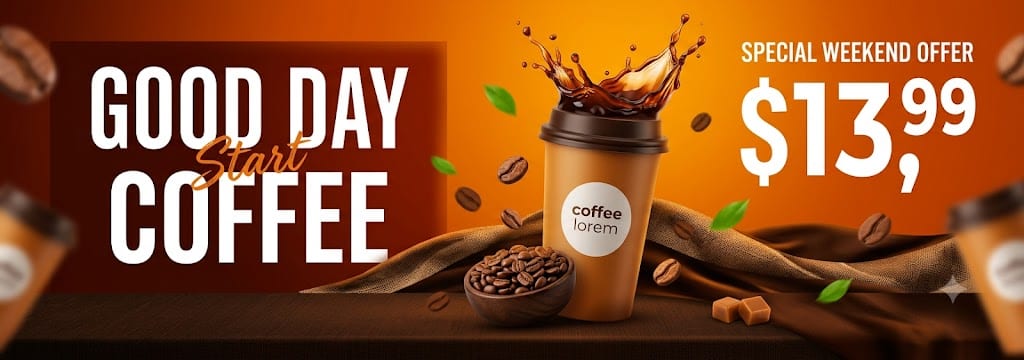
Use the uploaded image as the main design reference. Do not invent a new layout, color palette, typography system, or shape language — follow the upload exactly. Generate a wide horizontal product-promotion banner design in 2.8:1 aspect ratio, 1620 × 580 px composition. The final output must be a fully composited flat banner image — all zones, background colors, typography, graphic shapes, decorative elements, and the product subject must appear together in one single flat image. The transparency checkerboard (alpha channel) must not be visible anywhere in the final output. Every pixel of the 1620 × 580 px canvas must be filled with the banner design. Do not output a standalone transparent cutout or isolated subject. ZONE LOCK — THIS IS A HARD BOUNDARY: The left headline zone occupies exactly 38% of the canvas width (616px at 1620px canvas). The centre product/image zone occupies exactly 32% of the canvas width (518px), spanning from 38% to 70% from the left (616px to 1134px). The right offer/price zone occupies exactly 30% of the canvas width (486px), spanning from 70% to 100% from the left (1134px to 1620px). The generator must not redistribute these zone proportions or allow content from one zone to bleed into another under any circumstance. Layout: main headline "GOOD DAY" and "COFFEE" left-aligned at 5% from canvas left, occupying 8%–58% canvas height (46px–336px). Script overlay "Start" diagonally positioned across the headline at approximately 12% from left and 35% from top. Offer label "SPECIAL WEEKEND OFFER" upper-right at 72%–95% width and 8%–16% height (46px–93px). Price "$13,99" upper-right at 72%–95% width and 16%–52% height (93px–302px). Central product cluster composited at 32%–78% width (518px–1264px) and 5%–88% height (29px–510px). Dark bottom base strip running full canvas width at 72%–100% canvas height (418px–580px). "IMAGE NOT INCLUDED" notice at bottom-centre is a stock watermark — ignore it entirely, do not reproduce it. Reading order: "GOOD DAY COFFEE" headline → product cluster → "SPECIAL WEEKEND OFFER" → "$13,99" price. Background & color blocking: the entire canvas background is a warm orange-to-amber gradient — upper-right corner is the brightest vivid golden-orange #E8820A, transitioning to a deeper reddish-amber #C05010 toward the centre and lower areas, and deepening further to dark reddish-brown #5A1A05 in the far left and lower-left areas. This gradient fills 100% of the canvas as the base layer. On top of the base gradient: a darker reddish-brown rectangular panel #3A0E05 behind the left headline zone occupying approximately 0%–40% width and 0%–72% height (0px–418px), with soft feathered right edge blending into the orange background rather than a hard cut. A dark brown horizontal base strip #2A1005 running the full canvas width at approximately 72%–100% canvas height (418px–580px), with a slightly textured surface suggesting a dark wooden table or fabric surface. A curved wave-like dark brown fabric band #3D1A08 crossing the lower-centre portion of the banner at approximately 30%–75% width and 55%–80% height, with soft natural draping folds and highlights suggesting a burlap or jute sack texture — warm amber highlights #8B5A20 on the raised fold ridges. No flat solid color zones — all transitions are gradient or soft-edged. Graphic shapes: darker reddish-brown left headline panel with soft feathered right edge as described. Dark wooden/fabric bottom base strip full width. Curved burlap/jute fabric wave band in the lower-centre with natural fold texture. Motion-blurred cutout accent elements at far-left edge (approximately 0%–8% width) and far-right edge (approximately 90%–100% width) — these are blurred coffee-related objects (coffee beans, small food items) appearing out-of-focus as if in motion, creating depth. Scattered small bright green leaf shapes #2A8A20 approximately 6 leaves of irregular organic shape distributed across the centre and right zones at various sizes and rotation angles. Scattered roasted coffee bean shapes #6B3A10 — approximately 8–10 oval coffee bean silhouettes with central crease line, warm amber-brown #A05A20, distributed floating across the centre and lower zones at various rotation angles. Small square caramel/toffee candy shapes #8B5A20 approximately 2–3 visible near the lower-right at 65%–78% width and 72%–85% height. All decorative elements layered above the background but integrated naturally into the scene. Typography: no logo or brand mark present — the headline text serves as the brand identity. Main headline reads exactly "GOOD DAY" on line one and "COFFEE" on line two — tall condensed uppercase sans-serif, white #FFFFFF, strong tracking/letter-spacing, left-aligned at 5% from canvas left, "GOOD DAY" at 8%–28% canvas height (46px–162px) and "COFFEE" at 30%–58% canvas height (174px–336px), each word spanning approximately 32% of canvas width, approximately 6× the size of the offer label. Script overlay reads exactly "Start" — small handwritten italic brush-script style, warm orange #E87820, positioned diagonally at approximately 12% from left and 35% from top, overlapping the space between "GOOD DAY" and "COFFEE" at a slight upward-left to lower-right diagonal angle, approximately 15% canvas width. Offer label reads exactly "SPECIAL WEEKEND OFFER" — very small compact uppercase sans-serif, white #FFFFFF, positioned upper-right at 72% from left and 9% from top, approximately 22% canvas width. Price reads exactly "$13,99" — oversized bold white numerals #FFFFFF, "$13" rendered at approximately 18% canvas height cap-height (very large dominant), "99" rendered at approximately 10% canvas height raised as a superscript beside "13", comma separator between 13 and 99, all positioned at 72% from left and 18% from top, spanning approximately 24% canvas width. No body copy, no contact details, no website text, no CTA text present. CTA button: no CTA button present in this banner — do not add one. Badge/promo tag: no badge shape or container present — the offer text "SPECIAL WEEKEND OFFER" and price "$13,99" are plain white text directly on the orange background with no surrounding shape, border, or container. Do not add a badge shape. Iconography/contact strip: no contact strip, no social icons, no phone number, no website, no email present. Do not add any contact elements. Logo: no separate logo or brand mark present — do not add one. The headline text "GOOD DAY COFFEE" serves as the brand identity. Photo/image subject: Condition B applied — coffee product cluster composited directly onto banner, no user replacement supplied. SUBJECT CONTAINMENT LOCK: The central coffee product cluster occupies exactly 46% of canvas width (745px) and 83% of canvas height (481px). Left edge anchored at 28% from canvas left (454px). Right edge anchored at 74% from canvas left (1199px). Top edge anchored at 5% from canvas top (29px). Bottom edge anchored at 88% from canvas top (510px). Blurred motion accent elements extend to the far-left edge (0px) and far-right edge (1620px) but remain as shallow out-of-focus elements only. The primary subject cluster must not extend beyond the stated left anchor of 454px into the pure headline text area. Do not resize or reposition the primary cluster beyond these four anchors. The product subject is a coffee cup with liquid splash composited directly onto the banner — it is part of the assembled flat banner, not a floating cutout. Primary subject: a tall takeaway coffee cup #D4A870 with a warm caramel-brown body, a dark brown lid #3A1A05 at the top, a white circular label on the cup body reading "coffee lorem" in small dark brown sans-serif text, the cup viewed from a slight front-left angle. Erupting from the top of the cup: a dramatic upward coffee liquid splash #3A1A05 — dark brown liquid with translucent amber edges #8B4010 at the thinner splash tendrils, the main splash mass rising approximately 25% of canvas height above the cup lid, with multiple irregular drip and droplet shapes breaking off the main mass at various angles. The splash catches warm amber backlighting on its outer edges. Below and around the cup: a small dark wooden bowl #3A1A05 approximately 10% canvas width containing roasted coffee beans #6B3A10, positioned at approximately 32% from left and 68% from top. Scattered individual roasted coffee bean shapes across the surface. The burlap/jute fabric wave crosses behind the cup's lower portion. Additional blurred coffee-related objects at the far-left canvas edge (motion-blurred coffee beans and possibly a blurred cup fragment, very out of focus) and far-right canvas edge (motion-blurred coffee beans and small food items, very out of focus) — these blurred edge accents create a sense of depth and motion. Small bright green leaf shapes and scattered coffee beans float around the cup at various distances. All elements rendered as naturally lit 3D product photography style composited directly onto the warm gradient banner background. Lighting from upper-right with warm amber key light — strong highlights on the right face of the cup and the splash outer edges, cooler shadows on the left face of the cup. Render at maximum graphic-design quality pixel-accurate to the reference. The complete 1620 × 580 px canvas must be fully filled — no transparent regions, no transparency checkerboard, no alpha channel visible anywhere. The warm orange-to-brown gradient background must fill every pixel. The burlap fabric wave must have natural draping fold texture. The coffee splash must be dramatically rendered with translucent amber edges. The green leaf and coffee bean scatter must feel naturally integrated. The "IMAGE NOT INCLUDED" stock watermark notice visible in the reference must not be reproduced. No warped text, no paraphrased copy, no invented decorative elements beyond those described, no CTA button, no logo, no contact strip, no watermark, no zone boundary violations, no transparency checkerboard in output.
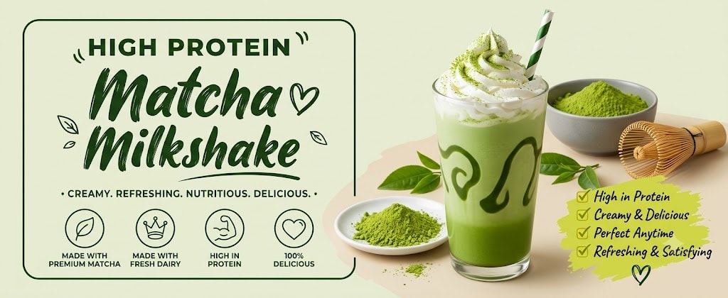
Use the uploaded image as the main design reference. Do not invent a new layout, color palette, typography system, or shape language — follow the upload exactly. Generate a wide horizontal healthy drink promotion banner design in 2.4:1 aspect ratio, 1400 × 580 px composition. The final output must be a fully composited flat banner image — all zones, background colors, typography, graphic shapes, decorative elements, and the product subject must appear together in one single flat image. The transparency checkerboard (alpha channel) must not be visible anywhere in the final output. Every pixel of the 1400 × 580 px canvas must be filled with the banner design. Do not output a standalone transparent cutout or isolated subject. ZONE LOCK — THIS IS A HARD BOUNDARY: The left typography/feature zone occupies exactly 55% of the canvas width (770px at 1400px canvas). The right product/photo zone occupies exactly 45% of the canvas width (630px), spanning from 55% to 100% from the left (770px to 1400px). The boundary between zones is a soft natural transition — no hard dividing line. The generator must not redistribute these zone proportions under any circumstance. Layout: "HIGH PROTEIN" label at 8%–38% width (112px–532px) and 5%–14% height (29px–81px). Main headline "Matcha" at 4%–52% width (56px–728px) and 13%–42% height (75px–244px). "Milkshake" at 4%–52% width and 40%–65% height (232px–377px). Descriptor line "CREAMY. REFRESHING. NUTRITIOUS. DELICIOUS." at 6%–52% width and 66%–72% height (383px–418px). Thin rounded border frame wrapping left content zone at approximately 4%–54% width and 3%–74% height. Feature icon row across lower-left at 4%–52% width and 74%–92% height (429px–534px). Matcha milkshake glass and props composited right-centre at 42%–100% width (588px–1400px) and 0%–100% height. Checklist block bottom-right at 72%–96% width (1008px–1344px) and 68%–92% height (394px–534px). Reading order: "HIGH PROTEIN" → "Matcha Milkshake" → descriptor line → feature icons → milkshake glass → checklist. Background & color blocking: full canvas is a pale creamy matcha-green #E8EDD8 — a soft desaturated yellow-green with warm cream undertone, flat and uniform across the entire canvas with no gradients, no panels, no texture overlays. This single pale green fills 100% of the canvas. The product props (matcha powder plate, bamboo whisk) sitting on the right side rest on a slightly warm beige surface #E8E0CC that forms a natural tabletop feel at the canvas bottom-right, this surface transition is subtle and photographic rather than a designed color block. Graphic shapes: thin deep green rounded rectangle border frame #2A5A1A approximately 2px stroke, no fill, with soft rounded corners (approximately 20px radius), wrapping the left content zone at 4%–54% width and 3%–74% height — this frame contains the HIGH PROTEIN label, the Matcha Milkshake headline, and the descriptor line within its bounds. The frame has a small gap or opening at the bottom-centre where it transitions to the feature icon row. Thin horizontal curved underline stroke #2A5A1A approximately 1.5px under "Milkshake" at approximately 4%–50% width and 66%–67% height. Small hand-drawn decorative marks around "HIGH PROTEIN" — two small curved bracket-like doodles on either side of the label, each approximately 12px, deep green #2A5A1A. Small heart doodle #2A5A1A approximately 10px beside the end of "Matcha" headline at approximately 50% width and 28% height. Small leaf doodle shapes #2A5A1A — 2–3 simple two-lobe leaf silhouettes scattered near the headline area at approximately 46%–52% width and 20%–38% height. Four thin-line circular feature icons as described below. Yellow-green checkmark accents #8AB820 in checklist block. All decorative elements composited as part of the flat banner. Typography: "HIGH PROTEIN" — bold uppercase sans-serif #2A5A1A deep forest green, strong letter-spacing approximately 0.15em, positioned at 8% from left and 6% from top, approximately 30% canvas width, small size approximately 2.5% canvas height cap-height, flanked by small curved doodle marks. "Matcha" — large brush/script lettering #2A5A1A deep green, thick natural brush strokes with slight variation in stroke weight, natural calligraphic letterforms, positioned at 4% from left and 14% from top, approximately 48% canvas width, approximately 25% canvas height cap-height — largest text element. "Milkshake" — same large brush/script style as "Matcha", deep green #2A5A1A, positioned at 4% from left and 41% from top, approximately 48% canvas width, approximately 22% canvas height cap-height, with thin underline stroke beneath. Descriptor reads exactly "• CREAMY. REFRESHING. NUTRITIOUS. DELICIOUS. •" — very small uppercase sans-serif #2A5A1A with bullet point separators and dot separators between each word, positioned at 6% from left and 67% from top, approximately 46% canvas width. Feature icon labels — four labels each in two stacked lines of very small bold uppercase sans-serif #2A5A1A: "MADE WITH / PREMIUM MATCHA", "MADE WITH / FRESH DAIRY", "HIGH IN / PROTEIN", "100% / DELICIOUS". Checklist items — four lines of small handwritten-style italic text #2A5A1A: "High in Protein", "Creamy & Delicious", "Perfect Anytime", "Refreshing & Satisfying", each preceded by a yellow-green checkmark #8AB820. No logo, no CTA, no phone, no website, no badge. CTA button: no CTA button present — do not add one. Badge/promo tag: no badge present — do not add one. Iconography/feature strip: four circular feature icons in a horizontal row at 4%–52% width and 74%–92% canvas height, evenly spaced approximately 12% canvas width apart. Each icon is a thin-line circle outline #2A5A1A approximately 40px diameter with a thin-line icon inside: Icon 1 at 6% from left: leaf/matcha plant icon — simplified single leaf with central vein line. Label below: "MADE WITH" line 1 and "PREMIUM MATCHA" line 2. Icon 2 at 18% from left: water drop with dairy/crown quality mark — simplified crown or droplet with quality indicator. Label below: "MADE WITH" line 1 and "FRESH DAIRY" line 2. Icon 3 at 30% from left: flexed arm/bicep muscle icon — simplified arm silhouette suggesting strength/protein. Label below: "HIGH IN" line 1 and "PROTEIN" line 2. Icon 4 at 42% from left: heart outline icon — simple thin-line open heart. Label below: "100%" line 1 and "DELICIOUS" line 2. All icons thin-line style #2A5A1A deep green on transparent circle background, labels in very small bold uppercase sans-serif #2A5A1A below each circle. No contact strip, no social icons, no phone, no website present. Logo: no logo or brand mark present — do not add one. Photo/image subject: Condition B applied — matcha milkshake glass and surrounding props composited directly onto banner, no user replacement supplied. SUBJECT CONTAINMENT LOCK: The primary matcha milkshake glass occupies approximately 22% of canvas width (308px) and 88% of canvas height (510px). Glass left edge anchored at 46% from canvas left (644px). Glass right edge anchored at 70% from canvas left (980px). Glass top (including whipped cream and straw) anchored at 2% from canvas top (12px) — cream and straw extend near the canvas top edge. Glass base anchored at 88% from canvas top (510px). Surrounding prop elements extend from 42%–100% canvas width and 30%–100% canvas height. The glass must not bleed left of 46% (644px) into the primary headline text zone. Total right zone subject spread: left boundary 42% (588px), right boundary 100% (1400px), top boundary 0%, bottom boundary 100%. The product subject is a matcha milkshake glass with surrounding props composited directly onto the banner — it is part of the assembled flat banner scene, not a floating cutout. Primary subject: a tall clear glass tumbler with slightly tapered cylindrical form, viewed from a slight front-right angle. The glass interior is filled with a vibrant matcha green milkshake — rich vivid green #4A8A20 at the base fading to lighter green #6AAA30 toward the upper portion, creamy and opaque with a smooth surface. On the inner glass walls: two large decorative drizzle marks in deeper forest green #2A5A1A forming stylised swirl or wave patterns. The glass exterior is clear showing the green drink contents. On top of the glass: a large generous mound of white whipped cream #F8F8F5 piped in full swirling peaks extending approximately 25% above the glass rim. On top of the whipped cream: a generous dusting of bright matcha green powder #4A8A20 scattered across the cream surface. A green and white diagonal-stripe paper straw #F0F0E8 with dark green #2A5A1A stripes, inserted at a slight angle from the cream, extending approximately 15% above the cream peak. Lighting from the upper-right — warm soft light creating highlights on the right glass face and cream peaks, the green drink has a fresh vibrant saturated quality. Surrounding prop elements composited into the right zone: Matcha powder in a small white ceramic plate with scattered powder. Matcha powder in a grey ceramic bowl behind the glass. Traditional bamboo chasen whisk beside the bowl. Fresh green tea leaves scattered naturally around the scene. Soft yellow-green paint wash behind the checklist. All props rest on a warm beige tabletop surface #E8E0CC and blend naturally into the pale green background. Checklist block: bottom-right at 72%–96% width and 68%–92% height. Yellow-green paint splash background #C8D840. Four checklist items in handwritten-style italic script #2A5A1A, each preceded by a yellow-green checkmark #8AB820: High in Protein Creamy & Delicious Perfect Anytime * Refreshing & Satisfying Render at maximum graphic-design quality pixel-accurate to the reference. The complete 1400 × 580 px canvas must be fully filled — no transparent regions, no transparency checkerboard, no alpha channel visible anywhere. The pale creamy matcha-green background must be soft and uniform. The "Matcha" and "Milkshake" brush-script headlines must have authentic calligraphic brush quality with natural stroke weight variation. The thin green rounded border frame must be clearly visible around the left content zone. The four feature icons must be rendered as clean thin-line circles with simplified icons inside. The matcha glass must show the vivid green drink with decorative inner drizzle swirls clearly visible through the clear glass walls. The surrounding props must feel naturally arranged on a real tabletop surface. No warped text, no paraphrased copy, no invented decorative elements beyond those described, no CTA, no logo, no badge, no watermark, no zone boundary violations, no transparency checkerboard in output.
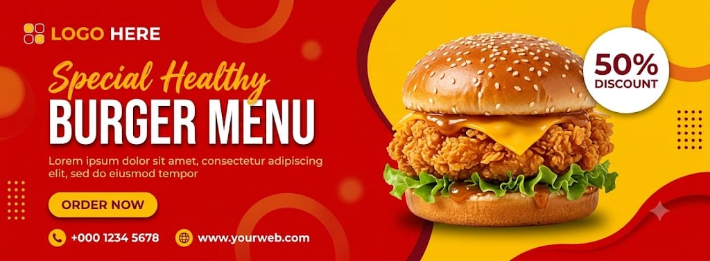
Use the uploaded image as the main design reference. Do not invent a new layout, color palette, typography system, or shape language — follow the upload exactly. Generate a wide horizontal food-promotion banner design in 2.70:1 aspect ratio, 1620 × 600 px composition. ZONE LOCK — THIS IS A HARD BOUNDARY: The left content zone occupies exactly 58% of the canvas width (939px at 1620px canvas). The right image zone occupies exactly 42% of the canvas width (681px). The divider between them is an organic S-curve boundary: top anchor at 58% from left, mid-upper anchor bending left to 52% from left at the 25% vertical position, mid-lower anchor bending right to 63% from left at the 77% vertical position, bottom anchor at 60% from left. The generator must not redistribute these zone widths or allow content from one zone to bleed into another under any circumstance. Layout: logo zone upper-left 5%–23% width (81px–373px) and 10%–18% height (60px–108px). Supporting script headline upper-left 9%–35% width (146px–567px) above the main headline. Main headline left-centre 9%–56% width (146px–907px) and 37%–66% height (222px–396px). Body-copy zone directly beneath headline 9%–51% width (146px–826px) and 68%–77% height (408px–462px). CTA and contact row lower-left 9%–55% width (146px–891px) and 82%–91% height (492px–546px). Photo cutout zone centre-right 61%–93% width (988px–1507px) and 14%–87% height (84px–522px). Discount badge upper-right 87%–96% width (1409px–1555px) and 18%–37% height (108px–222px). Strong left alignment across all content. Reading order: logo → "Special Healthy" script → "BURGER MENU" → right image frame → discount badge → "ORDER NOW" CTA → contact row. Background & color blocking: left panel flat vivid red #D40008 occupying the full left 58% behind all text content. Right panel flat golden yellow #FFCA05 occupying the full right 42%. No gradients — all flat. Semi-transparent red-orange circular rings and blurred circular accents across both zones at 20–40% opacity. A 5×5 dotted matrix in deep burgundy-red #9D171D near mid-right edge at approximately 78% width and 45% height. Short vertical dotted accent column near left edge at approximately 6% width and 65%–80% height. Red organic wave shape #D40008 rising from lower-right corner at 85% width and 100% height curving upward to 100% width and 55% height with slightly darker red shadow edge, overlaying the yellow panel in the lower-right. All decorative elements remain in the background layer beneath text and image cutout. Typography: logo reads exactly "LOGO HERE" — compact bold all-caps sans-serif, "LOGO" in orange-gold #FFB51B and "HERE" in white #FFFFFF, preceded by a small white outlined square icon containing four smaller rounded squares, positioned upper-left at 5% from left and 12% from top directly on red panel, approximately 16% of banner width total. Supporting headline reads exactly "Special Healthy" — one line, handwritten brush-script style, medium-heavy connected strokes, warm orange-gold #FFB51B, positioned at 9% from left and 28% from top, approximately 26% of banner width. Main headline reads exactly "BURGER MENU" — ultra-bold tall condensed sans-serif, all caps, white #FFFFFF with subtle grey-dark offset drop shadow, positioned 9% from left and 37% from top, occupying 47% of banner width, approximately 4–5× the cap height of body copy. Body copy line 1 reads exactly "Lorem ipsum dolor sit amet, consectetur adipiscing" — line 2 reads exactly "elit, sed do eiusmod tempor" — medium-to-bold sans-serif, warm light yellow-orange #FFC25A, positioned 9% from left and 68% from top. Phone reads exactly "+000 1234 5678" small bold sans-serif white #FFFFFF. Website reads exactly "(http://www.yourweb.com)" small bold sans-serif white #FFFFFF. CTA button: exact text "ORDER NOW", horizontal pill-shaped rounded rectangle, fill warm golden yellow #FFB51B, text deep burgundy-red #9D171D bold all caps, approximately 12% of banner width (194px) and 7% of banner height (42px), left edge at 9% from canvas left (146px), vertical centre at 86% from canvas top (516px), soft dark-red drop shadow beneath pill, no icon. The yellow CTA color intentionally repeats in the script headline and right panel — preserve this reuse pattern exactly. Badge/promo tag: white circle approximately 9% of banner width (146px diameter), centre at 91% from canvas left (1474px) and 27% from canvas top (162px), exact text "50%" first line and "DISCOUNT" second line in deep burgundy-red #A31124 bold sans-serif all caps, "50%" approximately 2.3× larger than "DISCOUNT", partially overlapped by burger cutout in front. Iconography/contact strip: horizontal row at 82%–91% canvas height, left-aligned from 22% canvas width — first a small golden-yellow #FFB51B filled circle with simplified white handset symbol paired with "+000 1234 5678" in white bold sans-serif, then a small golden-yellow #FFB51B filled circle with simplified white globe symbol paired with "(http://www.yourweb.com)" in white bold sans-serif. No email, location, or social icons present. Logo: upper-left at 5% from canvas left and 12% from canvas top, approximately 16% canvas width including wordmark, small white outlined square icon with four inner rounded squares, wordmark "LOGO HERE" with "LOGO" in orange-gold #FFB51B and "HERE" in white #FFFFFF, no container or badge. Photo/image frame: Condition B applied — food product photograph, no user replacement supplied. SUBJECT CONTAINMENT LOCK: The burger occupies exactly 32% of canvas width (518px) and 72% of canvas height (432px). Left edge anchored at 61% from canvas left (988px). Right edge anchored at 93% from canvas left (1507px). Top edge anchored at 10% from canvas top (60px). Bottom edge anchored at 90% from canvas top (540px). The burger must not bleed left of 61% (988px) — this is the hard boundary of the text zone. Do not resize or reposition the burger beyond these four anchors under any circumstance. An irregular transparent-background cutout masked region at centre-right, clean cutout edges with no visible border or stroke, soft dark elliptical drop shadow beneath, layered in front of yellow background and partially in front of the discount badge. The frame contains a stacked gourmet burger: tall multi-layer silhouette, wider at middle than at bun edges. Top: large domed sesame-seed bun, golden-brown #C17D2A with warm amber highlights, scattered white sesame seeds across crown. Below crown: thick golden-brown crispy fried chicken fillet #B8722A with heavily textured craggy crust in warm amber-orange. Below fillet: melted yellow-orange cheese slice #E8A830 draped over fillet edges. Below cheese: fresh bright-green lettuce leaves #4A8C2A with ruffled edges spilling outward beyond bun diameter. Below lettuce: glossy dark amber-orange sauce layer #8B4513 visible between components. Bottom: toasted flat golden-brown bottom bun #C17D2A. Lighting from upper-left — strong specular highlights on bun crown and cheese surface, deeper shadows pooling on lower layers. Background inside cutout fully transparent. Regenerate this burger STRICTLY within the pixel boundaries stated above — left edge no further than 988px from canvas left, right edge no further than 1507px, top no higher than 60px from top, bottom no lower than 540px from top. Do not allow any part of the burger to bleed into the left red content zone. Render as a high-quality food photograph cutout on transparent background with soft elliptical drop shadow. Do not alter subject type, color, layering, or composition. Render at maximum graphic-design quality, pixel-accurate to the reference. The left red zone with all typography must be fully visible and unobstructed. The right yellow zone must sit cleanly behind the burger cutout. The S-curve boundary must be clearly visible. No warped text, no paraphrased copy, no invented decorative elements, no watermark, no zone boundary violations. new cateogry for this social media banner
14
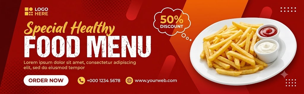
Use the uploaded image as the main design reference. Do not invent a new layout, color palette, typography system, or shape language — follow the upload exactly. Generate a wide horizontal food-promotion banner design in 3.2:1 aspect ratio, 1620 × 500 px composition. The final output must be a fully composited flat banner image — all zones, background colors, typography, graphic shapes, and the food subject must appear together in one single flat image. The transparency checkerboard (alpha channel) must not be visible anywhere in the final output. Every pixel of the 1620 × 500 px canvas must be filled with the banner design. Do not output a standalone transparent cutout or isolated subject. ZONE LOCK — THIS IS A HARD BOUNDARY: The left text/content zone occupies exactly 55% of the canvas width (891px at 1620px canvas). The right food image zone occupies exactly 45% of the canvas width (729px). The divider between them is a hard diagonal straight cut running from approximately 58% from the left at the top edge down to 48% from the left at the bottom edge, angled at approximately 10–12 degrees clockwise. The generator must not redistribute these zone widths or allow text content to bleed into the right image zone or vice versa under any circumstance. Layout: logo zone upper-left at 4%–18% width (65px–292px) and 8%–18% height (40px–90px). Script headline "Special Healthy" positioned at 4% from left and 22% from top. Main headline "FOOD MENU" positioned at 4% from left spanning to 52% width, occupying 28%–58% of banner height (140px–290px). Body copy directly beneath headline at 4%–52% width and 60%–72% height (300px–360px). CTA and contact row at 4%–55% width and 78%–90% height (390px–450px). Discount badge at 42%–54% width (680px–875px) and 8%–28% height (40px–140px). Food image composited right-centre at 52%–98% width (843px–1588px) and 5%–98% height (25px–490px). Strong left alignment across all content. Reading order: logo → "Special Healthy" script → "FOOD MENU" headline → discount badge → food image → body copy → "ORDER NOW" CTA → contact row. Background & color blocking: full canvas base is deep vivid red #C0180C with a subtle dark halftone dot texture pattern at approximately 15% opacity across the entire red zone — dots are deep burgundy-red #8B0000, small uniform circles in a regular grid pattern most visible in upper-left and lower areas. A dark maroon angled strip #7A0E09 along the far left edge running full canvas height approximately 3% of canvas width (49px), right edge cut at a slight inward diagonal. A large diagonal orange-to-red gradient panel in the upper-right occupying approximately 40%–100% width and 0%–65% height — gradient runs from vivid orange #E8650A at top-right corner fading into deep red #C0180C toward the lower-left boundary of this panel. The diagonal left edge of this orange panel cuts from approximately 40% from left at top edge to 58% from left at 65% canvas height, angled at approximately 20 degrees clockwise. This orange panel sits behind the food subject. Several small semi-transparent circular red highlights #D42020 at 25% opacity scattered across the red background zone. Four small white dot clusters (2×4 rectangular dot grids) positioned near upper-right at approximately 82% width and 12% height, and lower-right at approximately 88% width and 82% height. Additional small white dot cluster lower-left at approximately 8% width and 82% height. No flat solid yellow background block — yellow/gold used exclusively as accent color on text and icons only. Graphic shapes: dark maroon left-edge diagonal strip #7A0E09 approximately 3% canvas width full canvas height right edge angled inward. Large orange diagonal gradient panel upper-right as described above. Subtle circular red glow accents on red background. White dot grid clusters at four positions. All decorative elements remain in background layer beneath text and food subject. Typography: logo reads exactly "LOGO HERE" — small compact uppercase sans-serif, yellow square grid icon #FFD700 (small outlined square containing 4 smaller rounded squares) followed by "LOGO" in yellow #FFD700 and "HERE" in white #FFFFFF, positioned upper-left at 4% from left and 10% from top. Script headline reads exactly "Special Healthy" — one line, handwritten brush-script style, medium-weight connected letterforms with natural ink variation, warm yellow-gold #E8C430, positioned at 4% from left and 22% from top, approximately 30% of canvas width. Main headline reads exactly "FOOD MENU" — ultra-bold distressed grunge-texture uppercase sans-serif, white #FFFFFF with visible rough distressed texture on letterforms (intentionally weathered edges, not clean smooth strokes), positioned at 4% from left and 28% from top, spanning approximately 48% of canvas width and occupying 30% of canvas height, dominant text element at approximately 5× the cap height of body copy. Body copy line 1 reads exactly "Lorem ipsum dolor sit amet, consectetur adipiscing" — line 2 reads exactly "elit, sed do eiusmod tempor" — small-to-medium weight sans-serif, warm yellow-white #F0E080, positioned at 4% from left and 60% from top. CTA text reads exactly "ORDER NOW" bold uppercase sans-serif deep red #C0180C inside white pill. Phone reads exactly "+000 1234 5678" small bold sans-serif white #FFFFFF. Website reads exactly "(http://www.yourweb.com)" small bold sans-serif white #FFFFFF. CTA button: exact text "ORDER NOW", small horizontal pill-shaped rounded rectangle, white fill #FFFFFF, text deep red #C0180C bold all caps, approximately 13% of canvas width (211px) and 8% of canvas height (40px), left edge at 4% from canvas left (65px), vertical centre at 84% from canvas top (420px), thin red border outline #C0180C, no drop shadow, no icon. White fill is exclusive to the CTA only and does not repeat elsewhere as a background fill. Badge/promo tag: cloud thought-bubble outline shape — irregular organic bubble with small circular bumps along outer edge, white outline stroke #FFFFFF approximately 2px, transparent interior showing red background through, positioned at 43%–54% width (697px–875px) and 8%–28% height (40px–140px), exact text "50%" on first line in yellow-gold #FFD700 bold sans-serif and "DISCOUNT" on second line in white #FFFFFF bold sans-serif all caps, "50%" approximately 2× larger than "DISCOUNT", two small white circles beneath the bubble tail as speech-bubble connector dots, badge overlaps the boundary between text zone and image zone. Iconography/contact strip: horizontal row at 80%–88% canvas height left-aligned from 22% canvas width (357px) — first a small yellow #FFD700 filled circle approximately 16px diameter containing a simplified white handset symbol paired with "+000 1234 5678" in white bold small sans-serif, then a small yellow #FFD700 filled circle approximately 16px diameter containing a simplified white globe symbol paired with "(http://www.yourweb.com)" in white bold small sans-serif. No email location or social icons present. Logo: upper-left at 4% from canvas left and 10% from canvas top, approximately 14% canvas width total including wordmark, small yellow #FFD700 outlined square icon with four inner rounded squares, followed by "LOGO" in yellow #FFD700 and "HERE" in white #FFFFFF, no separate container. Photo/image subject: Condition B applied — food product composited directly onto banner, no user replacement supplied. SUBJECT CONTAINMENT LOCK: The french fries plate subject occupies exactly 43% of canvas width (697px) and 88% of canvas height (440px). Left edge anchored at 52% from canvas left (843px). Right edge anchored at 98% from canvas left (1588px) — right-side clipping of the plate at the canvas edge is intentional and must be preserved. Top edge anchored at 5% from canvas top (25px). Bottom edge anchored at 98% from canvas top (490px). The subject must not bleed left of 52% (843px) into the text content zone. Do not resize or reposition the subject beyond these four anchors. The food subject is a french fries serving composited directly onto the orange-red background panel — it is not a floating cutout, it is part of the assembled banner. A large round white ceramic plate #F5F5F5 with slightly raised rim viewed from a front-slightly-elevated angle. On the plate: a generous mound of golden-yellow french fries #E8B830 with darker golden-brown #C8922A tips and edges, irregular thin-cut sticks piled loosely occupying approximately 65% of the plate surface on the right side. On the left side of the plate: two white ceramic dipping sauce cups #ECECEC — one taller cylindrical cup containing bright red tomato ketchup #D42020 visible at the top, one shorter wider cup containing pale off-white cream sauce #F0EDE0. Lighting from upper-left — strong highlights on white plate rim and sauce cup surfaces, warm highlights on fry tips, soft shadows beneath fry pile. The plate sits directly over the orange diagonal background panel with a soft diffused shadow beneath it onto the background. The plate right edge clips at the canvas right boundary intentionally. The food subject must be rendered as part of the composited banner scene — not as an isolated transparent cutout. Render at maximum graphic-design quality pixel-accurate to the reference. The complete 1620 × 500 px canvas must be fully filled — no transparent regions, no checkerboard, no alpha channel visible anywhere. The left red content zone with all typography must be fully visible and unobstructed. The distressed grunge texture on "FOOD MENU" must be faithfully reproduced. The orange diagonal gradient panel must be clearly visible in the upper-right behind the food subject. The thought-bubble badge outline must be rendered with its organic bumped edge exactly as shown. No warped text, no paraphrased copy, no invented decorative elements, no watermark, no zone boundary violations, no transparent or isolated cutout output.
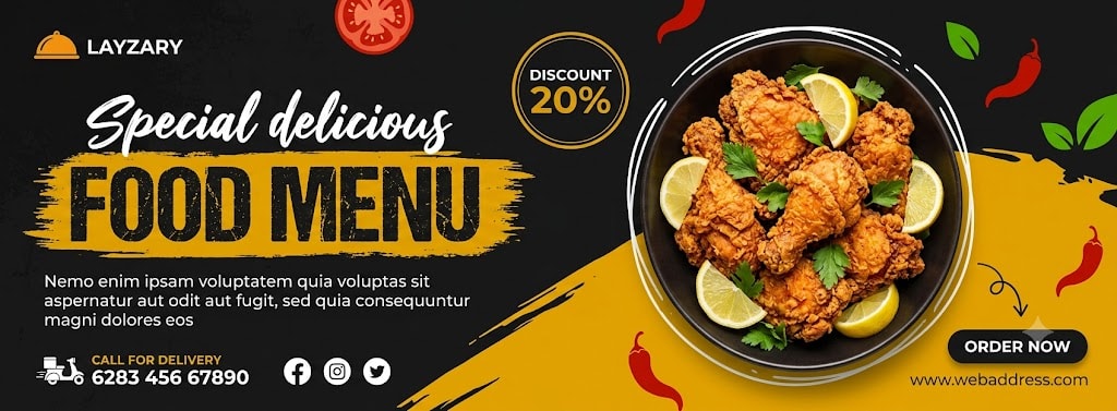
Use the uploaded image as the main design reference. Do not invent a new layout, color palette, typography system, or shape language — follow the upload exactly. Generate a wide horizontal food-promotion banner design in 2.7:1 aspect ratio, 1620 × 600 px composition. The final output must be a fully composited flat banner image — all zones, background colors, typography, graphic shapes, decorative elements, and the food subject must appear together in one single flat image. The transparency checkerboard (alpha channel) must not be visible anywhere in the final output. Every pixel of the 1620 × 600 px canvas must be filled with the banner design. Do not output a standalone transparent cutout or isolated subject. ZONE LOCK — THIS IS A HARD BOUNDARY: The left text/content zone occupies exactly 49% of the canvas width (794px at 1620px canvas). The right food image zone occupies exactly 51% of the canvas width (826px). The boundary between them is not a straight vertical line — it is a diagonal sweep: the large mustard-yellow paint diagonal block rises from the bottom-left at approximately 30% from canvas left and 100% canvas height, sweeping upward to approximately 60% from canvas left at 55% canvas height, then continuing to approximately 100% canvas width at 55% canvas height. This yellow diagonal sweep occupies the entire lower-right quadrant. The dark charcoal background occupies the upper-left zone behind all text content. The generator must not redistribute these zone proportions under any circumstance. Layout: logo zone upper-left at 3%–15% width (49px–243px) and 5%–15% height (30px–90px). Script headline "Special delicious" at 3% from left and 20% from top. Main headline "FOOD MENU" with yellow brush-stroke panel behind it at 3% from left spanning to 48% width, occupying 25%–52% of banner height (150px–312px). Body copy directly beneath headline at 3%–48% width and 54%–68% height (324px–408px). Contact and social strip bottom-left at 3%–45% width and 75%–90% height (450px–540px). Discount badge upper-centre at 42%–52% width (680px–842px) and 5%–22% height (30px–132px). Circular food bowl image composited centre-right at 48%–92% width (778px–1490px) and 3%–82% height (18px–492px). ORDER NOW CTA and website bottom-right at 68%–95% width and 78%–90% height. Reading order: logo → "Special delicious" script → "FOOD MENU" headline → food bowl image → discount badge → body copy → contact strip → "ORDER NOW" CTA → website. Background & color blocking: full canvas base is very dark charcoal-black #1A1A1A with a subtle distressed grunge texture — slight roughness and grain across the entire dark background, most visible in the upper-left and centre-left zones. This textured dark background fills 100% of the canvas as the base layer. On top of the dark base: a large bold mustard-yellow #E8A800 diagonal paint-sweep shape occupying the entire lower-right quadrant — left edge rising diagonally from approximately 30% canvas width at canvas bottom to approximately 55% canvas width at 55% canvas height, top edge running horizontally from 55% canvas height across to the right canvas edge, right edge at canvas boundary, bottom edge at canvas boundary. This yellow sweep has a slightly rough/brushy left edge rather than a perfectly clean diagonal cut. The yellow sweep sits above the dark background layer but below the food bowl and text content. No gradients — the yellow is flat mustard. Scattered red chili pepper accent shapes — approximately 4–5 irregular red chili silhouettes #CC2200 with curved elongated form, distributed near upper-right at 70%–85% width and 5%–20% height, and lower-right at 75%–90% width and 70%–85% height. Green leaf accent shapes — approximately 2–3 bright green leaf silhouettes #3A8A20 near the right edge at 85%–95% width and 15%–35% height. Small irregular red tomato/chili slice shapes — 2 cut cross-section silhouettes #CC2200 near 35%–45% width and 8%–18% height. White hand-drawn doodle outline — irregular freehand circle outline #FFFFFF approximately 3px stroke surrounding the circular food bowl area, giving the impression of a chalk or marker sketch drawn around the plate, slightly larger than the bowl itself with uneven gaps and overlapping strokes. Subtle distressed grunge texture across entire dark background at approximately 10% opacity. Graphic shapes: mustard-yellow diagonal paint sweep lower-right as described above. Rough yellow brush-stroke rectangle panel behind "FOOD MENU" text — approximately 3%–48% width and 27%–52% canvas height, fill mustard-yellow #E8A800 with heavily distressed rough brush-stroke edges on all four sides (not a clean rectangle — edges are frayed, uneven, paint-splatter style). White hand-drawn doodle circle outline around food bowl. Small thin curved black arrow-like doodle line near bottom-right at approximately 75% width and 72% height pointing toward the ORDER NOW button. Red chili silhouettes and green leaf accents as described above. Round discount badge outline circle at upper-centre. All decorative shapes layered above background but below or at same level as food bowl. Typography: logo reads exactly "LAYZARY" — small compact uppercase sans-serif, preceded by a small orange-yellow serving-dome/cloche icon #E8A800 (circular dome shape with small handle on top suggesting a restaurant serving cover), positioned upper-left at 3% from left and 6% from top, wordmark in white #FFFFFF approximately 10% canvas width. Script headline reads exactly "Special delicious" — one line, handwritten brush-script style, fluid connected letterforms with natural pressure variation, white #FFFFFF, positioned at 3% from left and 20% from top, approximately 32% of canvas width. Main headline reads exactly "FOOD MENU" — ultra-bold condensed uppercase sans-serif, mustard-yellow #E8A800 letters with visible white distressed edge treatment on letterforms (slightly rough white outline/highlight on the letter edges), sitting on top of the rough yellow brush-stroke panel, positioned at 3% from left and 27% from top, spanning approximately 45% of canvas width, approximately 5× the cap height of body copy — dominant element. Body copy line 1 reads exactly "Nemo enim ipsam voluptatem quia voluptas sit" — line 2 reads exactly "aspernatur aut odit aut fugit, sed quia consequuntur" — line 3 reads exactly "magni dolores eos" — small-weight sans-serif, white #FFFFFF, positioned at 3% from left and 54% from top, approximately 44% canvas width. Delivery text reads exactly "CALL FOR DELIVERY" small bold uppercase sans-serif white #FFFFFF. Phone reads exactly "6283 456 67890" small bold sans-serif white #FFFFFF. Website reads exactly "(http://www.webaddress.com)" small sans-serif white #FFFFFF positioned bottom-right. CTA reads exactly "ORDER NOW" bold uppercase sans-serif white #FFFFFF inside dark pill. CTA button: exact text "ORDER NOW", rounded pill-shaped capsule, dark charcoal-black fill #1A1A1A, text white #FFFFFF bold all caps, approximately 12% of canvas width (194px) and 7% of canvas height (42px), positioned bottom-right at approximately 72% from canvas left and 80% from canvas top, no border stroke, soft very subtle dark shadow beneath, no icon inside button. A thin curved hand-drawn doodle arrow line in dark charcoal #333333 near the button pointing toward it from the left. Badge/promo tag: circular badge shape with yellow-gold outline circle stroke #E8A800 approximately 3px, dark charcoal fill #1A1A1A inside, positioned upper-centre at 44%–52% width (713px–842px) and 5%–22% height (30px–132px), exact text "DISCOUNT" on first line in white #FFFFFF small bold uppercase sans-serif and "20%" on second line in mustard-yellow #E8A800 bold sans-serif, "20%" approximately 2.5× larger than "DISCOUNT", no tag extension or bubble tail — clean circle only. Iconography/contact strip: horizontal row at 76%–88% canvas height, left-aligned from 3% canvas width — first a small white flat delivery/vehicle icon (simplified truck or scooter silhouette) paired with "CALL FOR DELIVERY" in white bold small uppercase sans-serif above "6283 456 67890" in white bold small sans-serif, stacked vertically. Then three social media icons in a horizontal row: Facebook icon (white flat lowercase f in circle outline), Instagram icon (white flat camera outline in circle), Twitter/X icon (white flat bird in circle outline), all approximately 20px diameter, spaced evenly. Website "(http://www.webaddress.com)" in white small sans-serif positioned bottom-right at approximately 72% from canvas left and 87% from canvas top. Logo: upper-left at 3% from canvas left and 6% from canvas top, small orange-yellow serving dome icon #E8A800 above or beside wordmark "LAYZARY" in white #FFFFFF uppercase sans-serif, approximately 12% canvas width total, no container or badge, positioned directly on dark charcoal background. Photo/image subject: Condition B applied — food product composited directly onto banner, no user replacement supplied. SUBJECT CONTAINMENT LOCK: The circular food bowl subject occupies exactly 38% of canvas width (616px) and 75% of canvas height (450px). Left edge anchored at 50% from canvas left (810px). Right edge anchored at 90% from canvas left (1458px). Top edge anchored at 3% from canvas top (18px). Bottom edge anchored at 82% from canvas top (492px). The subject must not bleed left of 50% (810px) into the text content zone. Do not resize or reposition the subject beyond these four anchors. The food subject is a fried chicken bowl composited directly onto the banner — it is part of the assembled flat banner, not a floating cutout. A large round dark cooking bowl/plate #2A2A2A with a matte dark rim approximately 8% of bowl diameter, viewed from directly above (top-down bird's-eye angle). Inside the bowl: multiple pieces of golden-brown crispy fried chicken #C87820 with heavily textured craggy battered crust, warm amber-orange highlights on raised crust peaks, darker brown-mahogany #6B3A10 in the crevices, arranged loosely filling approximately 70% of the bowl interior. Between the chicken pieces: 3–4 bright yellow-green lemon/lime wedge slices #D4C830 with visible citrus segment texture. Scattered fresh bright green herb leaves (parsley or cilantro) #2A7A20 visible between chicken pieces. The bowl sits on the mustard-yellow diagonal sweep background in the lower portion and on the dark background in the upper portion. Lighting from directly above with slight upper-left bias — strong warm highlights on the chicken crust peaks, the lemon wedges are brightly lit, the bowl rim has a subtle specular highlight. A white hand-drawn doodle outline circle approximately 3px stroke #FFFFFF surrounds the entire bowl slightly larger than the bowl diameter with irregular hand-drawn character. Red chili silhouettes and green leaf shapes are scattered around the outside of the bowl as decorative elements extending beyond the bowl edge. The bowl subject must be rendered as part of the composited banner scene — not as an isolated transparent cutout. Render the bowl and all surrounding decorative elements (chili, leaves, doodle outline) composited directly onto the banner background. Render at maximum graphic-design quality pixel-accurate to the reference. The complete 1620 × 600 px canvas must be fully filled — no transparent regions, no transparency checkerboard, no alpha channel visible anywhere. The dark charcoal textured background must fill the entire canvas base. The mustard-yellow diagonal paint sweep must be clearly visible in the lower-right. The rough brush-stroke yellow panel behind "FOOD MENU" must have authentically frayed distressed edges. The white hand-drawn doodle circle around the bowl must have natural irregular hand-drawn character. The "pikbest" watermark visible in the reference is a stock-site overlay and must not be reproduced. No warped text, no paraphrased copy, no invented decorative elements beyond those described, no watermark, no zone boundary violations, no transparency checkerboard in output.
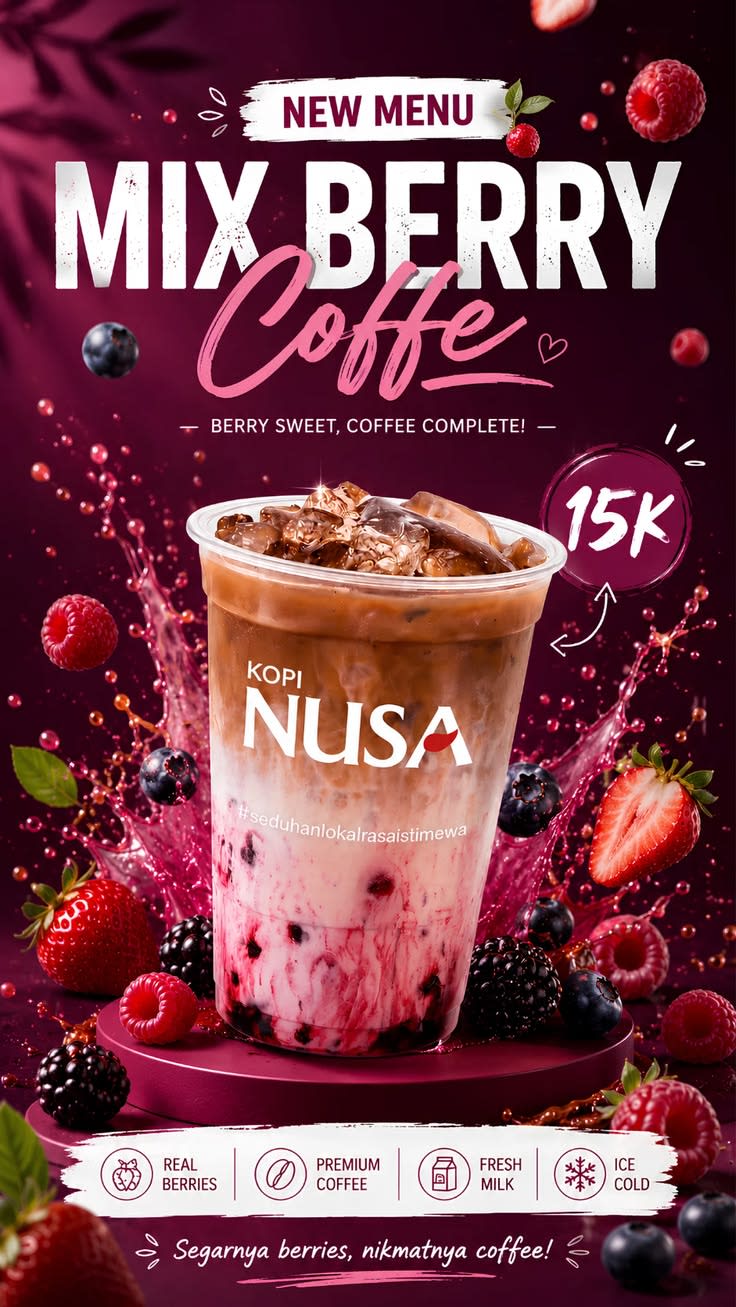
Generate a photorealistic product poster of an iced mixed-berry coffee drink in a clear plastic cup with dome lid, layered with a berry-swirled pink-and-white base, brown iced coffee on top, and stacked ice cubes, standing on a round burgundy pedestal platform, surrounded by a dramatic berry-juice splash and scattered fresh strawberries, raspberries, blueberries, and blackberries, in a portrait composition, with a stacked headline block at the top, the drink cup centered as the dominant hero in the middle-lower area, a circular price badge to its right, and a white feature-icon strip with a tagline beneath it at the bottom. Typography: render the following text exactly as written, with no spelling changes, no added words, and no dropped blocks — Headline: "NEW MENU" / "MIX BERRY" / "Coffee". Subhead: "BERRY SWEET, COFFEE COMPLETE!". CTA/button: "none present". Price/badge: "15K". Fine print: "none present". Additional locked text blocks: cup branding "KOPI" / "NUSA" and hashtag "#seduhanlokalrasaisitimewa" printed on the cup; feature strip "REAL BERRIES" / "PREMIUM COFFEE" / "FRESH MILK" / "ICE COLD"; bottom tagline "Segarnya berries, nikmatnya coffee!". Typeface style: "NEW MENU" in bold uppercase burgundy sans-serif sitting on a rough white brush-stroke banner, top-center; "MIX BERRY" in an enormous uppercase bold condensed sans-serif with a distressed/grunge texture, white, centered directly below; "Coffee" in a large pink handwritten script with an underline stroke beneath the headline; the subhead in small uppercase white sans-serif with dash ornaments on either side, centered; "15K" in a white handwritten brush style centered inside a dark-berry circular badge with a glowing outline and a small white arrow/doodle pointing toward it; "KOPI" in small clean sans-serif above "NUSA" in a larger clean serif/sans-serif hybrid, both white, centered on the cup; the hashtag in small white sans-serif across the lower cup; feature-strip labels in small uppercase sans-serif paired with thin line icons on a white brush-stroke strip; the bottom tagline in white handwritten script, centered. Product placement: cup centered and front-facing, occupying roughly 40–45% of the poster height, positioned slightly below the poster's midpoint, standing on a round burgundy pedestal platform with a soft contact shadow, transparent plastic cup showing the pink berry-swirl base transitioning to brown iced coffee with visible ice cubes on top and a clear dome lid. Branding: "KOPI NUSA" printed centered on the cup with the hashtag beneath it, no separate corner logo; 15K price badge fixed to the right side of the cup — do not resize, distort, recolor, or relocate this branding. Color palette: dominant deep burgundy/dark berry-purple background (about 55%, saturated and dark), vibrant berry pink splash and drink layer as secondary (about 20%), bright white headline, feature strip, and cup branding as accent (about 10%), warm brown iced-coffee layer (about 10%), raspberry-red, strawberry-red, blueberry-navy, and blackberry-purple fruit accents with small green leaf details (about 5%); white carries the primary contrast accent against the burgundy field, with the 15K badge in dark berry-red. Background: dark burgundy gradient background with subtle shadowed leaf textures and berry-themed depth, a dramatic pink-red berry-juice splash erupting behind and around the cup, floating berries, juice droplets, and small white decorative doodles scattered throughout, layered depth with the burgundy gradient and leaf shadows furthest back, the headline and berry splash in the middle layer, and the cup, platform, foreground berries, and bottom feature strip sharp in the front layer; no watermark, no additional logos. Lighting: soft frontal to top-front commercial lighting, soft contact shadow beneath the cup on its platform, glossy reflections on the plastic cup, ice cubes, lid, and liquid surface, overall photorealistic beverage-composite finish with a glossy berry splash, cup and foreground fruit sharp while some background fruits and droplets are slightly softened, straight-on beverage-advertising camera perspective. Render at maximum quality, matching the uploaded reference's exact layout, typography content and hierarchy, product geometry and color, branding placement, and lighting. No garbled, misspelled, duplicated, or invented text. No warping, no logo distortion, no added props, no watermark unless specified above. Sharp, legible type throughout; natural material texture on the product.
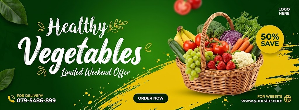
Use the uploaded image as the main design reference. Do not invent a new layout, color palette, typography system, or shape language — follow the upload exactly. Generate a wide horizontal healthy food promotion banner design in 2.7:1 aspect ratio, 1620 × 600 px composition. The final output must be a fully composited flat banner image — all zones, background colors, typography, graphic shapes, decorative elements, and the food subject must appear together in one single flat image. The transparency checkerboard (alpha channel) must not be visible anywhere in the final output. Every pixel of the 1620 × 600 px canvas must be filled with the banner design. Do not output a standalone transparent cutout or isolated subject. The stock site overlays reading "IMAGE NOT INCLUDED" and "PSD FILE • FULLY EDITABLE • FREE FONT USE" visible in the reference are watermarks and must not be reproduced. ZONE LOCK — THIS IS A HARD BOUNDARY: The left headline/content zone occupies exactly 43% of the canvas width (697px at 1620px canvas). The right image/promo zone occupies exactly 57% of the canvas width (923px), spanning from 43% to 100% from the left (697px to 1620px). The boundary between zones is not a hard vertical line — the yellow brush-stroke band and the vegetable basket subject from the right zone bleed slightly into the centre. The generator must maintain the left zone as the primary readable text area and must not allow text to overlap the basket subject. The generator must not redistribute these zone proportions under any circumstance. Layout: script accent "Healthy" upper-left at 4%–30% width (65px–486px) and 10%–24% height (60px–144px). Main headline "Vegetables" left-middle at 4%–42% width (65px–680px) and 22%–55% height (132px–330px). Script offer text "Limited Weekend Offer" near lower-right edge of "Vegetables" headline at approximately 22%–40% width and 52%–60% height. Delivery strip bottom-left at 4%–25% width and 72%–88% height (432px–528px). ORDER NOW CTA button bottom-centre at 36%–50% width (583px–810px) and 74%–88% height (444px–528px). Vegetable basket composited right-centre at 38%–95% width (616px–1539px) and 8%–88% height (48px–528px). Logo "LOGO HERE" upper-right at 80%–92% width (1296px–1490px) and 5%–13% height (30px–78px). Badge "50% SAVE" upper-right at 84%–95% width (1361px–1539px) and 15%–33% height (90px–198px). Website strip bottom-right at 65%–90% width (1053px–1458px) and 72%–88% height (432px–528px). Reading order: "Healthy" → "Vegetables" → "Limited Weekend Offer" → vegetable basket → "50% SAVE" badge → delivery strip → "ORDER NOW" → website strip. Background & color blocking: full canvas base is a deep saturated green #1A7A1A with a subtle radial brightening at the canvas centre — centre-right area brightens to a fresher vivid green #2A9A2A fading outward to deeper forest green #0F5A0F at the corners. This green fills 100% of the canvas as the base layer. On top of the green base: a large bold yellow paint-brush-stroke band #E8C820 sweeping across the lower-centre and lower-right of the banner — left edge of the yellow band starts at approximately 28% from canvas left and 45% from canvas top (273px, 270px), sweeping diagonally upward-right with rough brushy edges to approximately 55% from left at 35% from top (891px, 210px), then spreading across to fill the entire lower-right quadrant from approximately 35% canvas height down to 88% canvas height and 40% canvas width to 100% canvas width — the yellow band has heavily distressed rough brush-stroke edges on all sides with irregular paint-splatter marks extending beyond the main band mass, not a clean geometric shape. Subtle darker green texture/leaf pattern at very low opacity across the full dark green background. Large bright green leaf shapes — two prominent leaf clusters: one at upper-left corner at 0%–12% width and 0%–30% height, dark green leaf with visible veining #1A6A0A extending partly off-canvas; one at lower-left at 0%–8% width and 70%–100% height, similar dark green leaf. Small yellow-gold leaf/doodle accent shapes #D4A810 approximately 4–6 small leaf silhouettes scattered around the "Healthy" and "Vegetables" headline area. Small paint-splatter marks in yellow #E8C820 scattered near the brush-stroke band edges. Blurred red tomato/strawberry shapes at upper-right approximately 75%–85% width and 2%–12% height — 2–3 red fruit silhouettes partially cut off at the top canvas edge creating a motion/floating effect. Graphic shapes: large yellow brush-stroke band lower-centre/right as described above with heavily distressed rough edges and paint-splatter accents. Dark green corner leaf clusters upper-left and lower-left. Small yellow leaf doodle accents around headline. Red fruit silhouette accents upper edge. Yellow badge circle upper-right. All shapes composited as part of the flat banner. Typography: logo reads exactly "LOGO HERE" — very small compact uppercase sans-serif, white #FFFFFF, positioned upper-right at 80% from canvas left and 6% from top, approximately 10% canvas width, no icon, no container. Script accent reads exactly "Healthy" — medium-large handwritten chalk-style script font, white #FFFFFF with slightly rough textured stroke suggesting chalk or paint, slight upward-left to upper-right slant, small yellow-gold olive branch or leaf doodle accent #D4A810 at the end of the word, positioned at 4% from left and 11% from top, approximately 26% canvas width. Main headline reads exactly "Vegetables" — very large decorative white script font #FFFFFF with smooth thick strokes and natural calligraphic variation, slightly larger and bolder than "Healthy", positioned at 4% from left and 23% from top, spanning approximately 38% canvas width — dominant text element at approximately 2.5× the size of "Healthy". Script offer text reads exactly "Limited Weekend Offer" — small handwritten italic script, white #FFFFFF at approximately 70% opacity, positioned at approximately 22% from left and 53% from top near the lower tail of "Vegetables", approximately 18% canvas width. CTA reads exactly "ORDER NOW" — small bold uppercase sans-serif, white #FFFFFF inside dark pill. Delivery label reads exactly "FOR DELIVERY" — very small bold uppercase sans-serif, white #FFFFFF. Phone reads exactly "079-5486-899" — small bold sans-serif, white #FFFFFF. Website label reads exactly "FOR WEBSITE" — very small bold uppercase sans-serif, white #FFFFFF. Website URL reads exactly "(http://www.yoursite.com)" — small sans-serif, white #FFFFFF. Badge text reads exactly "50%" on first line and "SAVE" on second line — dark green #0F5A0F bold sans-serif, "50%" approximately 2× larger than "SAVE". CTA button: exact text "ORDER NOW", small rounded pill-shaped capsule, very dark green near-black fill #0A2A0A, text white #FFFFFF bold uppercase small sans-serif, approximately 11% of canvas width (178px) and 8% of canvas height (48px), centre at approximately 43% from canvas left (697px) and 81% from canvas top (486px), no border stroke, no drop shadow, no icon. Badge/promo tag: solid yellow circle #E8C820 approximately 8% of canvas width (130px diameter), centre at approximately 89% from canvas left (1442px) and 24% from canvas top (144px), exact text "50%" on first line and "SAVE" on second line in dark green #0F5A0F bold sans-serif all caps, "50%" approximately 2× taller than "SAVE", no outline stroke on circle. Iconography/contact strip: bottom-left delivery group at 4%–24% width and 73%–87% height — a small yellow #E8C820 phone/delivery handset icon approximately 20px, above or beside stacked text "FOR DELIVERY" in white very small bold uppercase sans-serif on line one and "079-5486-899" in white small bold sans-serif on line two. Bottom-right website group at 65%–90% width and 73%–87% height — a small yellow #E8C820 globe/link icon approximately 16px, beside stacked text "FOR WEBSITE" in white very small bold uppercase sans-serif on line one and "(http://www.yoursite.com)" in white small sans-serif on line two. No social icons, no email icon present. Logo: upper-right at 80% from canvas left and 6% from canvas top, "LOGO HERE" in white #FFFFFF very small compact uppercase sans-serif, approximately 10% canvas width, no icon, no container, positioned directly on green background. Photo/image subject: Condition B applied — vegetable basket composited directly onto banner, no user replacement supplied. SUBJECT CONTAINMENT LOCK: The vegetable basket subject occupies exactly 50% of canvas width (810px) and 78% of canvas height (468px). Left edge anchored at 40% from canvas left (648px). Right edge anchored at 93% from canvas left (1507px) — slight right-side blending into background at outer edge. Top edge anchored at 8% from canvas top (48px). Bottom edge anchored at 88% from canvas top (528px). The basket must not bleed left of 40% (648px) into the primary text zone. Do not resize or reposition the subject beyond these four anchors. The product subject is a wicker vegetable basket composited directly onto the banner — it is part of the assembled flat banner, not a floating cutout. Primary subject: a large round wicker basket #8B5A20 with natural woven texture — horizontal and diagonal weave pattern in warm amber-brown #A06820 with darker brown shadow weave lines #5A3010, viewed from a slightly elevated front angle showing the interior contents clearly. The basket has a tall arched wicker handle #6B4010 rising above the basket body. Inside and overflowing from the basket: a generous abundant arrangement of fresh mixed vegetables and fruits including — bright red tomatoes #CC2020 (3–4 round fruits), a cluster of green grapes #4A8A20 (small round translucent green berries), a large head of green broccoli #2A6A10, a red-purple cabbage #6A1A4A (round dense head), several green zucchini/courgette #3A7A10 (elongated cylindrical), orange carrots #D46010 (tapered with green tops), yellow banana cluster #D4C020 (curved yellow fruits), bright red strawberries #CC2020 with green caps, a white cauliflower head #ECECEC, and additional assorted vegetables filling the basket completely with items spilling over the basket edge. Lighting from the upper-right — strong highlights on the upper-facing surfaces of all items, saturated colours throughout, fresh and vibrant appearance. The basket sits against the yellow brush-stroke band background in its lower portion and the green background in its upper portion. The outer edges of the basket and overflowing produce blend naturally into the banner background with no hard rectangular cutout border. The subject must be rendered as part of the composited banner scene — not as an isolated transparent cutout. Render at maximum graphic-design quality pixel-accurate to the reference. The complete 1620 × 600 px canvas must be fully filled — no transparent regions, no transparency checkerboard, no alpha channel visible anywhere. The deep green radial background must have visible brightening at the centre fading to darker corners. The yellow brush-stroke band must have authentically rough distressed paint edges with visible paint-splatter marks. The "Healthy" and "Vegetables" script headlines must feel naturally calligraphic with textured chalk or paint stroke quality. The large dark green corner leaf clusters must be clearly visible. The stock watermarks "IMAGE NOT INCLUDED" and "PSD FILE • FULLY EDITABLE • FREE FONT USE" must not be reproduced. No warped text, no paraphrased copy, no invented decorative elements beyond those described, no watermark, no zone boundary violations, no transparency checkerboard in output.
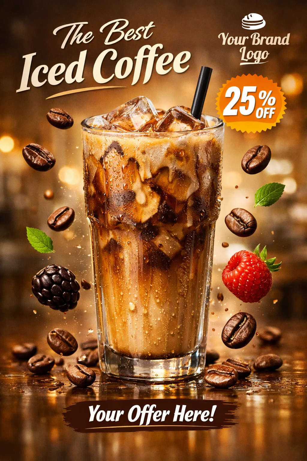
Hyper-realistic social media poster of a tall glass of iced coffee with visible ice cubes, condensation, and coffee beans scattered dynamically around. Floating coffee beans mid-air for motion effect. Soft cinematic lighting with warm highlights and reflective surface. Background: blurred café or gradient light brown backdrop. Text placeholders: ‘The Best Iced Coffee’, discount badge, and brand logo. Commercial-ready, Instagram-friendly, high-resolution.
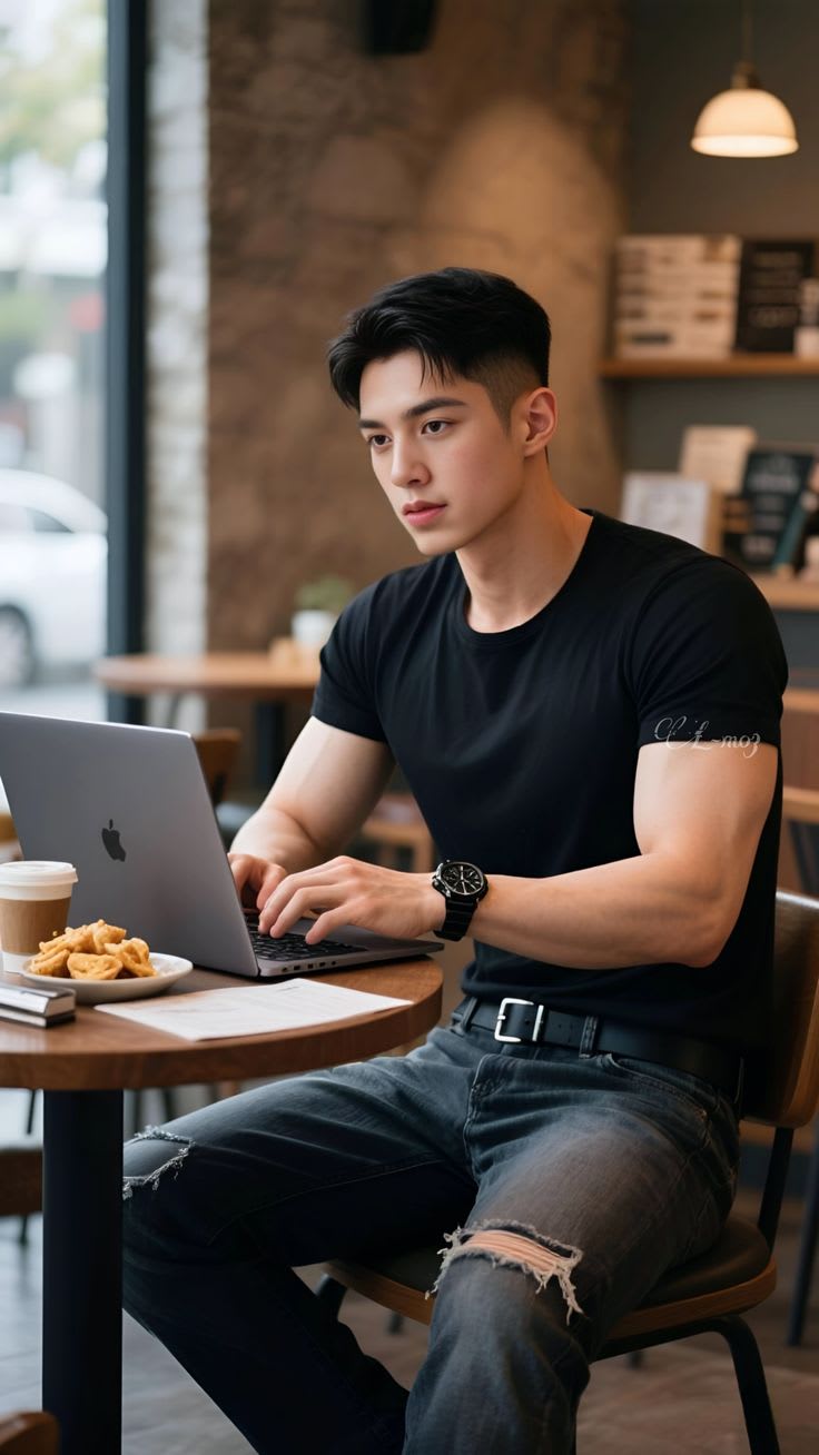
Use the uploaded image as the sole identity reference and preserve the exact face anatomy and identity of the person in it — the face must remain recognizably identical to the upload. Do not replace, swap, redesign, beautify, slim, widen, age, de-age, feminize, soften, or make the face more symmetrical or more model-like. Do not use any other face as reference. Preserve the exact overall face shape, forehead height and width, eye shape and spacing, eyelid state, eyebrow thickness and angle, nose bridge and tip shape, cheekbone structure, jawline shape, chin length and sharpness, upper and lower lip proportions, nose-to-lip and lip-to-chin distance, skin tone and undertone, natural facial asymmetry, hairline, hair volume, hair texture, hair length, and natural styling exactly as in the identity reference. Preserve the exact facial-hair state from the identity reference image used at generation time — if beard, mustache, or stubble is present, keep it exactly and do not shave, reduce, soften, or remove it; if clean-shaven, keep it clean-shaven. Do not copy or impose the expression from the café reference image onto the identity source; keep the original person’s natural masculine facial structure and natural expression style intact. Retouching level 3.5/10 to 4/10 — remove only minor noise or unevenness; keep natural skin texture, pores, facial-hair texture, and asymmetry; do not smooth, sharpen, slim, feminize, or generify the face. Create a vertical 9:16 ultra-realistic editorial lifestyle café portrait of a young man seated at a small round wooden café table, framed from upper head down to thighs, occupying the center-right of the frame, with the laptop and table filling the lower-left foreground. The subject is seated indoors in a modern café beside a large side window on image-left, wearing a fitted short-sleeve black crew-neck T-shirt with smooth cotton texture, low sheen, natural fabric tension across the chest and upper arms, subtle sleeve folds at the shoulder and bicep, dark blue-gray ripped denim jeans with worn fabric texture, visible distressed tears around the knees and thigh area, and a black belt with a metallic rectangular buckle. A black wristwatch with a dark round face and metallic details is on the wrist closest to image-left, visible while typing. His hands rest naturally on a gray/silver laptop keyboard, fingers lightly positioned as if typing, elbows bent, forearms visible, posture slightly leaning forward with focused calm attention. His body faces slightly toward viewer’s LEFT / image-left, seated in a wooden café chair, with shoulders relaxed and torso angled toward the laptop. Keep the expression neutral, calm, focused, and natural; do not impose a softer, delicate, or stylized expression from the reference image. GAZE LOCK — the full head turn is naturally angled toward viewer’s LEFT / image-left in a slight three-quarter angle, and the eyes/pupils look toward viewer’s LEFT / image-left at the laptop area, not direct-to-camera, not eyes-only side glance. GARMENT-STATE LOCK — short sleeves clearly end around upper bicep level, forearms fully visible, not rolled, not long-sleeved, not hidden. On the table are a disposable takeaway coffee/tea cup with a warm beige sleeve on the left side near the laptop, a small white plate containing irregular golden fried snack pieces / fries, one or more light-colored paper sheets lying flat near the front edge of the table, and a small additional item near or slightly behind the plate such as a closed notebook / booklet or stacked paper object, subtly visible and naturally placed. Keep the plate contents slightly varied and natural-looking rather than overly uniform. The silver-gray laptop remains open in front of the subject with a visible dark Apple logo on the back. BACKGROUND LOCK — real café interior with a large vertical side window on image-left showing a softly blurred outdoor street view and a pale car shape visible through the glass; the window area must remain only a secondary side element, softly diffused, muted, and naturally blurred, not bright white, not overexposed, not sharp, and not dominant in the frame. Reduce the visual dominance of the window / reflective side area so it does not cover or overpower the lamp and cupboard. Behind the subject is a warm medium-brown textured wall that is slightly darker and more controlled in brightness, matching the reference more closely. The wall must not appear too bright. A soft warm pool of light from the hanging lamp should fall visibly onto the wall behind the subject, creating a gentle lamp glow on the wall surface. On image-right behind the subject there is a cupboard / shelving unit with softly blurred books, stacked boxes, or menu items; this cupboard/books area must be clearly visible and more prominent than the window reflection area. In the upper-right background there is a single hanging pendant lamp with a white dome shade, softly glowing with low warm intensity; the lamp must remain visible, not hidden, not overly bright, not blown out, and not visually dominant. Keep the entire background more strongly blurred with smooth natural depth of field; the shelf, books, lamp, wall details, and window scene should all remain clearly readable as objects but visibly more out of focus. Do not invent plants, curtains, doors, studio backdrop, outdoor full city scene, extra furniture, or wrong wall color. Do not let the side reflective/window area hide the cupboard or the lamp. SHADOW LOCK — soft natural contact shadows under the arms, laptop, cup, plate, papers, table edge, and chair; shadows fall gently downward and slightly to image-right with warm brown midtone softness; do not remove, over-soften, or harshen it. Lighting is mixed natural window light and warm café practical light: broad soft key light from the large side window at image-left, slightly above face height, diffused through glass, approximately 5200K, creating a soft loop-to-broad lighting pattern across the face; warm pendant and interior ambient fill from image-right and background at approximately 3000K to 3200K, low intensity, producing a subtle warm-cool café contrast with soft edge quality and moderate shadow depth. The pendant lamp should provide gentle atmosphere only, not strong brightness, and its warm illumination should create a soft visible glow on the wall behind it. No hard flash, no harsh rim light, no dramatic glow. Color science is natural warm-neutral café grading with muted warm brown midtones, creamy beige highlights, soft gray-blue denim tones, deep neutral black clothing, slightly warm skin tones, and gentle indoor contrast. The outside window area should stay pale gray-white and softly blurred but controlled, not overexposed. No HDR, no tone mapping, no clarity boost, natural dynamic range, no artificial LUT. Camera feel is full-frame editorial lifestyle photography, 50mm to 70mm focal length range with mild portrait compression, f/1.8 to f/2.8 aperture range producing shallow depth of field, eye-level to slightly above-table camera angle, subject sharp with background strongly and smoothly defocused, smooth round medium-size bokeh in warm amber, beige, brown, and muted gray tones, clean digital sensor output, no grain, no noise, natural sharpening only, no visible lens distortion, no chromatic aberration, no heavy vignette. White balance should preserve mixed lighting: neutral daylight on the face from image-left and warm tungsten ambiance in the café background. Aspect ratio 9:16 vertical.
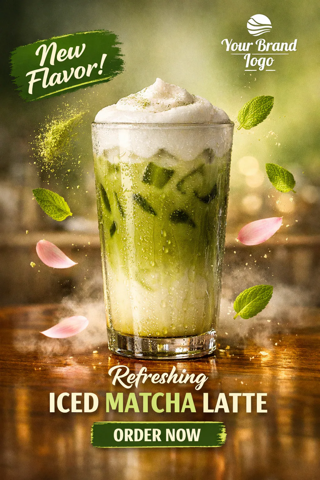
Ultra-realistic social media poster of a tall glass of iced matcha latte with condensation, topped with whipped foam. Floating matcha powder and mint leaves around the glass. Soft natural lighting, reflective wooden table surface. Background: blurred café or soft green gradient. Include text placeholders for ‘New Flavor’, brand logo, and call-to-action. Professional, high-resolution, commercial-ready