
Comparte tu calificación, comentarios e imagen opcional.
Accede a este prompt vía la API de PLH.
Metadatos

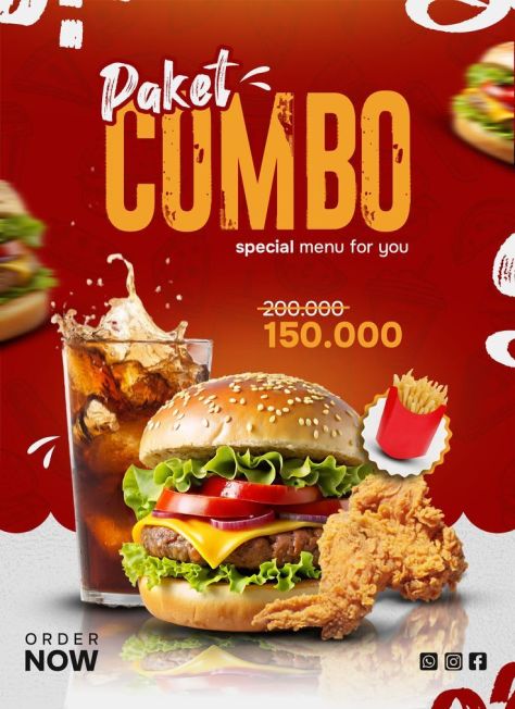
Generate a photorealistic product poster of a fried-chicken cheese burger (toasted sesame bun, melted cheese dripping down the sides, crispy fried chicken patty, lettuce, tomato) layered as a cutout composite over a flat graphic background, in a portrait composition, with a large curved deep-maroon abstract shape occupying the left and lower portion of the frame behind giant cropped "BURGER" typography, the burger positioned center-right overlapping that oversized text, the top area holding smaller headline text and a social handle, and the offer/CTA block stacked in the lower-right. Typography: render the following text exactly as written, with no spelling changes, no added words, and no dropped blocks — Headline: "Super" / "Delicious" / "Cheesy Crunch" / "Burger" (mixed placement across the top area, not a single stacked block). Subhead: "none present". CTA/button: "Order Now". Price/badge: "50%" / "OFF". Fine print: "none present". Typeface style: "Super" in a thin dark-brown handwritten script, tilted, top-left; "Delicious" in a bold black/dark-brown sans-serif directly beside it; "Cheesy Crunch" and "Burger" in a dark-brown serif display typeface, spread across the top-center; the social handle "@crunchycrave_food" in small bold black sans-serif at the top-right; a giant "BURGER" rendered in an extremely large, bold, cropped block sans-serif in deep maroon-brown, stacked vertically down the left/bottom edge of the poster and partially cut off by the frame edges; "50%" and "OFF" in a large decorative serif/display typeface with an outlined, shadowed look, dark maroon, stacked on the right side; "Free Home" and "delivery" in bold black sans-serif beside a scooter-delivery icon; "Order Now" in bold rounded sans-serif, beige/gold color, centered inside a filled maroon pill-shaped button; the phone number "+91 98765 43210" in bold dark text below the button beside a phone icon. Product placement: burger positioned center-right, overlapping the giant background typography, occupying roughly 40–45% of the poster height, straight-on hero side view, treated as a photorealistic cutout composited flatly onto the graphic background with no realistic table surface or cast shadow — just soft product-level shading; falling sesame seeds scattered above the burger and glossy melted cheese dripping downward from between the bun layers. Branding: no formal logo present; keep "@crunchycrave_food" fixed at the top-right corner, the "Order Now" pill CTA and phone number stacked at the bottom-right, and the delivery scooter icon beside "Free Home delivery" — do not invent, add, distort, or relocate any branding elements. Color palette: dominant warm beige/tan background (about 55%, medium-light, low saturation), deep maroon-brown oversized typography and curved graphic shape as secondary (about 25%), golden-orange bun and dripping cheese as accent (about 15%), green lettuce and red tomato as a smaller freshness accent, black text and icons (about 5%); maroon carries the CTA and giant-type brand accent against the beige field. Background: flat beige base with one large dark maroon curved abstract shape sweeping behind and around the burger, layered depth with the beige background furthest back, the maroon curve and oversized cropped "BURGER" typography in the middle layer, and the burger, discount text, CTA, and delivery details sharp in the front layer; no additional props beyond the burger itself, no watermark beyond the social handle. Lighting: soft frontal commercial lighting on the burger with glossy highlights on the melted cheese and bun, minimal to no realistic cast shadow consistent with a cutout-composite style, overall photorealistic burger cutout over a flat, sharply rendered graphic poster layout, straight-on food-hero camera perspective. Render at maximum quality, matching the uploaded reference's exact layout, typography content and hierarchy, product geometry and color, branding placement, and lighting. No garbled, misspelled, duplicated, or invented text. No warping, no logo distortion, no added props, no watermark unless specified above. Sharp, legible type throughout; natural material texture on the product.

Generate a photorealistic product poster of grilled chicken kebab skewers (three wooden skewers threaded with charred, spice-rubbed chicken chunks with visible char marks and grill texture, garnished with parsley flecks) floating diagonally on the left-center of the frame, alongside floating cucumber slices, cut onion rings, herb leaves, and golden spice particles suspended around the upper-right, with a small white ridged ramekin of bright orange dipping sauce lower-right, its contents caught mid-splash rising upward and to the side, against a smooth deep dark-red studio background, in a portrait composition with no table surface, no text, and no branding of any kind. Typography: none present anywhere in the composition — no headline, no subhead, no CTA, no price/badge, no fine print, no logo, no watermark, no captions. Preserve a completely text-free food hero image. Product placement: chicken skewers positioned slightly left of center, rising diagonally from lower-left toward upper-center, together with the sauce cup occupying roughly 65–70% of the visible poster height; skewers tilted at a natural floating angle with no ground contact; sauce cup tilted slightly upward toward the viewer in the lower-right, its orange contents splashing and curling upward with droplets suspended in the air around it; cucumber slices, onion rings, and herb leaves floating at varying depths in the mid-right area with slight scatter for a sense of freefall. Branding: absent — no logo, no brand name, no social icons, no watermark should be added anywhere in the image. Color palette: dominant deep dark red/burgundy background (about 60%, saturated and warm, slightly darker toward the corners), charred orange-brown grilled chicken as secondary (about 20%), bright orange dipping-sauce splash as accent (about 10%), fresh cucumber green as a contrasting accent (about 7%), white onion rings, green herb flecks, and golden spice particles as small supporting details (about 3%). Background: smooth dark red studio gradient with no visible surface or floor, subtle depth created by floating spice particles near the skewers, layered composition with the dark red background furthest back, floating cucumber/onion/herb/spice elements in the middle layer, and the sharp chicken skewers and sauce cup in the front layer; no props beyond those listed, no watermark. Lighting: soft front-left to top-left commercial lighting, no strong ground shadow since all elements float, soft object-level shading to create depth and dimension, glossy highlights on the moist grilled chicken glaze, the sauce splash, and the wet cucumber surfaces, overall photorealistic food-advertising composite finish, main skewers and sauce cup rendered sharp while the background stays smooth and unobtrusive, close-up food-advertising camera perspective. Render at maximum quality, matching the uploaded reference's exact layout, product geometry and color, lighting, and text-free composition. No garbled, misspelled, duplicated, or invented text of any kind. No warping, no added props, no watermark, no logo. Sharp detail and natural material texture on all food elements.

Generate a photorealistic product poster of a Lay's West Indies' Hot 'n' Sweet Chilli potato chips packet (orange packaging with red concentric swirl graphics) standing upright on a glossy red reflective surface, surrounded by rising flames, smoke wisps, floating potato chips, red chilies, garlic bulbs and cloves, sugar cubes, spice flakes, and oil droplets, in a portrait composition, with the headline occupying the top negative space, the packet centered as the dominant focal point taking up the middle and lower-middle of the frame, and fire/ingredient props layered around it in the foreground. Typography: render the following text exactly as written, with no spelling changes, no added words, and no dropped blocks — Headline: "SPACE FOR" / "HEADLINE" (two stacked lines, center-aligned, top of frame). Subhead: "none present". CTA/button: "none present". Price/badge: "₹30". Fine print: small nutrition information text on the lower-right of the packet, present but not fully legible. Typeface style: headline in a large, bold, heavy uppercase sans-serif, pure white, tightly tracked, centered, roughly twice the size of the packet's flavor text, with strong contrast against the background and no outline or shadow; price badge in a bold rounded sans-serif, red text on a bright yellow circular badge; on-pack flavor text in white sans-serif, centered. Product placement: packet centered and upright, front-facing with a straight-on hero-shot angle, occupying roughly 65–70% of the poster height, standing on a glossy reflective red surface with realistic packaging folds and a soft contact shadow plus surface reflection beneath it. On the packet itself, faithfully reproduce: a yellow circular ₹30 price badge in the upper-left area with bold red numerals; the Lay's wordmark in white on a red-and-yellow circular logo centered on the packet; "West Indies'" and "Hot 'n' Sweet Chilli" in white centered text directly below the logo; raw potato and sliced potato chips illustrated in the lower-left of the packaging artwork; small nutrition information panel in the lower-right of the packaging artwork. Branding: Lay's wordmark in white on a red badge with a yellow circular background, centered on the packet at roughly its middle third; ₹30 badge fixed in the upper-left packet area; do not resize, distort, recolor, or relocate this branding. Color palette: dominant fiery orange-red gradient background (about 60%, saturated and warm), orange packet with red swirl graphics as secondary (about 20%), bright yellow logo-circle and price-badge accents (about 10%), white headline and flavor text (about 5%), deep red chili/flame/shadow accents (about 5%); yellow carries the price/brand accent against the red-orange field. Background: fiery red-to-orange gradient background with rising flames and drifting smoke wisps, layered depth with a soft blurred back layer of gradient and smoke, a midground of flames and slightly motion-blurred floating chips/ingredients, and a sharp foreground of the packet plus crisp red chilies, garlic cloves, and sugar cubes resting on the glossy red surface; no watermark, no additional logos. Lighting: strong frontal commercial lighting with a warm glow rising from below, soft contact shadow and glossy surface reflection under the packet, glossy specular highlights across the packet's plastic surface, overall photorealistic commercial food-poster composite finish, packet rendered sharp while some side chips and particles carry slight motion blur, straight-on product-advertising camera perspective. Render at maximum quality, matching the uploaded reference's exact layout, typography content and hierarchy, product geometry and color, branding placement, and lighting. No garbled, misspelled, duplicated, or invented text. No warping, no logo distortion, no added props, no watermark unless specified above. Sharp, legible type throughout; natural material texture on the product.

Generate a photorealistic product poster of a large red-velvet cupcake with a pleated bronze-toned wrapper, a pink cake base, tall swirled cream-beige frosting piped in smooth folds, and a glossy strawberry-cherry topping, positioned as a right-side hero product layered over a graphic deep-red background, in a portrait composition, with the typography stack left-aligned occupying the left half of the frame, the cupcake dominant on the right and lower-right cropped slightly at the bottom and right edges, faint oversized diagonal "CUPCAKE" letterforms visible as a background texture, and small blurred cupcake props tucked into the top-right and bottom-left corners. Typography: render the following text exactly as written, with no spelling changes, no added words, and no dropped blocks — Headline: "Delicious" / "CUP" / "CAKE". Subhead: "A Little Frosting Makes" / "Everything Better.". CTA/button: "ORDER NOW". Price/badge: "none present". Fine print: "none present". Typeface style: "Delicious" in an elegant white handwritten script, top-left; "CUP" and "CAKE" in a huge uppercase condensed block sans-serif, left-aligned, stacked directly beneath, rendered in a soft cream-beige to dusty-pink tonal gradient with "CUP" slightly lighter/cream and "CAKE" a muted pink-mauve; the body copy in clean white sans-serif sentence case, left-aligned, smaller than the headline, positioned below it; "ORDER NOW" in bold condensed uppercase dark maroon sans-serif, centered inside a beige rounded-rectangle button beneath the body copy; faint oversized diagonal background letterforms in a barely-visible darker red tone, no other text effects, no drop shadows on the main headline. Product placement: cupcake positioned right side, lower-middle to bottom-right, occupying roughly 50–55% of the poster height, front-facing with slight side perspective, layered as a photorealistic/CGI-polished composite directly over the red graphic background with no visible tabletop, soft shading on the frosting folds and wrapper pleats, no strong ground shadow. Branding: no formal logo or brand mark present; keep "Delicious CUP CAKE" as the sole promo identity on the left and the "ORDER NOW" button beneath the body copy as the only CTA — do not invent or add any logo, handle, or icon. Color palette: dominant deep burgundy-red gradient background (about 60%, dark and saturated), cream-beige headline, frosting, and CTA button as secondary (about 25%), pink-red cupcake base and berry topping as accent (about 10%), white script/body text as a smaller accent (about 5%); cream-beige carries the primary brand-identity accent against the burgundy field, with dark maroon reserved for the CTA text. Background: deep red-to-burgundy gradient with subtle darker shadow falloff and faint oversized diagonal "CUPCAKE" letterforms as a barely-visible textural pattern, one blurred cupcake prop softly cropped in the top-right corner and another in the bottom-left corner, layered depth with the red gradient and faint typography pattern furthest back, the main text stack and CTA in the middle layer, and the large cupcake hero sharp in the front layer; no watermark, no additional props. Lighting: soft front-left to top-left commercial lighting, smooth creamy highlights along the piped frosting swirls, glossy specular highlight on the berry topping, soft shading with no strong cast shadow, overall polished photorealistic dessert-composite finish, main cupcake in sharp focus while corner cupcake props are heavily blurred, close-up dessert-advertising camera perspective. Render at maximum quality, matching the uploaded reference's exact layout, typography content and hierarchy, product geometry and color, branding placement, and lighting. No garbled, misspelled, duplicated, or invented text. No warping, no logo distortion, no added props, no watermark unless specified above. Sharp, legible type throughout; natural material texture on the product.

Portrait (4:5) premium fast-food commercial advertisement poster, dark moody background with cinematic warm lighting, smoke, and floating glowing embers. Framing lock: The full burger, fries bowl, drink glass, wooden pedestal, all headline text, and footer text must stay entirely within the frame with a small safe margin on all sides. Nothing should be cropped or touch the top, bottom, left, or right edges. Top-left: a circular badge logo with a flame icon above bold text "BBQ" and a script word "Burgers" beneath it, with a thin grill-fork line icon as part of the circular badge border. Top-right: a small cartoon chef mascot character giving two thumbs up, next to script text reading "Free Home Delivery" in orange. Center headline block: layered overlapping typography — a slim white cursive word above and behind bold distressed orange all-caps text, which overlaps the top of a large white script word beneath it, plus a small chef's hat icon graphic near the orange text. Below that, a tilted rough-edged orange brush-stroke banner shape containing bold black serif promotional text. Hero food composition, centered: a large sesame-seed cheeseburger with a glossy golden-brown bun, thick grilled beef patty with mild caramelization, one fully melted cheddar slice with soft folded edges, green leaf lettuce, purple onion rings, tomato slices, and white sauce peeking from beneath the bun — no dripping sauce. To its left, a white ceramic bowl of golden French fries. To its right, a tall clear glass filled with dark cola, ice cubes, visible carbonation bubbles, heavy condensation droplets, and a fictional brand script logo on the glass (not Coca-Cola or any real brand). All three items sit atop a thick rustic tree-trunk slice pedestal with natural bark edge and clean, unmarked wood grain — no watermark, no texture artifacts, no embedded text on the wood surface. Background: dark wooden plank tabletop beneath the pedestal, black seamless smoky backdrop behind, soft drifting backlit smoke, and small floating warm-orange glowing embers scattered across the negative space. Footer, bottom-left: bold white "Contact No:" label with an orange phone number beneath it. Bottom-center: orange handwritten script reading a call-to-action phrase. Bottom-right: white bold "Visit our website" label with an orange URL beneath it. Lighting: key light from the upper-left, front-right fill light, warm rim light outlining the burger's edges, smoke illuminated from behind, bright highlights on the bun and glass. Palette: deep black, warm orange, golden yellow, white, rich brown — medium-high saturation, warm highlights, dark shadows. Entire meal in crisp sharp focus, background softly blurred. Low grain, high-end commercial food compositing and retouching, premium/cinematic/smoky restaurant advertising mood. Composition note: full meal, pedestal, all headline and footer text fully visible with no edge-cropping; comfortable margin on all four sides. No real-world trademarked brand names or logos (e.g. Coca-Cola) — use fictional or generic branding only.

Generate a photorealistic product poster of an iced mixed-berry coffee drink in a clear plastic cup with dome lid, layered with a berry-swirled pink-and-white base, brown iced coffee on top, and stacked ice cubes, standing on a round burgundy pedestal platform, surrounded by a dramatic berry-juice splash and scattered fresh strawberries, raspberries, blueberries, and blackberries, in a portrait composition, with a stacked headline block at the top, the drink cup centered as the dominant hero in the middle-lower area, a circular price badge to its right, and a white feature-icon strip with a tagline beneath it at the bottom. Typography: render the following text exactly as written, with no spelling changes, no added words, and no dropped blocks — Headline: "NEW MENU" / "MIX BERRY" / "Coffee". Subhead: "BERRY SWEET, COFFEE COMPLETE!". CTA/button: "none present". Price/badge: "15K". Fine print: "none present". Additional locked text blocks: cup branding "KOPI" / "NUSA" and hashtag "#seduhanlokalrasaisitimewa" printed on the cup; feature strip "REAL BERRIES" / "PREMIUM COFFEE" / "FRESH MILK" / "ICE COLD"; bottom tagline "Segarnya berries, nikmatnya coffee!". Typeface style: "NEW MENU" in bold uppercase burgundy sans-serif sitting on a rough white brush-stroke banner, top-center; "MIX BERRY" in an enormous uppercase bold condensed sans-serif with a distressed/grunge texture, white, centered directly below; "Coffee" in a large pink handwritten script with an underline stroke beneath the headline; the subhead in small uppercase white sans-serif with dash ornaments on either side, centered; "15K" in a white handwritten brush style centered inside a dark-berry circular badge with a glowing outline and a small white arrow/doodle pointing toward it; "KOPI" in small clean sans-serif above "NUSA" in a larger clean serif/sans-serif hybrid, both white, centered on the cup; the hashtag in small white sans-serif across the lower cup; feature-strip labels in small uppercase sans-serif paired with thin line icons on a white brush-stroke strip; the bottom tagline in white handwritten script, centered. Product placement: cup centered and front-facing, occupying roughly 40–45% of the poster height, positioned slightly below the poster's midpoint, standing on a round burgundy pedestal platform with a soft contact shadow, transparent plastic cup showing the pink berry-swirl base transitioning to brown iced coffee with visible ice cubes on top and a clear dome lid. Branding: "KOPI NUSA" printed centered on the cup with the hashtag beneath it, no separate corner logo; 15K price badge fixed to the right side of the cup — do not resize, distort, recolor, or relocate this branding. Color palette: dominant deep burgundy/dark berry-purple background (about 55%, saturated and dark), vibrant berry pink splash and drink layer as secondary (about 20%), bright white headline, feature strip, and cup branding as accent (about 10%), warm brown iced-coffee layer (about 10%), raspberry-red, strawberry-red, blueberry-navy, and blackberry-purple fruit accents with small green leaf details (about 5%); white carries the primary contrast accent against the burgundy field, with the 15K badge in dark berry-red. Background: dark burgundy gradient background with subtle shadowed leaf textures and berry-themed depth, a dramatic pink-red berry-juice splash erupting behind and around the cup, floating berries, juice droplets, and small white decorative doodles scattered throughout, layered depth with the burgundy gradient and leaf shadows furthest back, the headline and berry splash in the middle layer, and the cup, platform, foreground berries, and bottom feature strip sharp in the front layer; no watermark, no additional logos. Lighting: soft frontal to top-front commercial lighting, soft contact shadow beneath the cup on its platform, glossy reflections on the plastic cup, ice cubes, lid, and liquid surface, overall photorealistic beverage-composite finish with a glossy berry splash, cup and foreground fruit sharp while some background fruits and droplets are slightly softened, straight-on beverage-advertising camera perspective. Render at maximum quality, matching the uploaded reference's exact layout, typography content and hierarchy, product geometry and color, branding placement, and lighting. No garbled, misspelled, duplicated, or invented text. No warping, no logo distortion, no added props, no watermark unless specified above. Sharp, legible type throughout; natural material texture on the product.

Generate a photorealistic product poster of a Nescafé Classic instant coffee glass jar with a red screw-cap lid, filled with dark roasted coffee granules, centered on a deep red studio background, surrounded by hand-drawn white coffee doodles (a coffee cup, a takeaway cup, coffee beans, stars, a heart, steam lines, and underline strokes), floating coffee granules, and rising steam behind the cap, in a portrait composition, with the script headline centered at the top, the jar dominant and centered in the middle of the frame, handwritten benefit callouts flanking it left and right, and the bottom brand lockup with feature icons centered beneath. Typography: render the following text exactly as written, with no spelling changes, no added words, and no dropped blocks — Headline: "Awaken" / "Every Moment". Subhead: "Rich Aroma." (left side) / "Bold Taste." (right side). CTA/button: "none present". Price/badge: "none present". Fine print: small vertical pack text present but not fully legible. Additional locked text blocks: on-jar label text "NESCAFÉ" / "CLASSIC" / "RICH AROMA" / "IMPROVED TASTE" / "SOLUBLE COFFEE POWDER" / "100% PURE COFFEE"; bottom lockup "Start Strong with" / "NESCAFÉ"; bottom feature row "RICH AROMA" / "BOLD TASTE" / "PURE COFFEE". Typeface style: "Awaken" and "Every Moment" in a large cream-white handwritten brush script, centered at the top, with a hand-drawn underline stroke beneath "Every Moment"; "Rich Aroma." and "Bold Taste." in the same handwritten script style, smaller, positioned left and right of the jar with casual hand-drawn underline flourishes; "NESCAFÉ" on the jar label and at the bottom in a bold, highly legible uppercase wordmark, white; "CLASSIC" in a smaller bold uppercase sans-serif beneath the jar wordmark; the small feature labels (RICH AROMA, IMPROVED TASTE, SOLUBLE COFFEE POWDER, 100% PURE COFFEE) in tiny uppercase sans-serif on the label; "Start Strong with" in cream-white script above the bottom NESCAFÉ wordmark; bottom feature row in small uppercase white sans-serif paired with simple line icons, centered. Product placement: jar centered both vertically and horizontally, occupying roughly 50–55% of the poster height, straight-on front product view, standing on a red surface with a soft contact shadow and warm red glow beneath it; visible glass jar body showing the dark coffee granules, a red screw-cap lid, and a red curved label wrapped around the front-center of the jar. Branding: "NESCAFÉ CLASSIC" logo centered on the jar's red label with the red cap and label clearly visible; "Start Strong with NESCAFÉ" lockup centered at the bottom beneath the jar; feature icons and labels (RICH AROMA, BOLD TASTE, PURE COFFEE) centered along the very bottom edge — do not invent, distort, relocate, resize, or omit this branding. Color palette: dominant deep saturated Nescafé-red background (about 65%, warm gradient, slightly darker at corners and bottom), dark roasted coffee-brown granules inside the jar as secondary (about 15%), cream-white typography and hand-drawn doodles as accent (about 15%), warm glass highlights and red glow around the product base (about 5%); red carries the dominant brand-identity color throughout, with white/cream reserved for all text and illustrative doodles. Background: deep red gradient studio background, slightly darker toward the corners and bottom, layered with a back layer of red gradient and soft steam, a middle layer of white hand-drawn doodles (coffee cup, takeaway cup, coffee beans, stars, heart, steam lines) plus callout text and floating coffee granules, and a sharp front layer containing the Nescafé jar and the bottom brand/icon row; no watermark, no additional props beyond those listed. Lighting: soft frontal to top-front commercial lighting, soft contact shadow with a red glow beneath the jar, strong glass reflections along the jar's edges and glossy highlights on the label, overall photorealistic product-poster finish with illustrated overlay doodles, jar rendered sharp while background doodles and floating particles remain mostly clear and crisp, straight-on product-advertising camera perspective. Render at maximum quality, matching the uploaded reference's exact layout, typography content and hierarchy, product geometry and color, branding placement, and lighting. No garbled, misspelled, duplicated, or invented text. No warping, no logo distortion, no added props, no watermark unless specified above. Sharp, legible type throughout; natural material texture on the product.

Ultra-realistic social media poster of a gourmet double cheeseburger, perfectly stacked with fresh lettuce, tomato, onions, and melted cheese. The burger sits on a reflective tabletop with soft cinematic lighting and realistic textures of bun, meat, and toppings. Include floating ingredients like sesame seeds, tomato slices, and subtle seasoning particles in motion. Vibrant gradient background (orange-red), slight depth-of-field to emphasize the burger. Integrated text placeholders for ‘50% OFF’, brand logo, and call-to-action. High-resolution, hyper-realistic, editorial-style for Instagram or Facebook advertising

Use the uploaded image as the main design reference. Do not invent a new layout, color palette, typography system, or shape language — follow the upload exactly. Generate a wide horizontal food-promotion banner design in 3.2:1 aspect ratio, 1620 × 500 px composition. The final output must be a fully composited flat banner image — all zones, background colors, typography, graphic shapes, and the food subject must appear together in one single flat image. The transparency checkerboard (alpha channel) must not be visible anywhere in the final output. Every pixel of the 1620 × 500 px canvas must be filled with the banner design. Do not output a standalone transparent cutout or isolated subject. ZONE LOCK — THIS IS A HARD BOUNDARY: The left text/content zone occupies exactly 55% of the canvas width (891px at 1620px canvas). The right food image zone occupies exactly 45% of the canvas width (729px). The divider between them is a hard diagonal straight cut running from approximately 58% from the left at the top edge down to 48% from the left at the bottom edge, angled at approximately 10–12 degrees clockwise. The generator must not redistribute these zone widths or allow text content to bleed into the right image zone or vice versa under any circumstance. Layout: logo zone upper-left at 4%–18% width (65px–292px) and 8%–18% height (40px–90px). Script headline "Special Healthy" positioned at 4% from left and 22% from top. Main headline "FOOD MENU" positioned at 4% from left spanning to 52% width, occupying 28%–58% of banner height (140px–290px). Body copy directly beneath headline at 4%–52% width and 60%–72% height (300px–360px). CTA and contact row at 4%–55% width and 78%–90% height (390px–450px). Discount badge at 42%–54% width (680px–875px) and 8%–28% height (40px–140px). Food image composited right-centre at 52%–98% width (843px–1588px) and 5%–98% height (25px–490px). Strong left alignment across all content. Reading order: logo → "Special Healthy" script → "FOOD MENU" headline → discount badge → food image → body copy → "ORDER NOW" CTA → contact row. Background & color blocking: full canvas base is deep vivid red #C0180C with a subtle dark halftone dot texture pattern at approximately 15% opacity across the entire red zone — dots are deep burgundy-red #8B0000, small uniform circles in a regular grid pattern most visible in upper-left and lower areas. A dark maroon angled strip #7A0E09 along the far left edge running full canvas height approximately 3% of canvas width (49px), right edge cut at a slight inward diagonal. A large diagonal orange-to-red gradient panel in the upper-right occupying approximately 40%–100% width and 0%–65% height — gradient runs from vivid orange #E8650A at top-right corner fading into deep red #C0180C toward the lower-left boundary of this panel. The diagonal left edge of this orange panel cuts from approximately 40% from left at top edge to 58% from left at 65% canvas height, angled at approximately 20 degrees clockwise. This orange panel sits behind the food subject. Several small semi-transparent circular red highlights #D42020 at 25% opacity scattered across the red background zone. Four small white dot clusters (2×4 rectangular dot grids) positioned near upper-right at approximately 82% width and 12% height, and lower-right at approximately 88% width and 82% height. Additional small white dot cluster lower-left at approximately 8% width and 82% height. No flat solid yellow background block — yellow/gold used exclusively as accent color on text and icons only. Graphic shapes: dark maroon left-edge diagonal strip #7A0E09 approximately 3% canvas width full canvas height right edge angled inward. Large orange diagonal gradient panel upper-right as described above. Subtle circular red glow accents on red background. White dot grid clusters at four positions. All decorative elements remain in background layer beneath text and food subject. Typography: logo reads exactly "LOGO HERE" — small compact uppercase sans-serif, yellow square grid icon #FFD700 (small outlined square containing 4 smaller rounded squares) followed by "LOGO" in yellow #FFD700 and "HERE" in white #FFFFFF, positioned upper-left at 4% from left and 10% from top. Script headline reads exactly "Special Healthy" — one line, handwritten brush-script style, medium-weight connected letterforms with natural ink variation, warm yellow-gold #E8C430, positioned at 4% from left and 22% from top, approximately 30% of canvas width. Main headline reads exactly "FOOD MENU" — ultra-bold distressed grunge-texture uppercase sans-serif, white #FFFFFF with visible rough distressed texture on letterforms (intentionally weathered edges, not clean smooth strokes), positioned at 4% from left and 28% from top, spanning approximately 48% of canvas width and occupying 30% of canvas height, dominant text element at approximately 5× the cap height of body copy. Body copy line 1 reads exactly "Lorem ipsum dolor sit amet, consectetur adipiscing" — line 2 reads exactly "elit, sed do eiusmod tempor" — small-to-medium weight sans-serif, warm yellow-white #F0E080, positioned at 4% from left and 60% from top. CTA text reads exactly "ORDER NOW" bold uppercase sans-serif deep red #C0180C inside white pill. Phone reads exactly "+000 1234 5678" small bold sans-serif white #FFFFFF. Website reads exactly "(http://www.yourweb.com)" small bold sans-serif white #FFFFFF. CTA button: exact text "ORDER NOW", small horizontal pill-shaped rounded rectangle, white fill #FFFFFF, text deep red #C0180C bold all caps, approximately 13% of canvas width (211px) and 8% of canvas height (40px), left edge at 4% from canvas left (65px), vertical centre at 84% from canvas top (420px), thin red border outline #C0180C, no drop shadow, no icon. White fill is exclusive to the CTA only and does not repeat elsewhere as a background fill. Badge/promo tag: cloud thought-bubble outline shape — irregular organic bubble with small circular bumps along outer edge, white outline stroke #FFFFFF approximately 2px, transparent interior showing red background through, positioned at 43%–54% width (697px–875px) and 8%–28% height (40px–140px), exact text "50%" on first line in yellow-gold #FFD700 bold sans-serif and "DISCOUNT" on second line in white #FFFFFF bold sans-serif all caps, "50%" approximately 2× larger than "DISCOUNT", two small white circles beneath the bubble tail as speech-bubble connector dots, badge overlaps the boundary between text zone and image zone. Iconography/contact strip: horizontal row at 80%–88% canvas height left-aligned from 22% canvas width (357px) — first a small yellow #FFD700 filled circle approximately 16px diameter containing a simplified white handset symbol paired with "+000 1234 5678" in white bold small sans-serif, then a small yellow #FFD700 filled circle approximately 16px diameter containing a simplified white globe symbol paired with "(http://www.yourweb.com)" in white bold small sans-serif. No email location or social icons present. Logo: upper-left at 4% from canvas left and 10% from canvas top, approximately 14% canvas width total including wordmark, small yellow #FFD700 outlined square icon with four inner rounded squares, followed by "LOGO" in yellow #FFD700 and "HERE" in white #FFFFFF, no separate container. Photo/image subject: Condition B applied — food product composited directly onto banner, no user replacement supplied. SUBJECT CONTAINMENT LOCK: The french fries plate subject occupies exactly 43% of canvas width (697px) and 88% of canvas height (440px). Left edge anchored at 52% from canvas left (843px). Right edge anchored at 98% from canvas left (1588px) — right-side clipping of the plate at the canvas edge is intentional and must be preserved. Top edge anchored at 5% from canvas top (25px). Bottom edge anchored at 98% from canvas top (490px). The subject must not bleed left of 52% (843px) into the text content zone. Do not resize or reposition the subject beyond these four anchors. The food subject is a french fries serving composited directly onto the orange-red background panel — it is not a floating cutout, it is part of the assembled banner. A large round white ceramic plate #F5F5F5 with slightly raised rim viewed from a front-slightly-elevated angle. On the plate: a generous mound of golden-yellow french fries #E8B830 with darker golden-brown #C8922A tips and edges, irregular thin-cut sticks piled loosely occupying approximately 65% of the plate surface on the right side. On the left side of the plate: two white ceramic dipping sauce cups #ECECEC — one taller cylindrical cup containing bright red tomato ketchup #D42020 visible at the top, one shorter wider cup containing pale off-white cream sauce #F0EDE0. Lighting from upper-left — strong highlights on white plate rim and sauce cup surfaces, warm highlights on fry tips, soft shadows beneath fry pile. The plate sits directly over the orange diagonal background panel with a soft diffused shadow beneath it onto the background. The plate right edge clips at the canvas right boundary intentionally. The food subject must be rendered as part of the composited banner scene — not as an isolated transparent cutout. Render at maximum graphic-design quality pixel-accurate to the reference. The complete 1620 × 500 px canvas must be fully filled — no transparent regions, no checkerboard, no alpha channel visible anywhere. The left red content zone with all typography must be fully visible and unobstructed. The distressed grunge texture on "FOOD MENU" must be faithfully reproduced. The orange diagonal gradient panel must be clearly visible in the upper-right behind the food subject. The thought-bubble badge outline must be rendered with its organic bumped edge exactly as shown. No warped text, no paraphrased copy, no invented decorative elements, no watermark, no zone boundary violations, no transparent or isolated cutout output.

Hyper-realistic social media poster featuring a healthy single patty burger with leafy greens, tomato, avocado slices, and cheese. Soft natural lighting, reflective table surface, floating microgreens and lettuce leaves. Clean green gradient background with subtle light particles, slight motion blur for ingredients. Text overlay placeholders: ‘30% OFF’, brand logo, and ‘Order Now’. Cinematic, commercial-ready, high-resolution Instagram-style poster.

Generate a photorealistic product poster of a scoop of creamy mango ice cream in a green cup topped with a swirled ice-cream scoop, diced mango cubes, a mint leaf sprig, and mango drizzle, standing on a round dark-wood pedestal with a fresh mango half and loose mango cubes beside it, plus a dramatic mango-juice splash erupting from behind, in a square composition, with brand identity top-left, social icons top-right, the stacked headline centered at the top, the ice-cream cup centered as the hero in the lower-middle area, a feature-claims column on the left, a hanging product tag on the right, and the CTA/contact block along the bottom. Typography: render the following text exactly as written, with no spelling changes, no added words, and no dropped blocks — Headline: "Special Delicious" / "MANGO" / "Ice Cream". Subhead: "none present". CTA/button: "ORDER NOW". Price/badge: "REAL MANGO" / "FRESH & NATURAL" / "CREAMY & DELICIOUS" (left feature column) and "MADE WITH REAL MANGO" (cup badge and hanging tag). Fine print: "Call For Delivery" / "03231080032" / "Email Us" / "shoaibahmedjokhio110@gmail.com". Additional locked branding text: "SHOAIB GRAPHIC" / "Creative | Modern | Professional". Typeface style: "Special Delicious" in a white handwritten script with small decorative flourishes on either side, centered above the headline; "MANGO" in a huge bold condensed uppercase sans-serif, yellow-orange with a lightly speckled/textured surface, centered; "Ice Cream" in white handwritten script with an underline stroke and small leaf doodles, centered directly below "MANGO"; left feature labels in bold uppercase sans-serif with the first word in white and the emphasis word in yellow-orange, each paired with a thin circular outline icon, left-aligned in a stacked column with dotted divider lines; "SHOAIB GRAPHIC" in bold sans-serif at top-left beside a circular profile photo, with "Creative | Modern | Professional" in a smaller thin sans-serif directly beneath it; "MADE WITH REAL MANGO" rendered twice — small on the cup's front circular badge and larger on the right-side hanging tag, both in a mix of white and yellow bold uppercase sans-serif; "ORDER NOW" in bold uppercase dark text centered inside a yellow rounded pill button with a small arrow icon, bottom-right; contact text in small clean white sans-serif, bottom-left and bottom-right. Product placement: cup centered and front-facing with the ice-cream scoop, mango cubes, and mint visible on top, occupying roughly 40–45% of the poster height together with the pedestal and surrounding mango pieces, positioned in the lower-middle of the frame on a round dark-wood pedestal with a soft contact shadow; a cut mango half and loose mango cubes resting beside the cup at lower-left, and a bright mango-juice splash with floating mango cubes rising behind and beside the cup. Branding: "SHOAIB GRAPHIC" with circular profile image fixed top-left, tagline beneath it, TikTok/Facebook/Instagram icons fixed top-right, "MADE WITH REAL MANGO" badge on the cup front and matching hanging tag on the right side — do not invent, distort, relocate, resize, or omit any of this branding. Color palette: dominant deep forest-green background (about 60%, dark and saturated), bright mango yellow-orange for headline, ice cream, mango pieces, and splash as secondary (about 25%), white typography and icon accents (about 8%), dark wood-brown pedestal (about 5%), fresh green leaf accents (about 2%); yellow-orange carries the primary promotional/brand accent against the dark green field. Background: dark green gradient background with softly blurred leaves and subtle tropical shadow texture, layered depth with the dark green leafy background furthest back, the headline, feature icons, hanging tag, and mango splash in the middle layer, and the ice-cream cup, mango chunks, pedestal, and CTA sharp in the front layer; no watermark beyond the top-left designer profile mark. Lighting: soft frontal to top-front commercial lighting, soft contact shadow beneath the pedestal and product, glossy highlights on the mango cubes, ice cream surface, and cup rim, overall photorealistic commercial dessert-composite finish with premium tropical styling, main cup and foreground mango sharp while background leaves and flying mango pieces are slightly blurred, straight-on food-advertising camera perspective. Render at maximum quality, matching the uploaded reference's exact layout, typography content and hierarchy, product geometry and color, branding placement, and lighting. No garbled, misspelled, duplicated, or invented text. No warping, no logo distortion, no added props, no watermark unless specified above. Sharp, legible type throughout; natural material texture on the product.

Use the uploaded image as the main design reference. Do not invent a new layout, color palette, typography system, or shape language — follow the upload exactly. Generate a wide horizontal food-promotion banner design in 2.70:1 aspect ratio, 1620 × 600 px composition. ZONE LOCK — THIS IS A HARD BOUNDARY: The left content zone occupies exactly 58% of the canvas width (939px at 1620px canvas). The right image zone occupies exactly 42% of the canvas width (681px). The divider between them is an organic S-curve boundary: top anchor at 58% from left, mid-upper anchor bending left to 52% from left at the 25% vertical position, mid-lower anchor bending right to 63% from left at the 77% vertical position, bottom anchor at 60% from left. The generator must not redistribute these zone widths or allow content from one zone to bleed into another under any circumstance. Layout: logo zone upper-left 5%–23% width (81px–373px) and 10%–18% height (60px–108px). Supporting script headline upper-left 9%–35% width (146px–567px) above the main headline. Main headline left-centre 9%–56% width (146px–907px) and 37%–66% height (222px–396px). Body-copy zone directly beneath headline 9%–51% width (146px–826px) and 68%–77% height (408px–462px). CTA and contact row lower-left 9%–55% width (146px–891px) and 82%–91% height (492px–546px). Photo cutout zone centre-right 61%–93% width (988px–1507px) and 14%–87% height (84px–522px). Discount badge upper-right 87%–96% width (1409px–1555px) and 18%–37% height (108px–222px). Strong left alignment across all content. Reading order: logo → "Special Healthy" script → "BURGER MENU" → right image frame → discount badge → "ORDER NOW" CTA → contact row. Background & color blocking: left panel flat vivid red #D40008 occupying the full left 58% behind all text content. Right panel flat golden yellow #FFCA05 occupying the full right 42%. No gradients — all flat. Semi-transparent red-orange circular rings and blurred circular accents across both zones at 20–40% opacity. A 5×5 dotted matrix in deep burgundy-red #9D171D near mid-right edge at approximately 78% width and 45% height. Short vertical dotted accent column near left edge at approximately 6% width and 65%–80% height. Red organic wave shape #D40008 rising from lower-right corner at 85% width and 100% height curving upward to 100% width and 55% height with slightly darker red shadow edge, overlaying the yellow panel in the lower-right. All decorative elements remain in the background layer beneath text and image cutout. Typography: logo reads exactly "LOGO HERE" — compact bold all-caps sans-serif, "LOGO" in orange-gold #FFB51B and "HERE" in white #FFFFFF, preceded by a small white outlined square icon containing four smaller rounded squares, positioned upper-left at 5% from left and 12% from top directly on red panel, approximately 16% of banner width total. Supporting headline reads exactly "Special Healthy" — one line, handwritten brush-script style, medium-heavy connected strokes, warm orange-gold #FFB51B, positioned at 9% from left and 28% from top, approximately 26% of banner width. Main headline reads exactly "BURGER MENU" — ultra-bold tall condensed sans-serif, all caps, white #FFFFFF with subtle grey-dark offset drop shadow, positioned 9% from left and 37% from top, occupying 47% of banner width, approximately 4–5× the cap height of body copy. Body copy line 1 reads exactly "Lorem ipsum dolor sit amet, consectetur adipiscing" — line 2 reads exactly "elit, sed do eiusmod tempor" — medium-to-bold sans-serif, warm light yellow-orange #FFC25A, positioned 9% from left and 68% from top. Phone reads exactly "+000 1234 5678" small bold sans-serif white #FFFFFF. Website reads exactly "(http://www.yourweb.com)" small bold sans-serif white #FFFFFF. CTA button: exact text "ORDER NOW", horizontal pill-shaped rounded rectangle, fill warm golden yellow #FFB51B, text deep burgundy-red #9D171D bold all caps, approximately 12% of banner width (194px) and 7% of banner height (42px), left edge at 9% from canvas left (146px), vertical centre at 86% from canvas top (516px), soft dark-red drop shadow beneath pill, no icon. The yellow CTA color intentionally repeats in the script headline and right panel — preserve this reuse pattern exactly. Badge/promo tag: white circle approximately 9% of banner width (146px diameter), centre at 91% from canvas left (1474px) and 27% from canvas top (162px), exact text "50%" first line and "DISCOUNT" second line in deep burgundy-red #A31124 bold sans-serif all caps, "50%" approximately 2.3× larger than "DISCOUNT", partially overlapped by burger cutout in front. Iconography/contact strip: horizontal row at 82%–91% canvas height, left-aligned from 22% canvas width — first a small golden-yellow #FFB51B filled circle with simplified white handset symbol paired with "+000 1234 5678" in white bold sans-serif, then a small golden-yellow #FFB51B filled circle with simplified white globe symbol paired with "(http://www.yourweb.com)" in white bold sans-serif. No email, location, or social icons present. Logo: upper-left at 5% from canvas left and 12% from canvas top, approximately 16% canvas width including wordmark, small white outlined square icon with four inner rounded squares, wordmark "LOGO HERE" with "LOGO" in orange-gold #FFB51B and "HERE" in white #FFFFFF, no container or badge. Photo/image frame: Condition B applied — food product photograph, no user replacement supplied. SUBJECT CONTAINMENT LOCK: The burger occupies exactly 32% of canvas width (518px) and 72% of canvas height (432px). Left edge anchored at 61% from canvas left (988px). Right edge anchored at 93% from canvas left (1507px). Top edge anchored at 10% from canvas top (60px). Bottom edge anchored at 90% from canvas top (540px). The burger must not bleed left of 61% (988px) — this is the hard boundary of the text zone. Do not resize or reposition the burger beyond these four anchors under any circumstance. An irregular transparent-background cutout masked region at centre-right, clean cutout edges with no visible border or stroke, soft dark elliptical drop shadow beneath, layered in front of yellow background and partially in front of the discount badge. The frame contains a stacked gourmet burger: tall multi-layer silhouette, wider at middle than at bun edges. Top: large domed sesame-seed bun, golden-brown #C17D2A with warm amber highlights, scattered white sesame seeds across crown. Below crown: thick golden-brown crispy fried chicken fillet #B8722A with heavily textured craggy crust in warm amber-orange. Below fillet: melted yellow-orange cheese slice #E8A830 draped over fillet edges. Below cheese: fresh bright-green lettuce leaves #4A8C2A with ruffled edges spilling outward beyond bun diameter. Below lettuce: glossy dark amber-orange sauce layer #8B4513 visible between components. Bottom: toasted flat golden-brown bottom bun #C17D2A. Lighting from upper-left — strong specular highlights on bun crown and cheese surface, deeper shadows pooling on lower layers. Background inside cutout fully transparent. Regenerate this burger STRICTLY within the pixel boundaries stated above — left edge no further than 988px from canvas left, right edge no further than 1507px, top no higher than 60px from top, bottom no lower than 540px from top. Do not allow any part of the burger to bleed into the left red content zone. Render as a high-quality food photograph cutout on transparent background with soft elliptical drop shadow. Do not alter subject type, color, layering, or composition. Render at maximum graphic-design quality, pixel-accurate to the reference. The left red zone with all typography must be fully visible and unobstructed. The right yellow zone must sit cleanly behind the burger cutout. The S-curve boundary must be clearly visible. No warped text, no paraphrased copy, no invented decorative elements, no watermark, no zone boundary violations. new cateogry for this social media banner