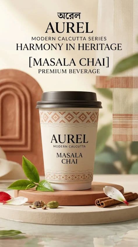

Artisan Bengali Spiced Chai Tea Beverage Poster
Create one finished vertical 9:16 premium advertising key visual for a fictional Bengali-inspired tea beverage brand. Generate this image independently as a single composition — never as a collage, contact sheet, split layout, or multi-panel design.
Use the following editable brand information exactly as supplied:
Brand Name: "[Brand Name]"
English Brand Name: "[English Brand Name]"
Series Name: "[Series Name]"
Product Name: "[Product Name]"
English Product Name: "[English Product Name]"
Product Type: "[Product Type]"
Brand Slogan: "[Brand Slogan]"
Primary Color: "[Primary Color]"
Flavor Elements: "[Flavor Elements]"
CREATIVE DIRECTION:
Imagine the launch campaign as a contemporary Bengali design atelier after a light monsoon rain: refined, tactile, architectural, quiet, and unmistakably premium. Build the visual language from authentic Bengali craft principles rather than obvious cultural decoration. Draw subtle inspiration from Jamdani geometry, Nakshi Kantha stitch rhythms, terracotta relief work, handwoven textiles, clay vessels, river ripples, paddy-field contours, botanical forms, and delicate ornamental line work. Translate those references into sophisticated modern packaging graphics, embossing, surface texture, shadows, and spatial rhythm.
The result must feel like an international luxury beverage campaign with Bengali cultural intelligence — never nostalgic costume styling, tourist imagery, a traditional restaurant poster, bubble-tea advertising, cartoon artwork, cheap e-commerce graphics, or a generic South Asian template.
HERO PRODUCT:
Place one premium takeaway tea beverage cup as the absolute visual focal point, vertically centered and fully visible from lid to base with no cropping. Keep the cup large enough to dominate the composition while preserving elegant breathing room around it.
Use realistic, beautifully engineered packaging with correct lid-to-body proportions, believable wall thickness, subtle seams, premium matte or softly frosted surfaces, refined paper or ceramic-inspired tactility, and controlled specular reflections.
Integrate Bengali-inspired graphics sparingly:
one restrained Jamdani-derived geometric band
a delicate Nakshi Kantha-inspired stitched line motif
subtle terracotta-relief geometry
minimal rice, river, floral, or botanical line art
one small original graphic emblem
Do not cover the entire cup in ornament. Preserve generous undecorated surface area so the packaging feels contemporary and expensive.
The cup may display only essential editable text:
"[English Brand Name]"
"[Series Name]"
"[English Product Name]"
Keep packaging typography clean, sharp, perfectly spelled, minimal, and legible. Do not introduce real-world brand names.
COMPOSITION:
Use a refined editorial composition rather than a conventional centered catalogue shot.
Create a shallow sculptural platform inspired by smooth Bengali clay and handmade paper. Position the cup centrally above it, with a faint reflective water plane or polished glaze beneath the base suggesting river light after rain.
Behind the cup, introduce one large abstract architectural form derived from terracotta relief geometry, softly out of focus and partially disappearing into negative space. Add a very restrained strip of handwoven textile texture along one lower edge, treated as a material accent rather than a decorative prop.
Allow the scene to transition vertically from tactile earth and flavor ingredients at the bottom into cleaner luminous negative space above, giving the poster a sophisticated editorial hierarchy.
FLAVOR STORY:
Use "[Flavor Elements]" as the only flavor-specific ingredient direction.
Arrange a small, carefully art-directed group of realistic flavor ingredients around the lower foreground. They should appear fresh, tactile, natural, and physically believable, with correct scale, moisture, translucency, surface texture, and contact shadows.
Translate the flavor into atmosphere as well as props:
earthy flavors → mineral surfaces, deeper botanical shadows, restrained water movement
fresh green or grape flavors → translucent fruit, fresh leaves, dew, pale botanical reflections
rice or milk flavors → creamy fluid forms, rice grains, warm clay accents, soft ivory surfaces
floral or peach flavors → delicate petals, fruit flesh, fine mist, restrained blush highlights
Do not overload the foreground. Flavor elements must support the product rather than compete with it.
BACKGROUND:
Build a sophisticated layered background using "[Primary Color]" as the lead brand tone, supported by warm cream, natural beige, muted botanical green, soft terracotta, restrained earth brown, and selective golden accents where appropriate.
Suggest Bengal through material and landscape abstraction rather than literal illustration: faint river-like light reflections, distant mist, woven textures, rice-field contour rhythms, handmade paper grain, or softened terracotta geometry.
Keep the background clean, restrained, atmospheric, and premium.
TYPOGRAPHY:
Use English typography only.
Reserve a calm brand-information area near the top with:
"[Brand Name]"
"[English Brand Name]"
"[Series Name]"
"[Brand Slogan]"
Place the main English product title:
"[English Product Name]"
as the dominant typographic statement in the upper-middle region. Use sophisticated editorial typography: an elegant high-contrast serif paired with a restrained modern sans serif. The main product name may be oversized but must not collide with or obscure the cup.
Supporting copy may include only:
"[Product Type]"
Keep all text minimal, correctly spelled, sharply rendered, properly kerned, visually balanced, and clearly separated from the product.
Do not invent extra slogans, descriptions, websites, QR codes, social handles, retailer marks, certification icons, or miscellaneous micro-copy.
LIGHTING:
Use soft cinematic side-back lighting inspired by luminous monsoon daylight entering through a large studio opening. Create a refined edge highlight around the cup, gentle tonal transitions across the packaging, realistic contact shadows, and subtle reflected warmth from the clay-toned lower surfaces.
Light direction, reflections, shadows, material response, and highlights must remain physically coherent. Avoid harsh black shadows, artificial HDR, excessive glow, or dramatic fantasy lighting.
PHOTOGRAPHIC QUALITY:
Luxury commercial beverage photography combined with contemporary editorial art direction, realistic product proportions, crisp packaging print, tactile paper and ceramic surfaces, believable condensation where appropriate, accurate ingredient textures, clean depth separation, controlled shallow depth of field, refined negative space, sophisticated material styling, cinematic realism, and premium campaign-level finishing.
The final image should feel like the hero key visual for the launch of a serious modern Bengali tea beverage brand — culturally rooted, globally contemporary, elegant, appetizing, and visually distinctive.
STRICTLY AVOID:
cropped cup, multiple cups, duplicate products, collage layouts, excessive cultural ornament, costume-like clichés, stereotypical motifs, clutter, cartoon rendering, bubble-tea-shop aesthetics, cheap promotional graphics, generic stock-photo styling, real existing brand names, Chinese characters, Chinese calligraphy, Chinese seals, Chinese architecture, Chinese decorative motifs, illegible typography, misspelled text, garbled letters, excessive small text, unrealistic packaging proportions, malformed lids, floating props, distorted ingredients, oversaturation, crushed blacks, and unnecessary logos.
Finished vertical commercial advertising key visual for an artisanal Bengali spiced milk tea brand. Features a condensation-beaded glass bottle of rich iced chai crowned with aromatic star anise, cinnamon sticks, and floating tea leaves on a warm rustic wood surface.